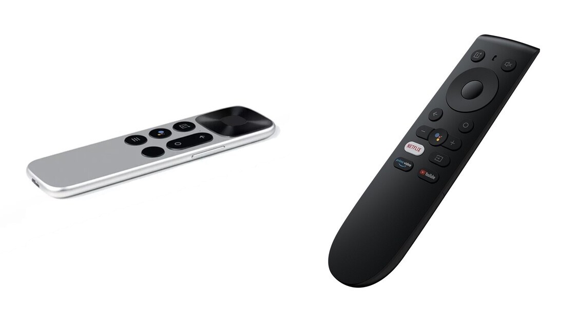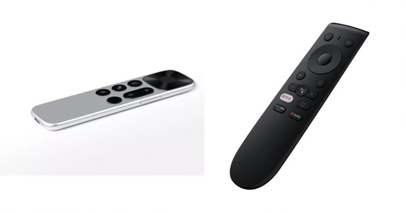
In September, weeks before launching its first TV, OnePlus’ CEO Pete Lau tweeted the picture of its remote. The design confused the hell out of me. It had volume buttons on the side like a smartphone, and no mute button.
At a OnePlus briefing days later, I got to use the remote, and it didn’t change my opinion. It was clunky and didn’t work half the time. Also, its buttons and functions were terribly confusing.
The company is finally fixing it with a new design that has dedicated buttons for YouTube and Netflix in addition to Amazon Prime. As you can see in the picture below, the volume buttons are on the front, and there’s now a mute button on the top-right corner as well.

The company said it’ll start shipping a new batch of TVs in India with new remotes and a dedicated Netflix app, which was missing in the previous batches. Hopefully, the remote performs better than the previous iteration.
If you’re a user with the old version of the remote, you can get a new updated version here for free.
Get the TNW newsletter
Get the most important tech news in your inbox each week.


