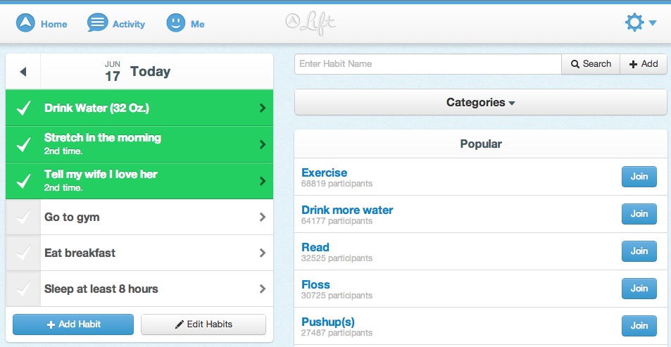
Today the habit forming app Lift is launching a new Web app that works across desktops and devices like Android and Windows phones. The app is designed to compliment the current version for iOS that launched in late 2012.
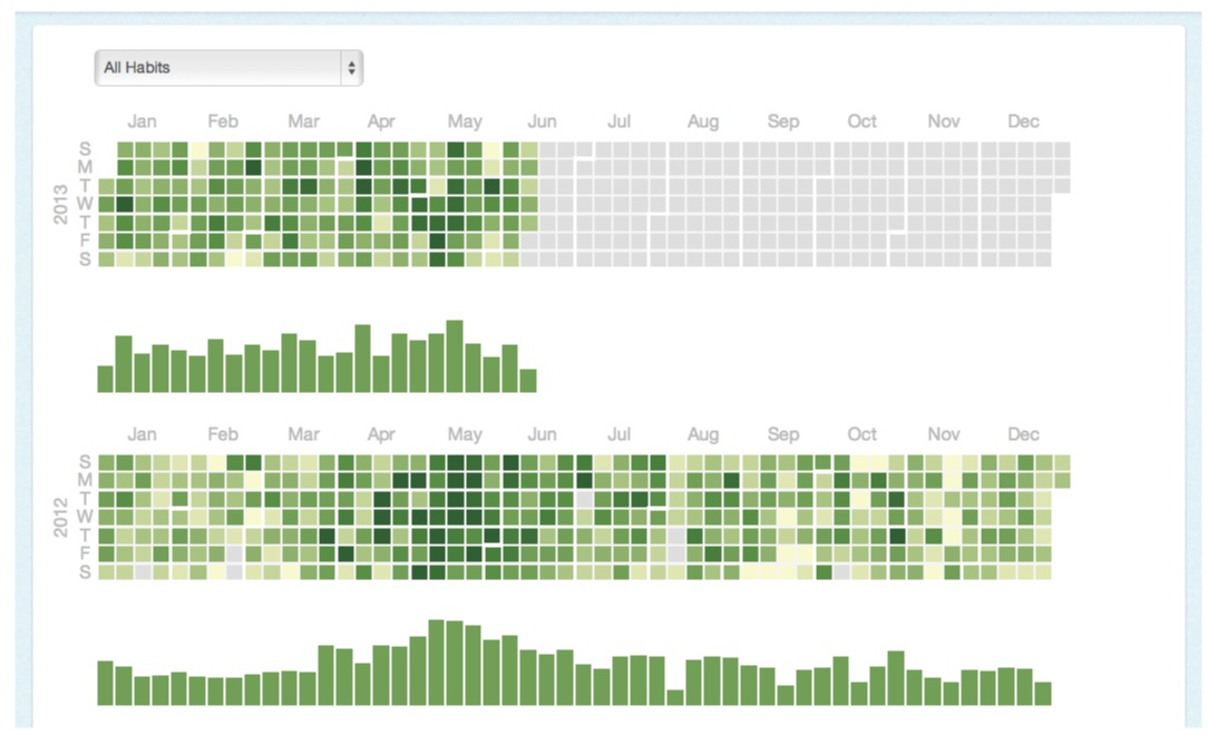
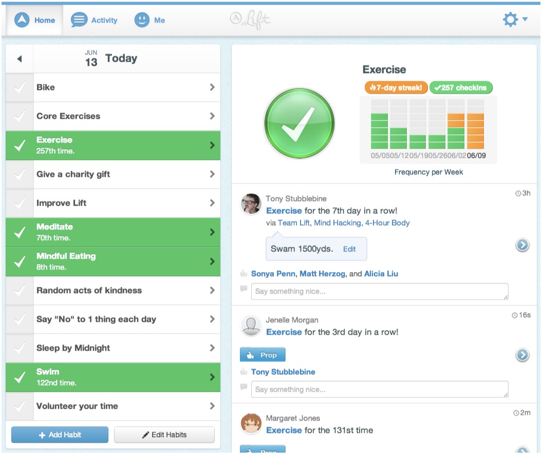
The Web edition of the app appears heavily inspired by mobile devices like the iPad, and it scales across multiple platforms with a responsive design. There’s near feature parity between the iOS app and the Web app, though a new statistics section has been added to the web to give you deeper and longer access to personal statistics and visualization.
Lift, if you’re unfamiliar, is an app that allows you to pick from predefined personal goals that you would like to transmute into habits, or create your own specific tasks that you’d like to do more of. It does this by encouraging you to check off each item that you do daily, making sure you begin building a regular rhythm of these checkins. As you go along, you’re rewarded with crisp, beautiful graphs and feedback in the form of streaks and encouragement from other users.
Lift was co-founded by Tony Stubblebine of Crowdvine and Jon Crosby of Path, in partnership with Obvious Co., a project of Twitter co-founders Biz Stone, Evan Williams and Jason Goldman. Lift received Series A funding led by Bijan Sabet at Spark Capital, who also joined their board. Other investors in the round include SV Angel, Adam Ludwin from RRE, as well as GTD author David Allen, speaker Tony Robbins and Emmy winning director Greg Yaitanes. Tim Ferriss, Narendra Rocherolle of Smile and Jeremy LaTrasse of MessageBus participated in the seed round along with Obvious.
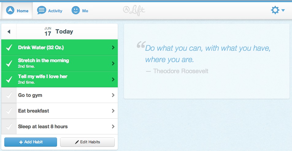
I’ve been playing with the Web version a bit and it’s pretty killer. There’s a lot to like here for a Lift user and the design brings not only the features of the iPhone app, but as much of the feel can be possible as well. Actions taken are nice and crisp, there is quick positive feedback in both buttons and page response times. You still get your nice graph and checkin buttons, as well as more expansive sections for commentary.
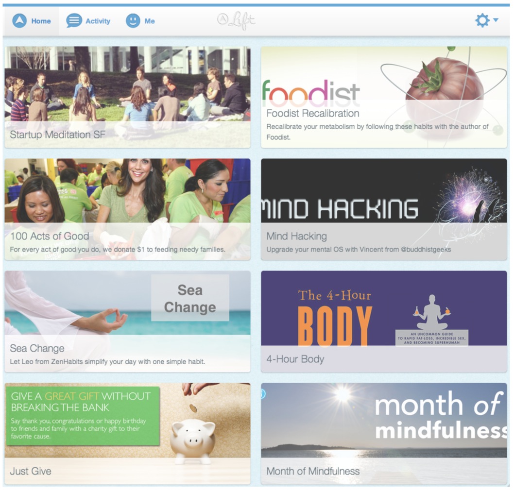
The social and interaction sections of Lift are now accessible to anyone, on any platform, which means that there should be more cross pollination between groups of users. This includes a few of the ‘formalized’ groups surrounding experts like Tim Ferriss, sites like Foodist and Zenhabits and more, as well as groups of friends and teams going after the same goals. The positive reinforcement gained when people are sharing tips and more in the comments of your goals or checkins is all part of the ‘positive feedback’ loop that Lift is trying to create.
And bringing the app to the Web proper allows people to sit down and write lengthier posts without having to type them out on the iPhone’s keyboard. This could encourage more sharing and socializing in addition to the regular ‘check in’ catchiness of the service.
The addition of mobile web editions also takes care of bringing Lift to every other platform outside of the iPhone in one swoop. Though an Android version of Lift is still in the works, developing for the mobile web hits a bunch of targets at once, so it was likely the best way to go. And the responsive design, I’m happy to report, looks great across a resized web browser or a phone browser.
The design of the Web experience owes a lot to the split pane standard set by the iPad and reflected by designs of other sites like Facebook and Pinterest. But that doesn’t make it any less effective. It’s done well and with restraint, and manages to translate the spirit of the iPhone app better than many other mobile web versions. This is how to do it right.
And there are some ‘bonus’ features for the Web in the form of a deeper tracking of habits across years. This exposes patterns of behavior in a colored graph that could help you to get a deeper understanding of the personal trends you’re seeing.
Going from the iPhone to a Web app is becoming a more frequent trend. Going from the most used mobile platform to the open web seems to be a really viable option for a lot of apps these days, especially ones looking to appeal to groups of people with disparate technologies. It doesn’t make sense for a motivational app like Lift to adhere to an artificial divide between ‘iPhone users’ and ‘not iPhone users’. Though other native clients will come, this particular path is one we’re seeing more and more, and it seems right for Lift, who has proven progressive about other features like push notifications as well.
Get the TNW newsletter
Get the most important tech news in your inbox each week.
