One thing I love about The Next Web is how we’re always iterating. While many of our rivals push out a whole new design every two or three years and then let it grow stale, we’re constantly making tweaks and improvements. Case in point: today our article pages have a fresh new look.
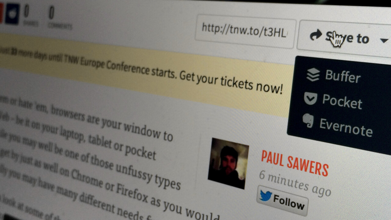
This isn’t just about new eye candy, there’s additional functionality here too. You can now quickly add any post to your Buffer, Pocket or Evernote account with the new drop-down ‘Save to’ menu, and there’s easy access to the post’s short URL, making it simpler to manually share wherever you wish, too. Up top, you’ll see we’ve made it easier to discover the articles published before and after the one you’re currently reading.
We’ve also added a photo of the author to each article. Although this may seem a purely cosmetic touch, we want you to get to know our authors better – after all, we’re not just faceless robots (most of us, anyway). If you particularly like a post, you can follow the author on Twitter right from their byline.
Don’t forget that to get the most out of The Next Web, you should try TNW Pro. This package gives you enhanced sharing features, ads removed across the site, and access to a full RSS feed. TNW Pro costs $30 per year or $3 per month, and you can try it free for 30 days. Let us know what you think!
➤ TNW Pro
Get the TNW newsletter
Get the most important tech news in your inbox each week.


