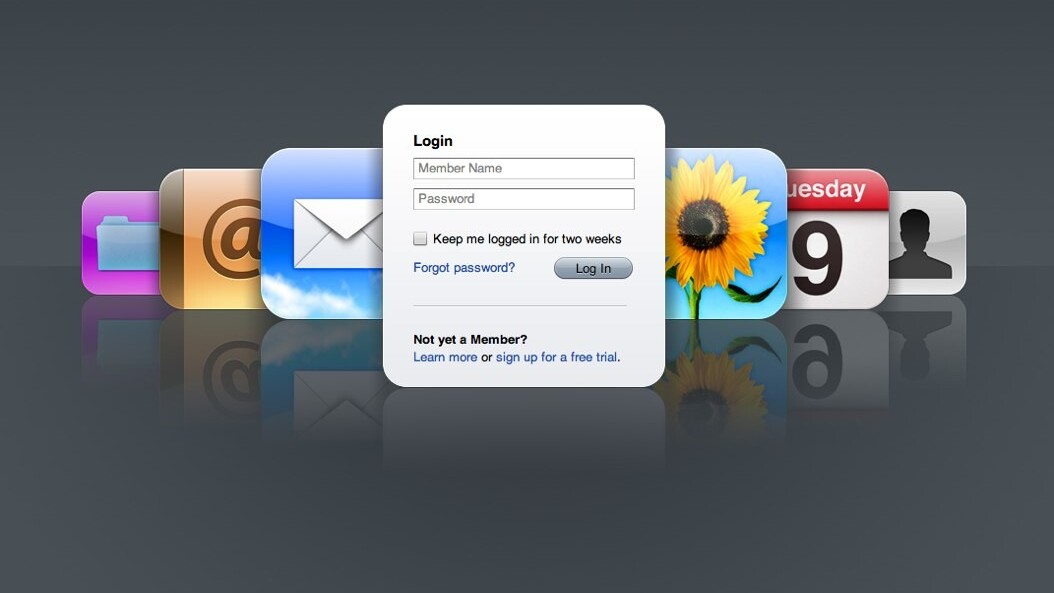
 Today Apple released its revamped Mobile Me web based email client. It’s as pretty as ever and comes with the a few decent – but late to the game – features mentioned below. The most exciting, at least for me, is being able to send and receive from any email address – something that’s made even trying Mobile Me impossible until now.
Where it seriously disappoints however is probably the most important element of the entire app – composing or replying to emails. Every time you click to reply or compose, up comes a new window… a POP UP NEW window(!?). What are you thinking Apple? Where is the elegance in that Apple? Extremely frustrating.
But that’s ok, one of the most interesting and unique features of Mobile Me was its “quick reply” feature which lets you reply without technically even having to open the email – that’s still around right? Wrong. Gone. Why?? [If I’m just missing this by the way or there’s a way to re-enable it, do let me know]
As far as I see it, the only reason you would use Apple’s Mobile Me is if you’re blinded by its beauty because frankly it certainly isn’t usable and fails in comparison to Gmail’s scope of features.
If you’re still interested in trying Mobile Me, new features are listed below, all of which are available in Gmail I might add:
Widescreen and compact views. When reading your mail at me.com, the new widescreen view lets you see more of each message with less scrolling. Choose compact view to hide your folders or classic view to see more of your message list.
Rules to keep your email organized everywhere. Mail rules help you reduce inbox clutter by automatically filing messages into folders you select ahead of time. Set them up at me.com, and your rules organize your incoming email on the web and everywhere else — on your iPhone, iPad, iPod touch, Mac, and PC.
Single-click archiving. Click the Archive button and the selected message is quickly filed into the Archive folder where it’s always available for future reference.
Formatting toolbar. You can create great-looking email messages using formatting buttons to bold or italicize text, change font color, insert images, and more. You can even create formatted web links to hide long URLs.
Faster performance. Mail at me.com loads your inbox and messages faster. And with interface refinements such as the ability to scroll through your entire inbox without having to manually click to load the next set of messages, you’ll be able to work more efficiently.
Increased security with SSL. With MobileMe Mail, accessing your email on the web is more secure than ever. Your inbox is protected to prevent anyone from eavesdropping on your webmail. As always, you receive SSL protection when you use your MobileMe Mail account on your iPhone, iPad, iPod touch, Mac, and PC.
Support for external email addresses. Reading all your email in one place is easy with MobileMe Mail. You can receive email from another service by having the email forwarded to your me.com address.* And when you reply to a message using webmail, you can choose to send it from the address it was sent to, or from your MobileMe account.
Improved junk mail filtering. MobileMe Mail places suspected spam messages directly in the Junk folder. If you see an email that you actually want, click the “Not Junk” button on me.com. MobileMe moves the message to your Inbox and makes sure that messages from that sender are not sent to your Junk folder again.
Get the TNW newsletter
Get the most important tech news in your inbox each week.


