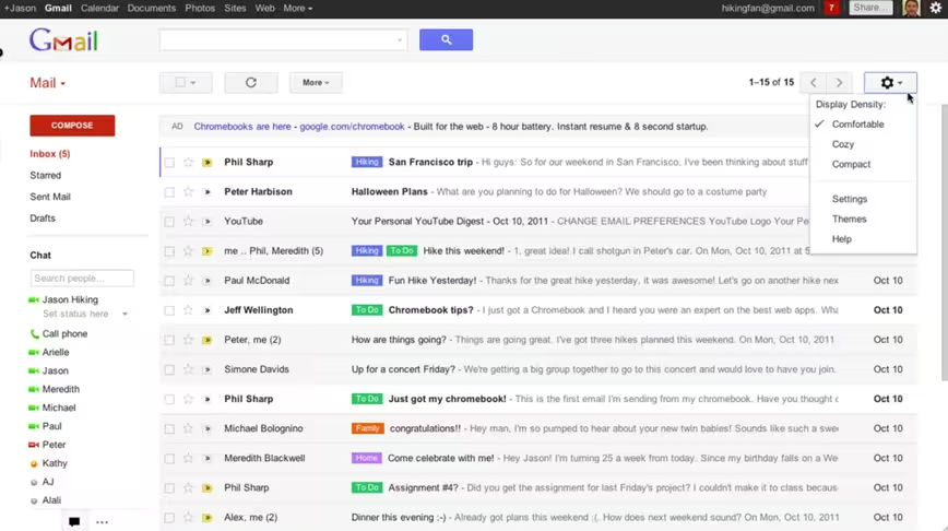
Google has today announced the debut of a new look and new features for its web-based Gmail client with improved navigation, better search options and selectable ‘information density’.
This update brings the changes we first reported on October 20th. There are also new HD themes to support higher resolution monitors.
The new look features the sparse styling that Google has been introducing with most of its products recently, although there is not an option that allows you to select how dense you want the layout to be.
The new look is designed to automatically scale to different display sizes, but thankfully those of us that prefer a denser look to our Gmail can now select between ‘Comfortable, Cozy and Compact’ options to increase the amount of information per square pixel.
Google is also debuting a bunch of new themes with content provided by iStockphoto. These themes will update your old ones automatically.
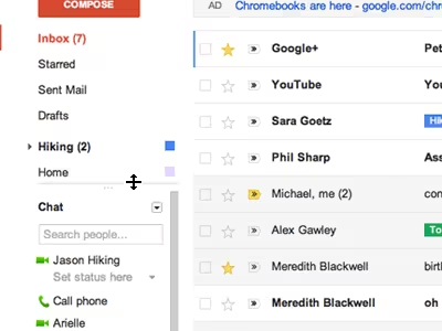
A revised navigation panel and better search options round out the updates. The new navigation pane will allow you to resize the label and chat zones or collapse the chat pane entirely.
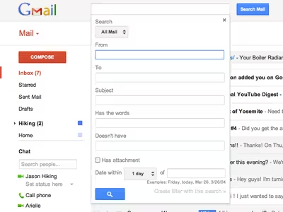
The search panel has been mercifully upgraded to allow direct search options rather than moving you to a separate page for those. You can insta-create filters based on search criteria here too.
The changes have not rolled out to everyone, but if you would like to switch now, Google says it is rolling out a ‘Switch to the new look’ link in the bottom right corner of your Gmail inbox over the next few days.
This looks to be a nice facelift for Gmail, as long as you don’t mind the minimal, somewhat spartan new look of Google’s products. If these upgrades still don’t float your boat though, make sure to check out our list of 13 Gmail plugins you really should have.
Get the TNW newsletter
Get the most important tech news in your inbox each week.

