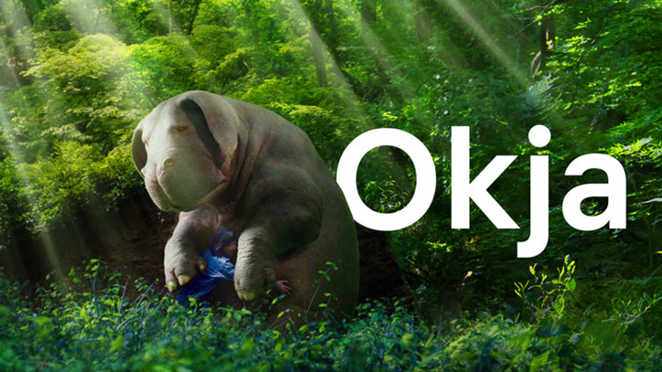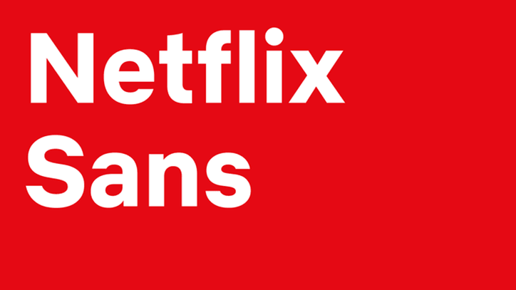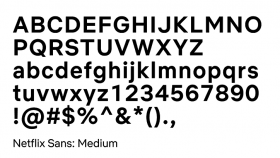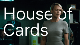
Typefaces are vital to a brand’s identity. For a while now, Netflix has been known by its use of the striking Gotham font. However, spiraling licensing costs have forced the streaming titan to look elsewhere, resulting in it launching its own bespoke typeface: Netflix Sans.
Netflix Sans was the product of a collaboration between an in-house team and the iconic font foundry Dalton Maag. It solves a couple of problems: first, Netflix was paying millions every year just for the privilege of using Gotham. When you license something at such a scale, it gets really pricey.


Speaking to design blog It’s Nice That, Netflix’s brand design lead Noah Nathan said: “With the global nature of Netflix’s business, font licensing can get quite expensive.”
“Developing this typeface not only created an ownable and unique element for the brand’s aesthetic…but saves the company millions of dollars a year as foundries move towards impression-based licensing for their typefaces in many digital advertising spaces.”
Second, Netflix wanted something unique to itself. Gotham is a lovely font, but it’s been used before. It was first created for the fashion magazine GQ, and later found its way into countless sites, publications, and marketing materials. It was even used by Obama’s 2008 presidential campaign.
Netflix wanted change it could believe in, and with Netflix Sans, it’s got a typeface that won’t appear anywhere else.
The Next Web’s 2018 conference is just a few months away, and it’ll be ??. Find out all about our tracks here.
UPDATE: This post has been updated with comment from Jonathan Hoefler.
Get the TNW newsletter
Get the most important tech news in your inbox each week.


