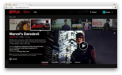
Netflix has finally unveiled its new website, after rumors about an upgrade began flying around a few weeks ago.
The company says the new designed looks to make finding content to watch faster and easier. It’s designed to look more like a mobile app than “a series of linked web pages” – that includes optimization for touchscreen too.
Information about videos will appear in-line rather than needing to load up a separate page, while hovering over a title will also provide a slideshow of images about the show to help you decide if you actually want to watch it.
Once you click on a title, a details pane will pop up to see reviews and more info. A “More Like This” feature also helps you find related titles if you’ve already seen something.
The new design is rolling out today – although it may take up to two weeks before you see it on your own account. Netflix notes you may have to upgrade your browser if you’ve been using an old version.
➤ The Netflix Website Gets A Major Upgrade [Netflix]
Get the TNW newsletter
Get the most important tech news in your inbox each week.


