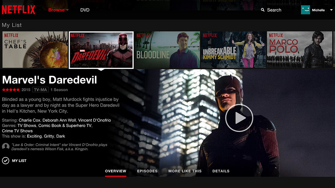
Netflix is prepping a redesign of its Web interface for release to all users — perhaps as early as June — and some subscribers are reportedly already seeing the update as part of a test, TechCrunch reports.
“I can confirm that we plan to launch the new UI, our first of update since 2011,” Cliff Edwards, director of corporate communications and technology at Netflix told TNW.
“The idea is to provide the same immersive experience you’d get on a TV and to deliver more information about a particular show in one place, in an easy to access way.” Edwards mentioned that the new UI has been demoed at various trade shows in the past, but that test locations and numbers are not public information. “We test generally on a global basis, ” he said.
![Netflix_website_title_detail_EN[1]](https://cdn0.tnwcdn.com/wp-content/blogs.dir/1/files/2015/05/Netflix_website_title_detail_EN1.jpg)
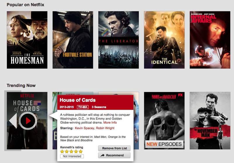
From published screenshots, it is evident that the new interface basically removes the slow-scrolling carousel and replaces it with a new design that expands each selection with a click, letting users get more details about the movie such as cast, summary, and episode, if appropriate.

The closest comparison today is the Netflix tablet interface, which appears to feature certain visual aspects of the new design.
➤ Netflix To Roll Out A New, More Immersive Web Interface Starting In June [TechCrunch]
Get the TNW newsletter
Get the most important tech news in your inbox each week.


