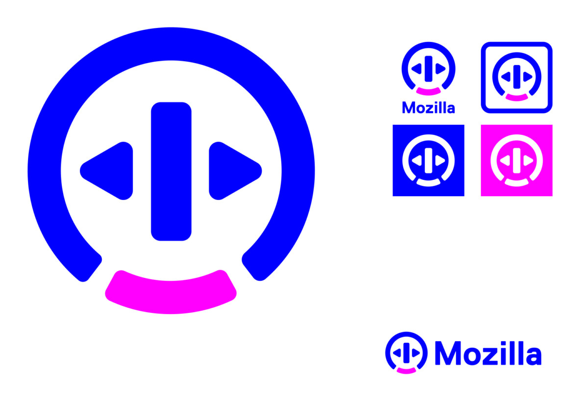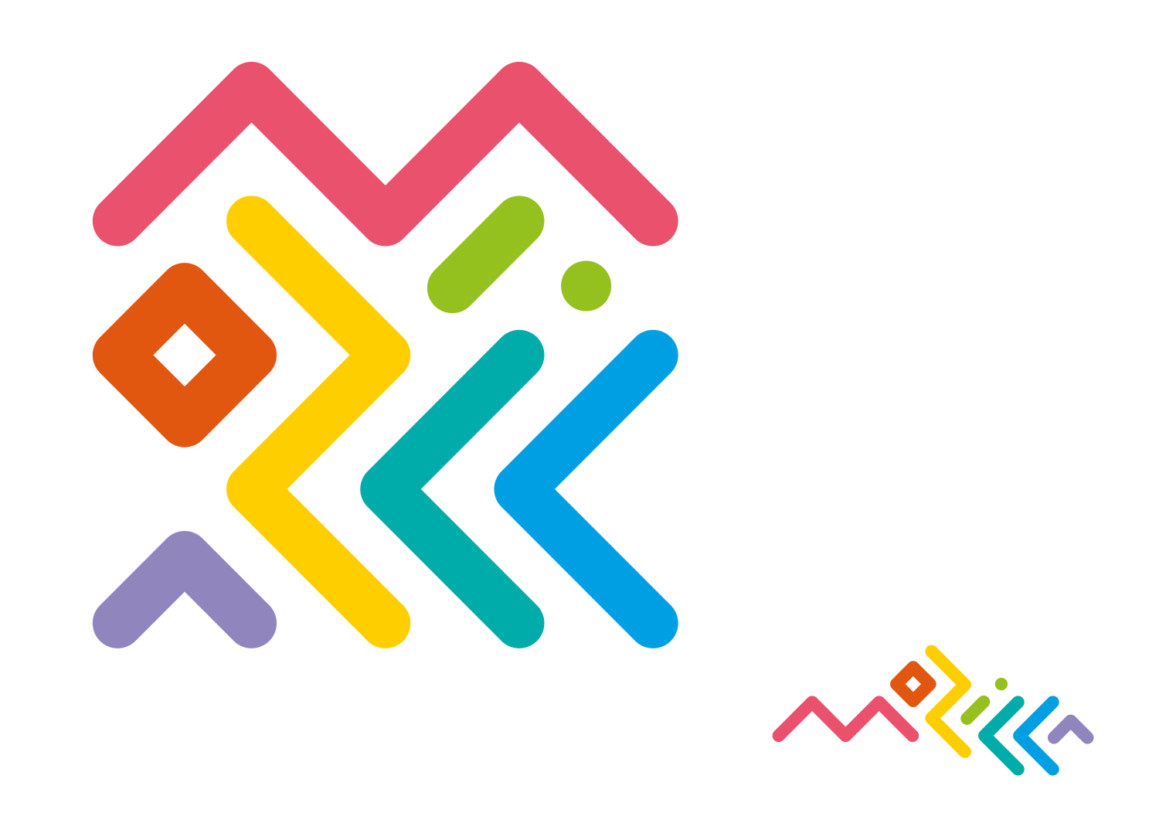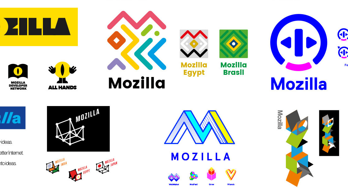
In June, Mozilla announced that it would be redesigning its logo with the help of the internet’s collaboration. Along the way, it asked its community members to provide feedback on every step, shaping the logo into what the Web believes is a strong rebrand.
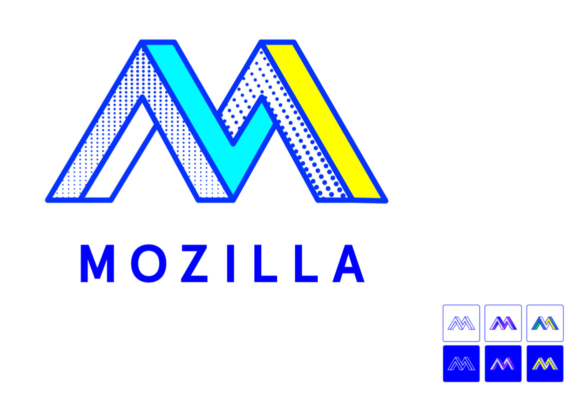
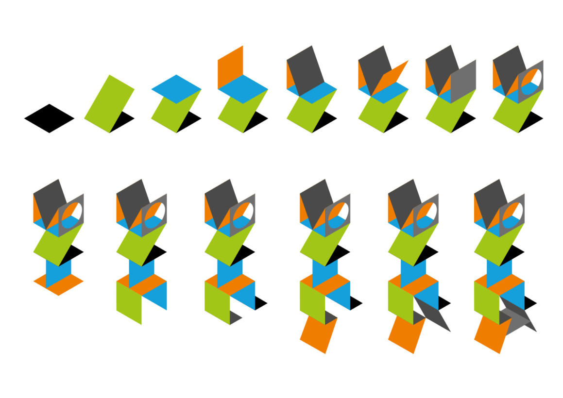
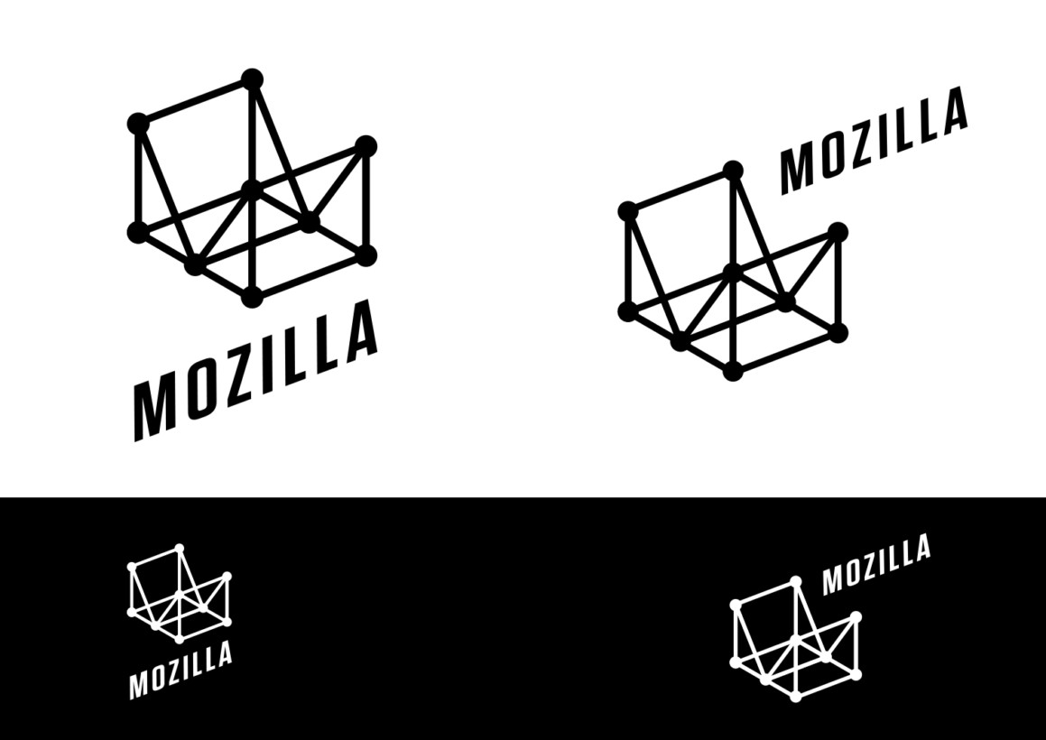
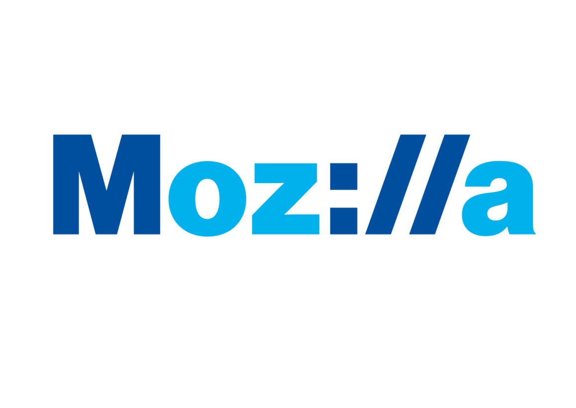
Today, the company unveiled the seven finalists up for selection. “Each of the seven concepts we’re sharing today leads with and emphasizes a particular facet of the Mozilla story,” Mozilla’s Creative lead wrote in a blog post.
“From paying homage to our paleotechnic origins to rendering us as part of an ever-expanding digital ecosystem, from highlighting our global community ethos to giving us a lift from the quotidian elevator open button, the concepts express ideas about Mozilla in clever and unexpected ways.”
The seven concepts are filed under different themes, such as “For The Internet of People” and “With You From The Start.” To learn more the story behind each logo, visit Mozilla and click on the image to see a full description.
Mozilla hopes to narrow the selections down to three by mid-September, and make its final pick at the end of that month. To be clear, community members will not get to vote on the final selection, they just get to see the concepts as they’re adapted and provide feedback for the creative team to consider.
Which is your favorite? My personal pick is the Open Button though they all look super 80s-inspired – but hey, what do I know.
Get the TNW newsletter
Get the most important tech news in your inbox each week.
