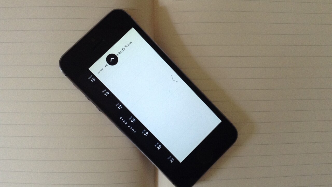
Moleskine Timepage is a calendar app for iPhone, iPad and Apple Watch. It supports iCloud, Gmail and Microsoft Exchange accounts. And it’s the first calendar app that’s really won me over.
It’s the latest in the notebook brand’s line up of iOS apps that also includes Creative Cloud (which turns hand drawn images into digital files) and Journal (a digital version of its classic design).
I’ve always had a soft spot for Moleskine. I carry one of its notebooks wherever I go and use it more than any note taking app on my phone, including the aforementioned Journal.
But while my notes are still pretty analogue, my calendar is digital, which is why I felt compelled to give Timepage a go.
Design
The simplicity and functionality of the design struck me first. It’s just like a Moleskine paper planner.
The default theme is red and black, but you can customize the colors as you wish.
The timeline view is easy to follow. It has the days of the week on the left with any corresponding entries in a block beside it.
You can navigate through your calendar and events using natural swiping gestures, or taps if you prefer.
The Sans Serif typeface is easy on the eye and will appeal to people who are already Moleskine enthusiasts.
In use
The app doesn’t sync with the native iOS calendar app. Instead, you log in and connect your iCloud, Exchange or Gmail account (or all three if you have them).
I didn’t mind this, although I can appreciate that it might be frustrating for someone who has all their information stored on their iPhone already.
Once you’ve logged in, you can set up access to multiple calendars. I chose to sync both my personal and TNW accounts.
The main view in the app is the timeline, which displays your agenda day by day in an infinitely scrolling listing.
Tapping on a day opens a full screen page showing your events and the expected weather. If you press on the weather icon, it reveals the hourly forecast.
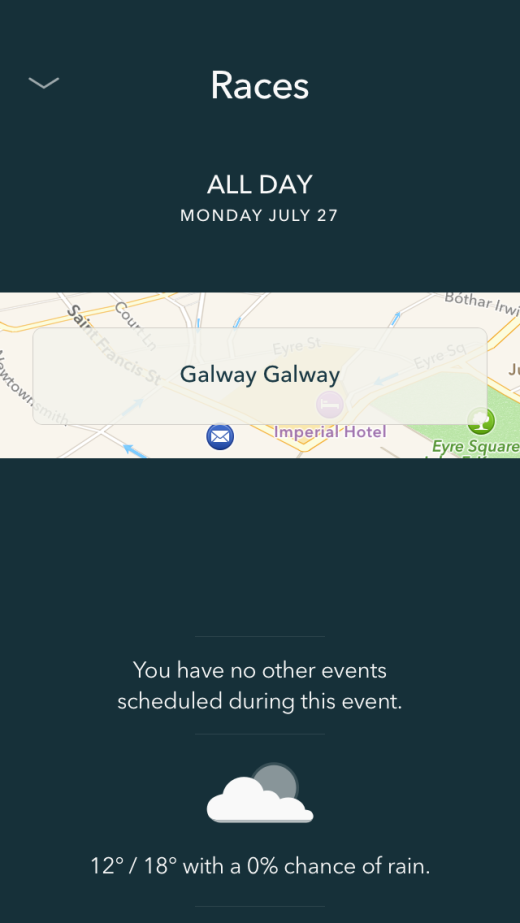
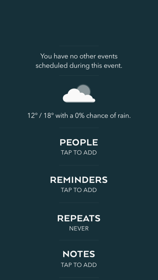
Selecting an event gives you further information such as who’s attending, the expected traveling time and a map of the location. You can also add notes and set reminders.
When you’re viewing an individual day, you can swipe left or right to skip backwards and forwards in your week. You can also choose which calendar an event belongs to.
A handy floating arrow sticks around while you scroll. Tapping it takes you straight back to today, so your thumbs aren’t overworked.
To create an event, you just have to pull down the page when you are in day view.
When you want to invite people to an event, the app automatically suggests people from your contacts as you type. You also add notes, reminders and the location to the event item.
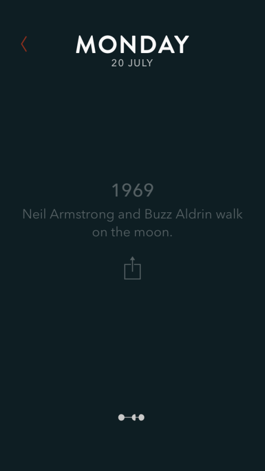
If you’re looking at a day with no events added, the app offers up facts from that date in history. It’s a fun, quirky feature.
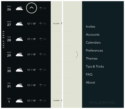
The settings page is accessed by swiping right on the timeline view. From there, you can sort invitations, add or remove accounts and adjust the theme. It’s also home to a tutorial with useful tips and tricks.
If you swipe left from the timeline, you can see daily weather forecasts.
Wrap
While I’ve been using the app for just under a month now, I feel confident in saying that I won’t be switching to another calendar app anytime soon.
The simplicity and elegance of the design appeals to me as much as the fluidity of using it. I’ve become somewhat dependent on having the weather alongside my daily events and it has been surprisingly accurate.
The syncing between the app and my calendars on the Web has been almost simultaneous, which is always a good thing.
However, I have found myself wishing that I could distinguish between my various calendar’s events in the timeline itself. At the moment, everything shows up in the same color text and you can only see what calendar it belongs to by selecting the individual event. I think it would be nice to have different color text for each calendar, so you can distinguish events at a glance.
That being said, I think the app is highly-functional and of course, aesthetically pleasing. It comes with a price tag of $4.99, which is the same as popular rival Fantastical 2, but it’s worth it for the ease of use alone.
It’s not surprising that Timepage is iOS-only. Moleskine’s CEO Arrigo Berni revealed, in an interview with Fortune, that it sees better sales when its shops are near an Apple Store.
So, next time you’re looking for a new Moleskine, look for the nearest Apple Store, if you haven’t already downloaded this app.
Read next: 7 personality traits of great designers
Get the TNW newsletter
Get the most important tech news in your inbox each week.

