To be a good designer, you need more than just mastery of design skills and a good eye. With more and more companies hiring waves of designers, you must have all the skills needed to thrive within a larger product team.
Photo credits: Lovelorn Poets
In this piece, we’ll describe some of the personality traits that help the designers in all aspects of their work, from satisfying users to working with stakeholders. Remember that one simply isn’t “born with” these traits (although a few may come naturally to some designers). These traits can be learned, developed, encouraged, and nurtured, transforming you into a better product team – and a better designer.
If you’d like more tips and case studies on better UX & UI design, check out the free e-books Web UI Best Practices and Interaction Design Best Practices.
1. Empathetic
Empathy is arguably the most important trait of a designer. You won’t get very far in design if you don’t understand your users, and you won’t get very far in business if you don’t understand your teammates.
Empathy serves a dual purpose.
The first part is emphasizing your users, which is pretty self-explanatory. If you understand what your user wants versus needs (and how they think), you’re in a much better position to design intuitive and desirable interfaces – which is especially important since people make decisions emotionally rather than rationally.
Source: “Empathy.” Sean MacEntee. Creative Commons.
For empathizing with users, usability testing can open the most doors into their mindsets. Reliable data takes a lot of the risky guesswork out of design, especially considering that the designer is rarely the target audience, so there’s always an element of uncertainty. Try to understand your users as much as possible, and fill in the remaining blanks with user research.
As described in Design Collaboration for the Enterprise, empathy also improves collaboration. Designers are trained very well in empathizing with users, but don’t forget to empathize within your team.
Study the culture and processes of your own company as though you were an outsider. Why are things done the way they are, and what are the processes that have created the existing design artifacts? If the company struggles with being design-focused, some internal ethnography helps give you a better understanding of cultural issues and realistic workarounds.
Empathy is particularly helpful during critiquing sessions: phrasing a criticism in the proper way will spare feelings, and also increases the likelihood of you winning over advocates in the company.
For eight tips on how to become more empathetic, read this fantastic article from UX Mastery.
2. Business-Savvy
With all the visual details involved, it can be easy to forget that design is a business.
As a designer, your own personal preferences and opinions come second to the business goals (and user goals) of a project. If a carousel performs well in usability tests, you might want to include it in your UI even if you personally hate it. Being business-savvy means making only the decisions that are good for users (and therefore business) – and that starts with knowing how.
Photo credit: Canned Muffins. Creative Commons.
Like we mentioned above, usability testing reveals smarter paths to satisfying user and business goals. The more you understand your users and their behavior (Empathy), the more-informed your business decisions.
Beyond studying users, designers need to also grasp why projects were initiated in the first place and how the company measures product success.
How does the business model work? Where does the current product you’re designing fit into long-term goals? Who are the top competitors, and what are their strengths and weaknesses? You probably won’t know the answers right away (and sometimes stakeholders might not even tell you upfront), so it’s your responsibility to tease out the information from the right people.
Sit in on sales demos, interview stakeholders, do whatever you can to understand why and how the company turns a profit. “Designers that can’t talk to value in the business model also can’t explain why they themselves should be on the payroll,” says usability expert Jared Spool in an excellent article from his site User Interface Engineering.
To ensure you’re always a business asset, you need to take the initiative and learn beyond the daily grind. Personally, we’re big fans of staying updated with Smashing Magazine’s Business section and Google Venture’s Library. They both provide practical design perspectives on very real and pressing business issues.
3. Empirical
The best designers can think like scientists.
As we just said, design is a business, so products cannot be built on the whimsy of the designer’s creative spirit. You need concrete research backed by quantitative and qualitative user data.
Source: “The Poetry of Logic.” Quinn Dombrowski. Creative Commons.
Web analytics, usability tests, and contextual interviews lend credibility to your intuition (or prevent you from making irreversible mistakes). Not only will these make your designs better, it will also be a great aid when defending your design choices in a review. If someone challenges your decisions, let the user data speak for itself.
Alissa Briggs, Brigade’s Director of UX, presents a great empirical approach to design issues. We first learned of her approach at Rosenfeld Media’s Enterprise UX 2015 conference.
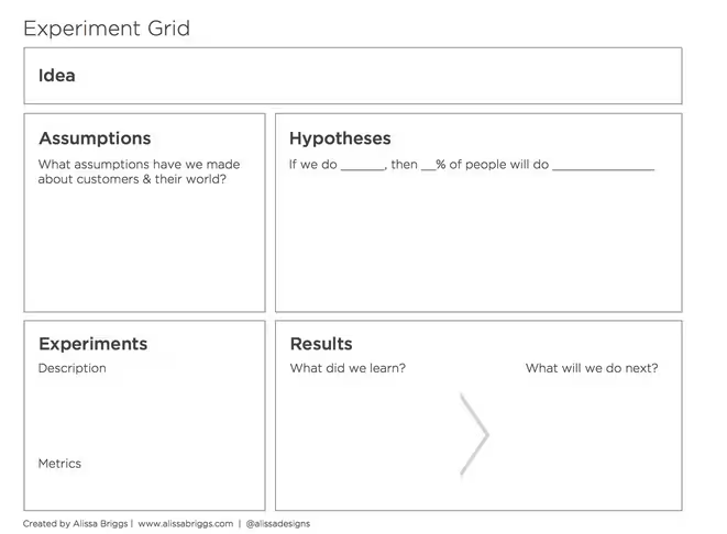
When Briggs worked at Intuit, customer feedback showed that their users would prefer a simplified product with multiple tiers under one license. Feedback alone wasn’t enough, however, since executives quickly shot down the idea.
That’s when Briggs broke out her experiment grid. This is a quick and effective spreadsheet for conducting small experiments to validate or invalidate otherwise abstract theories. By using this document for testing a simplified product on a small set of users, Briggs had the hard data to back up the customer feedback.
Once the executives saw the hard data, they were immediately on board. Other departments even took notice and wanted to try out the experiment grid. Now, the single-license product outsells all others.
Photo credit: Alissa Briggs
Just don’t go overboard. You have to know when enough is enough in terms of testing to avoid data fetishization – don’t make the mistake Google did with their infamous 41 shades of blue test.
For more advice on how to apply scientific testing into design, check out this slideshow on experimenting in Lean UX.
4. Meticulous
In a medium based in visual minutiae and the intangibles of psychology, an eye for detail is crucial for consistent UI and UX design.
Source: “Spiders web, How Hill, Norfolk.” Willzay. Creative Commons.
Great designers pay attention to the details. No aspect of the site’s interface is too small, too insignificant. For example, the art of interaction design requires that you pay attention to how each microinteraction (which lasts milliseconds) affects an overall experience (which can span minutes or hours). It might seem nitpicky to deliberate over a hover-to-reveal versus click-to-reveal, but usability testing usually reveals otherwise.
Part of being meticulous means maintaining consistency, as explained in Consistency in UI Design. Grids, layout patterns, color palettes, editorial styles – these must all remain consistent across all the pages of a website, or else you risk users relearning functionalities (which increases friction).
Once you finalize these decisions – color codes, and typography specifics, etc. – try organizing them with a style guide. A quick reference guide (best created in HTML with reusable code) helps relieve a lot of the strain of ensuring site-wide consistencies.
5. Patient
When you’re at the nth iteration, it’s easy to just cave in and say “good enough”. Deadlines loom and sometimes compromise is the path of least resistance.
But like we described in Consistency in UI Design, always take the time to verify that your designs are first externally consistent (match what users expect) and internally consistent (consistent with itself).
Some clients might not notice, but others may require stringent reviews where they will ask uncomfortable questions about why certain fonts in a wireframe aren’t consistent, or the spacing looks off from page to page. You can try pre-empting those comments by explaining that it’s just a wireframe, but you’re better off just putting in some extra effort to avoid the conversation completely.
We’re big believers in spending more time upfront on the design foundation, so we suggest you first refine the information architecture and test it with users via card sorting. You can then move into a rapid prototype – even an interactive wireframe – to explore how your design actually works before diving into visual details.
If possible, create some rough copy (or use competitor’s copy) instead of taking the Lorem Ipsum shortcut. At this rough stage, the prototype is likely to require rebuilds, so don’t commit to higher fidelity than needed for usability testing.
Patience is equally important when testing and interviewing users. Don’t just write up a list of questions, run through them with users like a script, and call it a day. Many times, you’ll find the best user insights are hidden in the pauses between questions. Use your list of questions as a rough prompt, then dive deeper with follow-up questions (Liz Danzico provides some great guidance in her presentation)
6. Perceptive
Solving problems is an everyday responsibility for the designer. Finding the right problems to solve, after all, is at least half the job.
You need to be able to see outside the design. It’s easy to just get on the grind when you’ve been working on the same project for months, so you start treating the end-date as a light at the end of the tunnel. But great designers have the uncanny ability to still see their design as if it were the first time, even if they’ve worked on it for what seems like forever.
Source: “Innovación.” Ruta N Medellín. Creative Commons.
While some designers are born with that skill, others can build up that strong perspective through user-focused exercises like empathy mapping and usability testing. In fact, try moderating a few usability testing sessions for rare glimpses into candid user behavior. You’ll naturally internalize their reactions for fresh perspectives on future iterations.
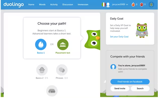
When speaking at Rosenfeld Media’s Enterprise UX 2015 conference, Catherine Courage, SVP of Customer Experience at Citrix, also suggested finding inspiration outside your industry. It can be as simple as looking at the brands you yourself love, and trying to incorporate those characteristics into another industry where they’re not common.
Photo credit: Duolingo
For example, Duolingo incorporates the delightful design elements from mobile gaming apps into language learning. As a result, the learning experience feels more enjoyable by shedding the academic feel. Patterns like unlocking achievements, gratifying incentives, fun colors, and cartoony graphics all counteract the traditional classroom feeling.
To develop these unprecedented design solutions, you must be willing to question the constraints. Pay attention to assumptions, seek inspiration outside your industry, and start making those unseen connections.
7. Grounded
The final trait that ties everything together is being grounded.
A firm sense of reality is the key to effectively applying all of the above traits. By seeing the problems at hand and resisting the temptation to sugar-coat them, you’ll develop a better understanding of how to legitimately solve them.
Source: “Feet on the ground.” Felipe Gabaldón. Creative Commons.
Being down-to-earth gives you the openness to understand others (empathy). It allows you to see how things really are (empirical) so you can accept how they relate to the project’s specific goals (business-savvy). Keeping your feet on the ground reminds you to take your time (patience) on filing in the details (meticulous), and provides a reliable anchor so you can safely explore new ideas (perceptive).
Conclusion
We can’t possibly list all the great traits that help designers – humility and ambition are two traits that are often cited, and for good reason.
These are simply the ones that that stand out in our minds, and the qualities we’ve observed in the best designers we know. While these seven alone may or may not be the secret to becoming a great designer, we can say one thing with confidence: they certainly never hurt any designers.
If you’d like to learn more techniques of great web designers, check out the free 109-page e-book Web UI Design Best Practices. The book explores techniques spanning UX design, visual design, and interaction design. Examples are analyzed from 33 companies including Apple, Spotify, Skullcandy, and others.
Read Next: The ultimate guide to launching your UX career
Image credit: Shutterstock
Get the TNW newsletter
Get the most important tech news in your inbox each week.


