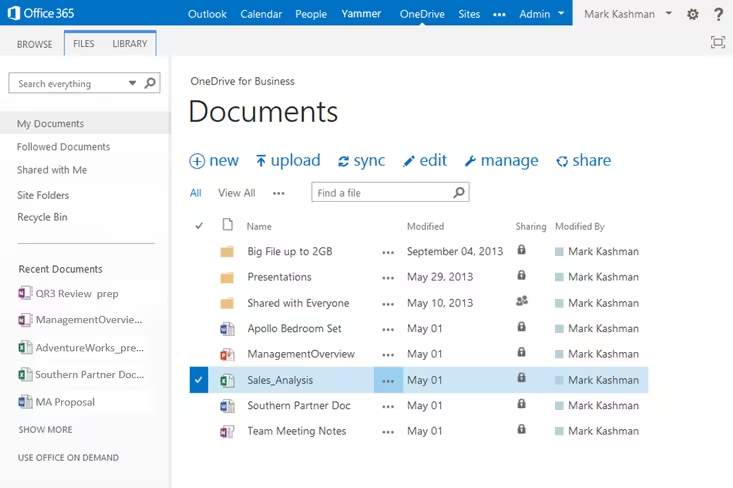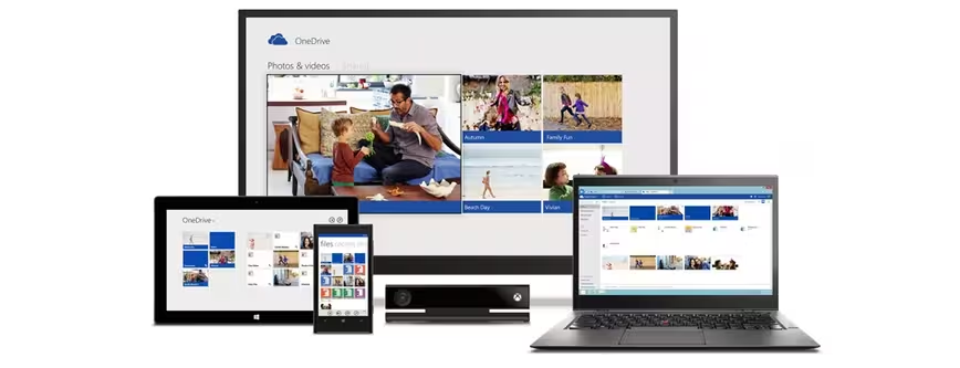
Microsoft today updated OneDrive for Business with a new design as well as three new features. The former consists of refinements to the user interface while the latter consists of Simple Controls, Site Folders, and smarter search.
First up, let’s talk about the service’s new design. One of the first things you’ll notice is that the OneDrive for Business Recycle Bin has been moved to the left-hand navigation area of your Web view.
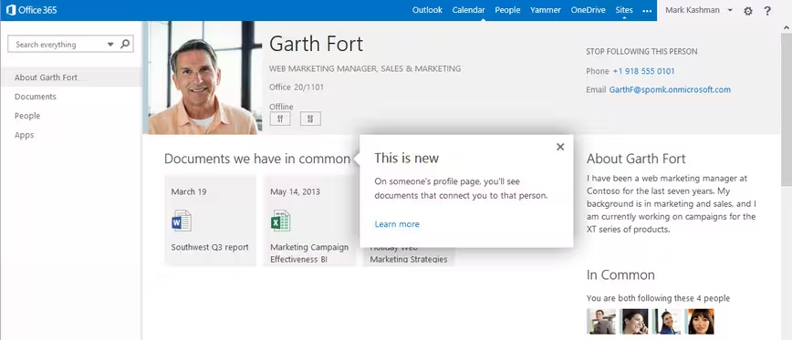
Next, the “About Me” page has been revamped to highlight documents and people you have in common with the person viewing your page (as shown above). Furthermore, your profile picture will no longer appear in the upper-left portion of the OneDrive for Business user interface, but it will show up across all of Office 365 when it becomes a part of the evolving global top navigation bar.
Microsoft has added a new Simple Controls bar (new, upload, sync, edit, manage, and share) that appears directly above your personal work document folders. With one click or touch, you can create new Office documents, upload files, initiate sync to take your files offline, share your files internally and externally, and so on. Simple Controls are also available for all team site document libraries.
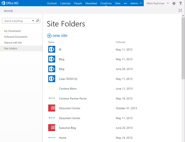
The new Site Folders link on your main Web view takes you directly to document libraries within sites you follow. This is part of Microsoft’s strategy to make OneDrive for Business the single location for all of your work files, whether it’s your personal work documents or those shared on team sites.
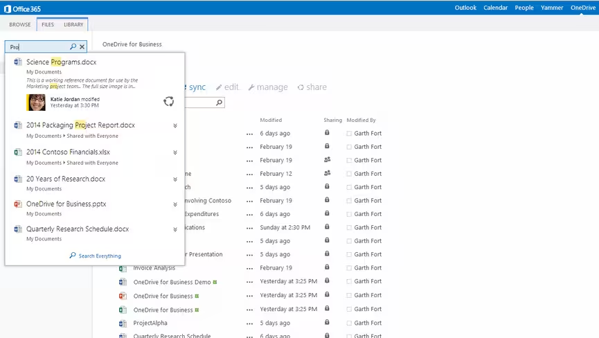
Last but certainly not least, the search box has gotten smarter. You can now simply start typing to find any document you have uploaded or that has been shared with you. Furthermore, you can take immediate action (like sharing a file) directly from within the search results (note the circular sharing icon shown above).
It’s also worth pointing out that the search box has moved from the upper right to the upper left. Microsoft says it made this change “for greater consistency across the Office 365 experience.” We personally prefer search in the top-right corner, but consistency is a good thing.
See also – Microsoft increases OneDrive for Business storage from 25GB to 1TB per user, including for Office 365 ProPlus and Microsoft SkyDrive becomes OneDrive, gets camera backup for Android, real-time co-authoring, and easier video sharing
Top Image Credit: Microsoft
Get the TNW newsletter
Get the most important tech news in your inbox each week.
