Microsoft stuck its neck out when it released a very early build of Windows 8 to the world, likely knowing beforehand the level of complaint that it was going to receive from users who did not appreciate the changes implemented. But the company wanted to solicit early feedback to ensure that at launch, the product would not flop.
In a way, with the updates coming in Windows 8 being as dramatic as they are, Microsoft nearly had to get code out early to gauge reaction over its direction. Today the company acknowledged some feedback, and noted that it is listening.
It also gave a stern reprimand, via Steven Sinofsky’s introductory blurb to its post: “We’ve seen some small amount of visceral feedback focused on “choice” or “disable”—a natural reaction to change, but perhaps not the best way to have a dialog leading to a new product. ” Zing.
The company responded piece by piece to a full grip of issues, enough that we are not going to attempt their summary. If you want to go fully granular, head here. If you want to know the broad strokes, stick with us. Let’s begin with the App Screen.
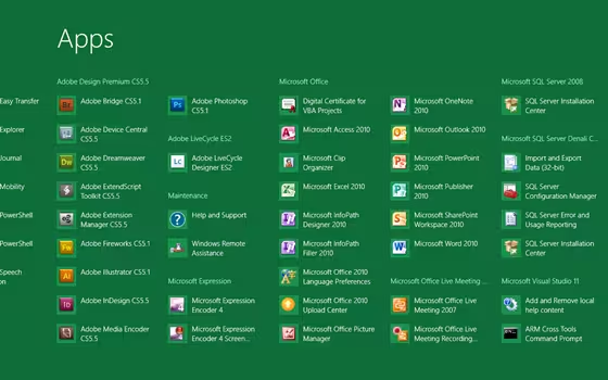
Microsoft has revamped the App Screen in Windows 8 to support the display of apps in groups as opposed to being purely in alphabetical order. Also, the company is making the app density greater, so more total content is displayed. This is crucial for powerusers and neatfreaks alike. Also, it was much requested. This is what it looks like:
For enterprise customers, Microsoft pointed out a nice little carrot in its operating system: “For Windows 8, we support deployment scenarios that include Start screens with a layout of tiles that matches their business group’s needs, allowing for an even greater number of pinned apps to be pre-defined for their users. We also support the managed lockdown of customization of the Start screen so that it is consistent across the corporation.” That is a big, slobbery kiss that every enterprise customer should enjoy.
However, as Mary Jo at ZDNet notes, “There’s still no direct answer in today’s blog post as to whether Microsoft will allow admins to use Group Policy settings to circumvent the Windows 8 tiled interface altogether and default to the Desktop app with the more familiar Windows 7-like interface.” That is one of the most requested features in Windows to date. Microsoft likely doesn’t want to implement it.
The rest of the post contains endless nitpicks that are important, and data that will apply to those who demand the most out of Windows. Given the massive length of the piece, and that Microsoft directly quoted feedback and responded to it, you can consider today’s entry a defensive, and offensive salvo against complaint. Expect more, too. This is just getting started.
Check our top tips and tricks for Windows 8.
Get the TNW newsletter
Get the most important tech news in your inbox each week.


