Today Microsoft announced a slate of upgrades to its consumer cloud storage solution, SkyDrive.
Chief among the new capabilities include HTML5 video tag support, faster load times, better file management, and much better photo support including a new ‘mosaic layout.’
According to the Microsoft PR copy, “Common tasks and scenarios, like clicking on folders and navigating photo albums will go from 6-9 seconds down to 100-300 milliseconds.” This is possible because the software is now using hardware acceleration to stem lag.
SkyDrive’s new capability to handle HTML5 video tags will allow H.264 video playback of clips of up to 10o megabytes. We’re not sure why there is a cap on the video size, but it could be raised in the future.
Perhaps most important among the SkyDrive upgrades is a new interface for managing files. As SkyDrive is essentially a box to put your data into, how you interact with said files is crucial. Microsoft has brought all user content, including data groups into a single pane, to make the information simpler to mange.
The move was to make the layout more familiar: “We took elements of the common file system you’re used to on Windows and Mac OS so navigating SkyDrive is more intuitive.” This is what it looks like:

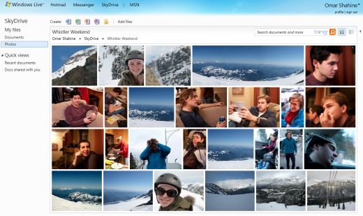
And finally, Microsoft has boosted the photo chops of SkyDrive with infinite scrolling, and a pretty new view called ‘Mosaic:’

That’s the new SkyDrive. Sound off in the comments if you use think that these updates will help SkyDrive compete with DropBox. What follows is the Microsoft press release:
What’s new in SkyDrive?
· It’s Faster.
o Caching and hardware acceleration- Common tasks and scenarios, like clicking on folders and navigating photo albums will go from 6-9 seconds down to 100-300 milliseconds. We took advantage of hardware accelerated graphics to make it fast to skip thru slideshows
o Support for HTML5 video tag – Playback H.264 videos (with support for files of up to 100MB)
o Pin SkyDrive to your taskbar – With IE9 on Windows7, you can pin SkyDrive to your taskbar for even faster access to the files you want. Create Word, Excel or PowerPoint doc stored in the cloud in just 1 click
· Is Easier to Navigate.
o All your content in one place including SkyDrive groups – We brought together all your photos, docs, files shared with you and files in SkyDrive groups into one view. We took elements of the common file system you’re used to on Windows and Mac OS so navigating SkyDrive is more intuitive.
o Quick views – We incorporated navigational elements and a layout that is consistent with Hotmail (Quick Views for recent docs & files shared with you)
o Information pane – We removed ads to create room for a pane of information about your files – so you can take actions such as opening a doc in Word or Excel on the desktop directly from SkyDrive
· Photos are More Beautiful.
o Mosaic layout – We got the chrome out of the way to let your photos fill the browser. We create thumbnails that reflect the original aspect ratio of your picture. Portraits, landscapes and panoramas can retain their personality even in thumbnail mode
o Clean arrangement – Regardless of what size screen you have, how big your browser window is, or how many photos you have, SkyDrive always arranges your photos into a perfect, clean square. In achieving this, we use CSS3 Transitions to add life to your photo album by animating thumbnail rearranging when you resize the browser window.
o Living, breathing presentation – When viewing your albums, SkyDrive pulses through your thumbnails, letting you experience the contents of an album even before diving in.
o Infinite scrolling – We no longer have pages in the photo viewing experience; you just scroll the page and quickly see your photos fill in. It looks and feels like a native application.
Get the TNW newsletter
Get the most important tech news in your inbox each week.


