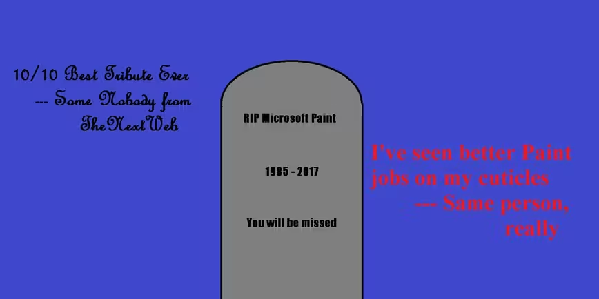
The internet discovered today that Microsoft Paint might be removed in an upcoming Windows Update, and newshounds everywhere rushed to open their copies of the program to create ironic images.
I’ll never pass up a chance to let my inner art snob out to play, so here’s a quick review of my favorite Paint Memorials the internet news have to offer.
The Fader
https://twitter.com/Economistaken/status/889442864555601920
The Fader used an image from Twitter user Ramsha in its article. This is one of the most elaborate memorials, with a hint of Dali’s surreal perspective play. It’s certainly a more cheerful tribute than my own, given that it implies Paint will have a final resting place next to a cabin in the mountains.
Fortune
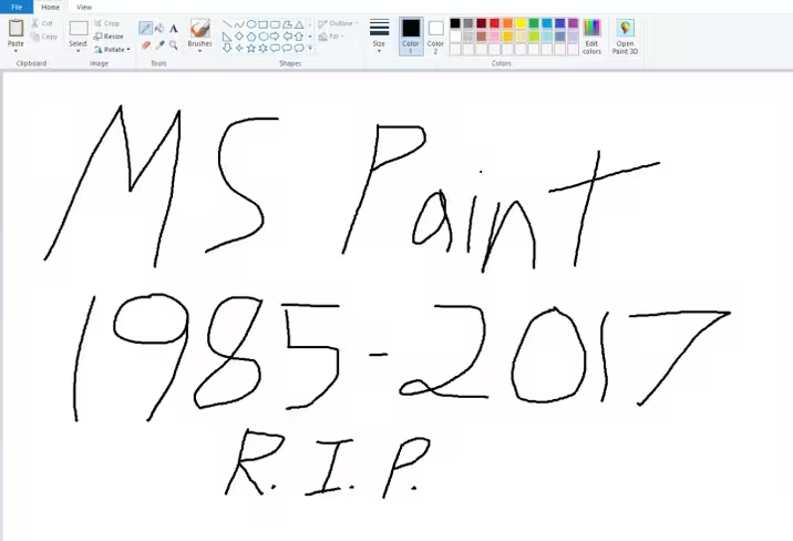
On the other end of the scale, we have this . . . minimalist design from Fortune‘s Chris Morris. An interesting use of the line tool suggests the caricatures of Jack Lane. Many other outlets did the same thing, but Morris’s handwriting is the most elegant in my eyes.
Mashable
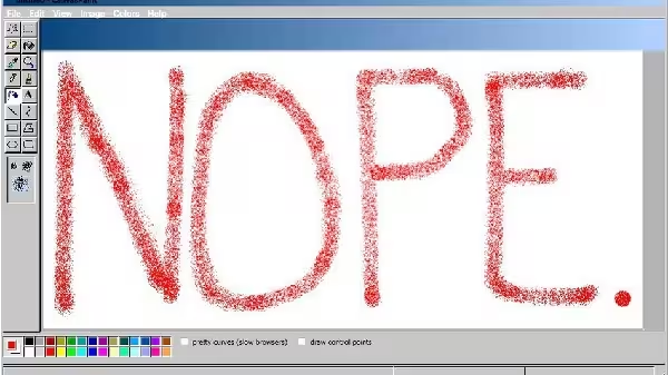
Mashable‘s Alex Hazlett goes for a more vintage look — Windows 98-vintage, from the looks of it. While I’m not a fan of this more Dadaist look, it does tie closely with the headline alleging that no one has used Paint in years. Hazlett went several OS generations back to prove the point, and if that was intentional … bravo.
BBC Tech
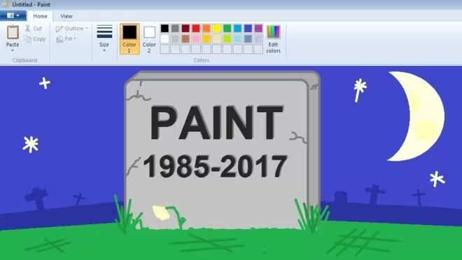
And here we see a common theme among the tributes — headstones. I’m not judging anyone for jumping immediately to this symbol, since I used it myself, as you can see. Maybe we can start a new movement: Morbidism.
Anyway, I liked this image from BBC‘s Zoe Kleinman most out of all the various headstones, if only for it’s use of layers. The dying flower in the front is a nice touch, as it draws attention to the fact that Paint hasn’t really had significant updates for quite some time — meaning it’s been “dying” for a while.
Ars Technica
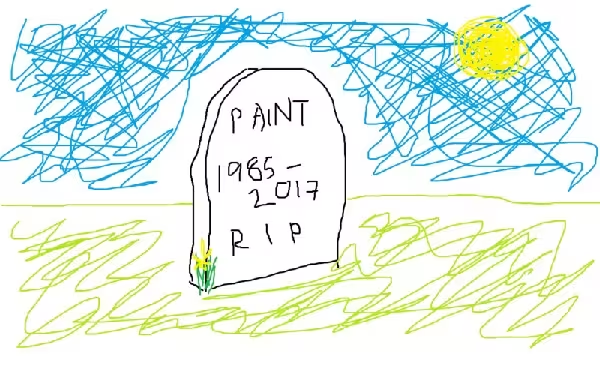
Here’s the opposite of the above: a more cheerful graveyard, with an airy, impressionistic openness. Looking at this, I’d say Ars Technica‘s Peter Bright is taking a more optimistic view of the death of Paint than most.
Good showing everyone! Oh, and . . . rest in peace, Microsoft Paint.
Get the TNW newsletter
Get the most important tech news in your inbox each week.
