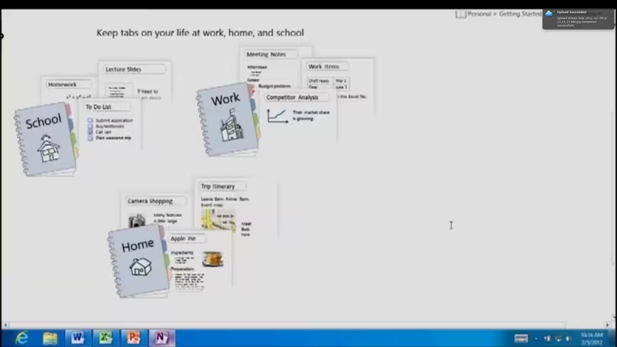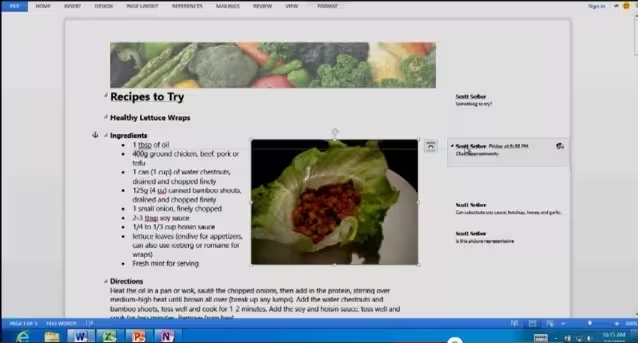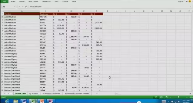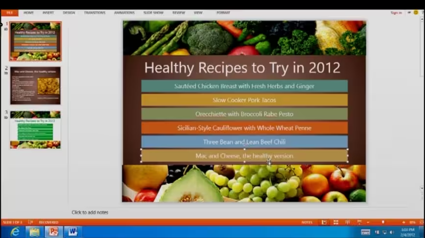
Earlier today, Microsoft dropped a huge blog post with details about its Windows 8 for Arm plans, clearing up a lot of questions that people have had in the process. In that post was embedded a video, in which Tom Warren of The Verge uncovered a look at the new Office 15 stylings and interface.
The new Office looks to be a much cleaner and crisper version of the industry standard productivity app than many of us were hoping for. Despite jokes about how poorly the classic ‘Ribbon’ interface would translate to tablets, this new version actually looks pretty great.
You can check out the entire video with brief cameos of Word, Excel, PowerPoint and OneNote below:
http://www.youtube.com/watch?feature=player_embedded&v=IhN3-sy-PCY
A few screenshots pulled out show off the new interface and look of Office 15:
It’s completely possible that these screenshots aren’t telling us the whole truth about Office 15 and that the much-maligned Ribbon interface is tucked up there out of sight in a maximized view, but I’m willing to be cautiously optimistic about this. The screenshots of the app definitely show off a distinctly Metro flair and that’s a really good thing when it comes to making Windows 8 work on tablets.
What do you think? Are you ready to see Microsoft drop its old look for Office and start fresh, and if so, does this look like a good start?
Get the TNW newsletter
Get the most important tech news in your inbox each week.
