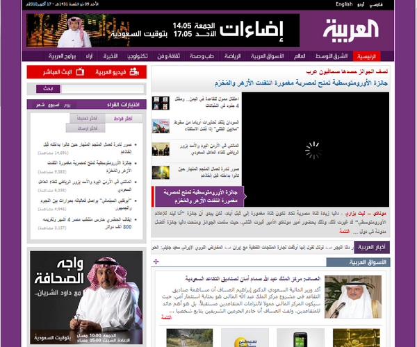
 This year seems to be a bad year for Arab news portal makeovers with Al Jazeera English’s recent launch of their new interface and today with Al Arabiya’s launch of the new and improved design. Which is plain hurtful.
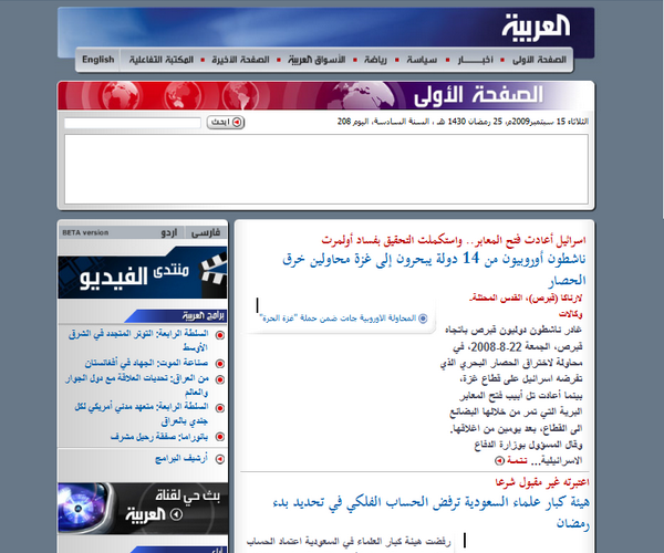
The old school design Al Arabiya wore for it’s visitors for the past 6 years is finally gone. It was stuck with the same initial design they started with back in 2004. Ironically change management isn’t on AlArabia’s list of strengths.
Now that their new design is out, and being a news portal we immediately assumed they’d have a big surprise for all of us that would make up for a bad 6 year user experience you can see below, but we were terribly mistaken.
Beginning with the shade of purple they’ve blinded us with instead of branding the website, to the cropped Live Broadcasting interface. The website looks like it’s been done on ‘Makeover with Joelle’ that water alone simply can’t get rid of.
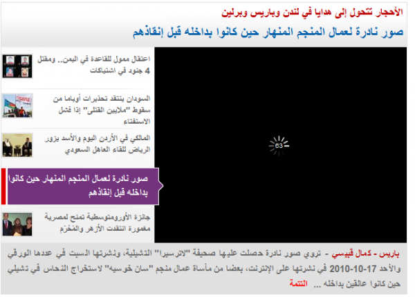
Once you’re over the initial color shock you attempt to actually read the news, heading to the most noticeable section, that being the center of the design with a big image illustrating the news, but you notice they’ve put in a video to load instead.
It’s probably a good thing to be ahead of the competition in the news industry, but to overload your readers with video when they hover over a news title is not only impractical but slows down both the rendering of the page and adds a waiting time for the Adobe Flash based movie clip not to mention the overall lacking bandwidth MENA readers have to put up with thus making the process even slower.
Truth to be told they have been able to provide the popular customizable widgety interface that allows users to prioritize categories of news according to user preference. They’ve also allowed the system to place images instead of videos for some stories, which they should kill entirely, that or go with an HTML5 version if news clips are so important.
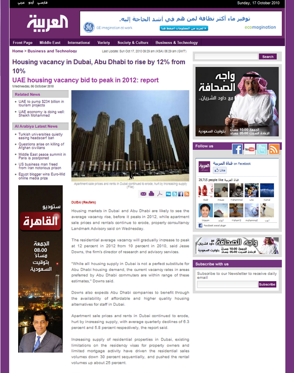
The website which provides content in four languages include Arabic (default), English, Urdu, and Farsi all with their relative design and different topics according to language. Which means if your multilingual you’ll probably find interesting articles all over.
On the inside the portal places the actual content in a narrow column which I guess isn’t that bad, but is a bit annoying when you try to ignore the animated ads to the sides of the articles.
Considering Al Arabiya is a leading news agency in the region and owned by MBC Group they could have done a much better job, but it appears news portals like Al Arabiya and Al Jazeera are having a hard time really nailing the online portal game. Let us know what you think should change to make it more usable.
Get the TNW newsletter
Get the most important tech news in your inbox each week.
