This post originally appeared on the Buffer blog.
Social media is a crowded place. You need every competitive advantage possible to stand out.
Luckily, giving your social media posts a little something extra doesn’t have to mean to a lot of extra work for you.
In this post, we’ll go over some simple tricks and best practices of social media formatting to help you create unique, stand-out posts on Twitter, Facebook, Google+, LinkedIn and Pinterest, along with some tools to help you create memorable blog tidbits worth sharing.
Let’s get started!
Stand out on Twitter
Offering just 140 characters and a very short shelf life, Twitter may be the most challenging medium to stand out on.
Here are a few ways to make the most of your tweets.
Symbols and emoticons
Adding symbols like ♥✩♬♡►♪☺♫ to your tweets isn’t just fun – it can also make your tweets shorter and easier to read. The Wall Street Journal even uses Twitter symbols to add bar charts to its tweets.
To get started using the more than 109,000 symbols available, head over to our Ultimate Guide to Adding Cool Symbols to Your Tweets.
Keep it short
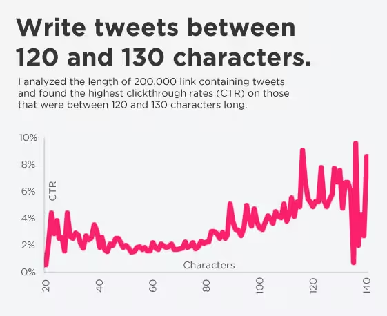
Tweets get more traction when there’s a little room to spare – shoot for 120-130 characters.
Add value with photos
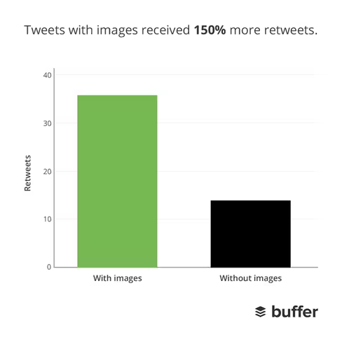
Buffer’s research on Twitter posts with photos versus without indicates that photo posts vastly outperform non-photo posts in terms of both clicks and shares.
Tweets with images received 18% more clicks, 89% more favorites and 150% more retweets.
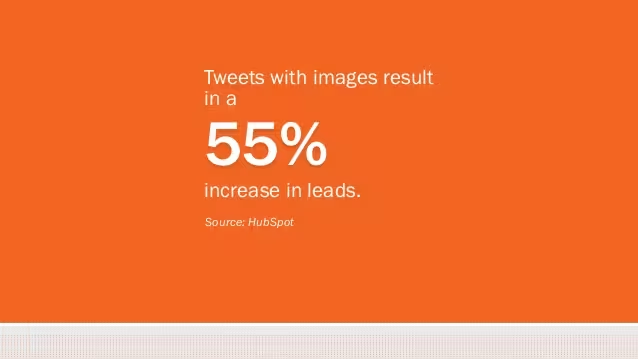
And according to HubSpot research, photo posts bring in 55% more leads, as well.
Stand out on Facebook
With Facebook’s recent algorithm changes meaning less exposure for brands, most of us can use all the help we can get making posts stand out here. Here are some tactics to try.
Creative emoticons
They’re not always so professional, but they sure are fun. Emoticons can spice up a status update – here’s a list from Jess3 of some popular ones and how to make them.
Contrary to the footnote at the bottom of the graphic, these images actually do work in status updates – even for brand pages.
Shorter is better
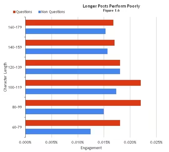
BlitzLocal looked at close to 120 billion Facebook impressions and discovered some interesting facts about lengths of posts. The researchers concluded:
“Longer posts tend to perform poorly. The ideal interaction being driven by posts is between 100 to 119 characters. Questions tend to drive interaction up by 10 to 20 percent.”
Pin posts
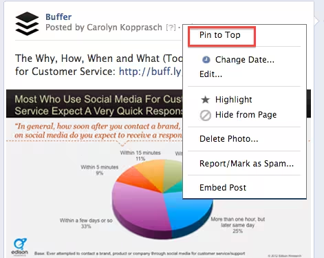
For crucial info, current offers or simply a post you really want to be seen, try pinning. A pinned post is an update that you manually select to stay at the top of your Timeline even as you add other posts to your page.
Highlight posts
A similar option is highlighting. A highlighted post expands across your page, taking up both columns. Highlight a horizontal photo to draw attention to it on your page.
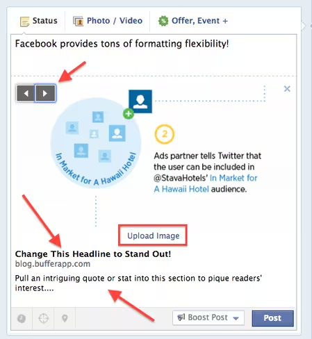
Edit headline and summary text
One of the greatest things about posting to Facebook is how many of the fields are totally customizable. Use this flexibility to highlight the most shareable elements of your content.
Pro tip: You can do all of this if you’re Buffering a post to Facebook, too (and gets lots more photo thumbnail choices)!
Size photos correctly
Because Facebook will automatically resize images that don’t match its specifications, size and aspect ratio of photos are super important.
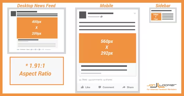
The aspect ratio is very specific: image widths need to be 1.91 times the height. This will mean the image scales perfectly in both the desktop News Feed and on mobile.
Images are now larger when shown in the News Feed, so keeping the aspect ratio right will make sure your images look great wherever the user sees them.
Recommended image sizes have also changed for Facebook’s desktop News Feed and mobile views. For the News Feed, Facebook recommends thumbnail images of 400×209 pixels. Images that are smaller than these dimensions will be resized to either 154×154 or 90×90 pixels.
On mobile, Facebook’s recommended image size is 560×292. Images smaller than this will be resized to 100×100 pixels.
This handy graphic from Jon Loomer shows the right sizes:
Stand out on Google+
Google+ offers some very specific elements different from other social networks that can help you stand out. Here’s a guide to them.
Prioritize rich visuals
A quick glance over at Google+ will show you that it’s an incredibly visual social network.
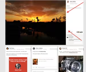
Make the most of this by posting useful, interesting or engaging images at full size (not the thumbnail that comes with a link) like so:
The network also takes some posts and gives them priority placement in a user’s feed.
How can you make that your post? According to Google, “a variety of factors determine what becomes an enhanced post in your stream but we try to surface content and people that we think you wouldn’t want to miss.”
But you can up your chances by posing lots of high-resolution photos and video.
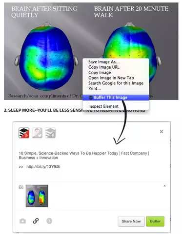
Pro tip: Install Buffer’s browser extension and right click on an image to add it full-size to your Google+ queue:
Useful, eye-catching GIFs
It’s hard NOT to have animated GIFs catch your eye, and Google+ is one of the few social networks that celebrates them.
Google even uses animated GIFs as tutorials when they introduce new features and highlights great ones, like this one from New York Fashion Week.
Slightly longer posts
Research by Quintly shows that the average Google+ post peaks at 156 characters, or 2-3 sentences.
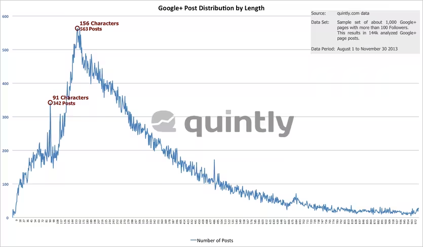 This is in line with the general philosophy of Google+ as a place for more in-depth, thoughtful discussions. (Google+ allows you to share up to 100,000 characters.)
Take advantage of the extra space to explain a concept, pull out a stat or otherwise provide a valuable tidbit to pull the reader in.
Format for better readability
Google+ also offers more formatting options than the other social networks, including the ability to bold, italicize and strikethrough. Use these options to create headlines and more for your posts so they’re easier for readers (and Google!) to discover.
Here’s a quick guide from Social Media Examiner: 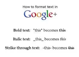 Lower Thirds in Hangouts
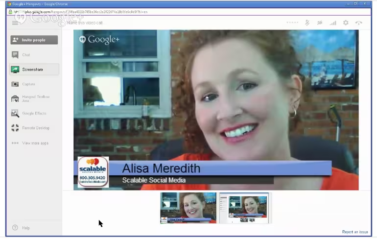
If you participate in Google+ Hangouts, make sure you get as much out of them as possible by using the branding possibilities of Lower Thirds.
This allows you to add your name, title and other information so it can be seen by everyone on the Hangout.
Here’s a guide to putting it to use from Alisa Meredith, pictured above.
Next: Stand out on LinkedIn
Stand out on LinkedIn
LinkedIn provides multiple posting opportunities, including from a personal page and from a company page. We’ll touch on both with a few stand-out tips.
Post often
This first step might seem a bit obvious, but many people still think of LinkedIn as a place to keep up your professional resume when in fact frequent sharing can make a big difference.
According to LinkedIn research, users who share articles or content with their LinkedIn network at least once a week are nearly 10 times more likely to be contacted by a recruiter for new opportunities than people who don’t share with their network.
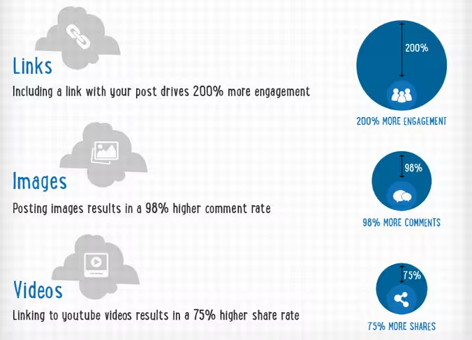
Share links and photos
Here’s what types of content stand out most when it comes to LinkedIn posts.
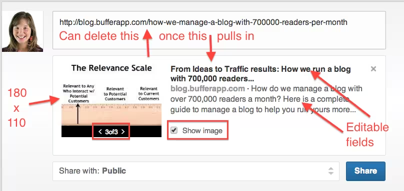
As with Facebook, aspect ratio is important when posting a photo to LinkedIn. Photos within a post will be resized to 180 x 110, so start with that width to height aspect in order to make sure your image looks its best.
And much like Facebook, most fields of a post are customizable, so make them network-specific and catchy!
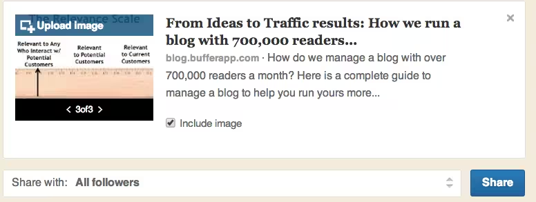
Company posts also have an additional option to upload a custom photo different that one of the options LinkedIn automatically pulls in.
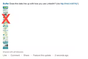
LinkedIn works well with most photos, but be careful when posting long visuals like infographics. Often it can be better for readability to take a screenshot of a portion for your update instead of posting the whole thing.
Max out company page visual real estate
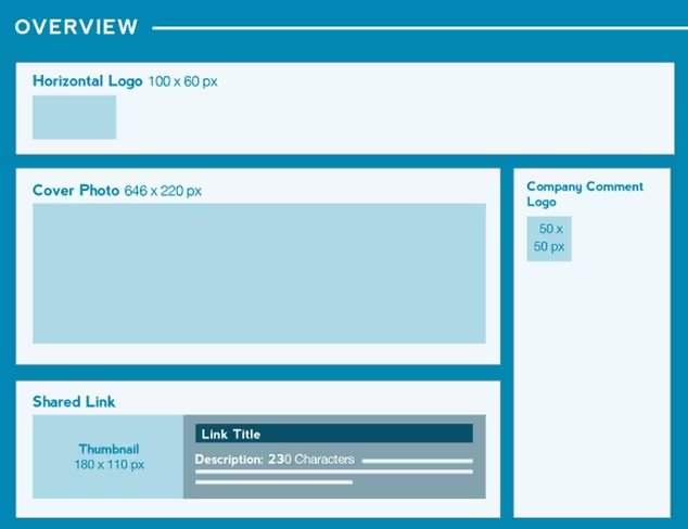
For a LinkedIn company page, there are a lot of opportunities for great visuals. Here are the dimensions to know:
Don’t forget to make the most of your visual real estate. HubSpot offers up some tips on maximizing it in this quick slideshow.
Next: Stand out on Pinterest
Stand out on Pinterest
For Pinterest, we’ll focus on image size and type to help your pins stand out.
Employ rich pins
If you haven’t already, be sure to explore rich pins, a way of adding additional, useful info to pins. Types include:
- Article pins, which include the headline, author, story description and link
- Product pins, which include real-time pricing, availability and where to buy
- Recipe pins, which include ingredients, cooking times and serving info
- Movie pins, which include ratings, cast members and reviews
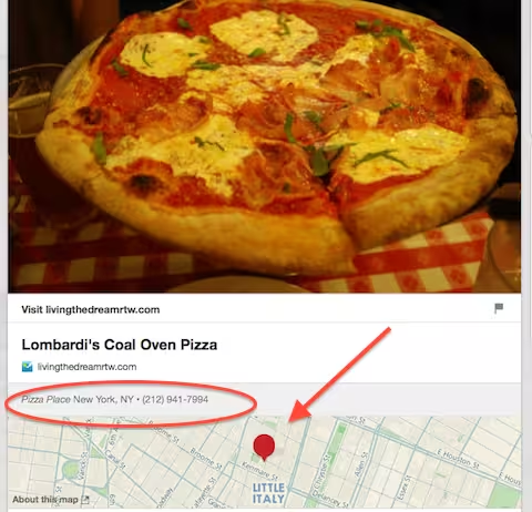
- Place pins, which include an address, phone number and map
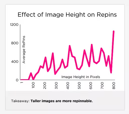
Use taller images for more repins
Social media scientist Dan Zarrella researched what works best on Pinterest and found that the taller an image is, the more likely it is to be repinned:
Try animated GIFs
It hasn’t been too long ago that Pinterest added animated GIFs as a new option, so there’s still time to stand out with these – as this attention-grabbing image shows.
Next: Make your blog post stand out
Make your blog post stand out
Add more shareable elements into any blog post with these tools and tricks.
Make facts and stats quickly tweetable
If you work in marketing, chances are you’ve seen HubSpot’s blog posts shared a lot. One cool way they accomplish that is by making it easy to share stats as seen below.
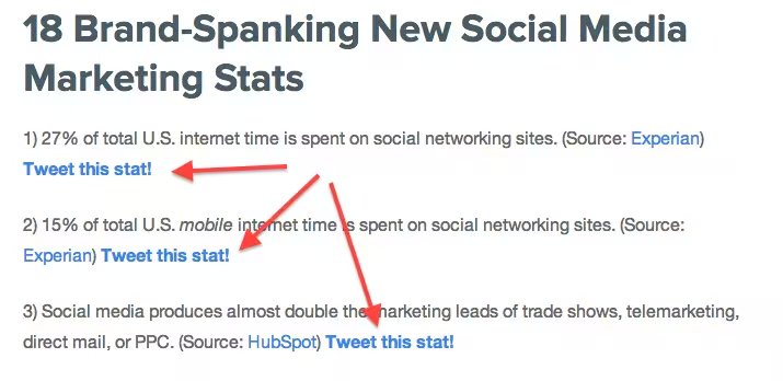 You can employ this tactic, too. Use a tool like Click to Tweet to create pre-populated tweets with the message you want to be shared. Here’s how it works:
Embed social media posts
Bring the power of social media sharing right onto your blog by embedding Twitter, Facebook orGoogle+ posts into your blog post. Viewers can engage with embedded posts by following users, liking or commenting on posts and watching video posts.
Even better: Those who don’t already like or follow you will have the option to do so without leaving the page, meaning embedded posts can potentially help boost your fan count across social networks.
Consider replacing screenshots with embedded posts so that users can engage with your examples.
Pinterest boards are a little trickier to embed, but it can be done. Here’s a full guide from Ginny Soskey and a look at her adorable example board.
Make unique, shareable images
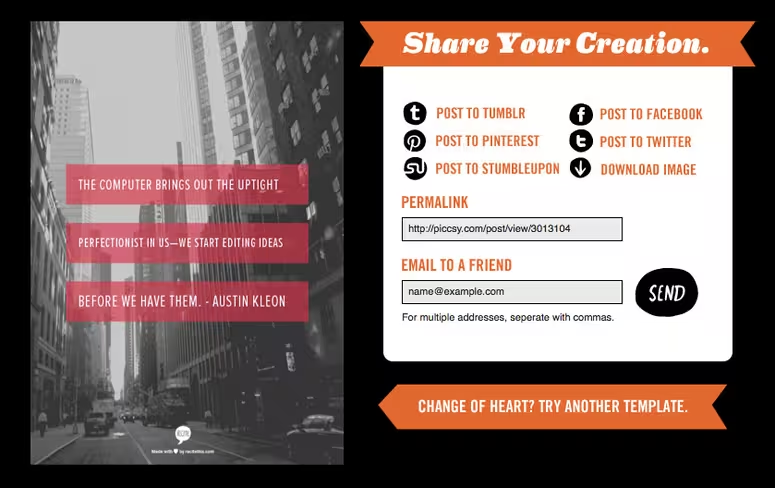
Visuals like quote photos and infographics are irresistibly shareable, and there are plenty of tools out there to help you make them quickly and easily – like Recite, pictured here.
Start making your own (and find lots more useful visual tools) with our roundup of 14 Great Tools to Create Engaging Infographics and Images for your Social Media Posts.
Top image credit: Shutterstock/Africa Studio
Get the TNW newsletter
Get the most important tech news in your inbox each week.
