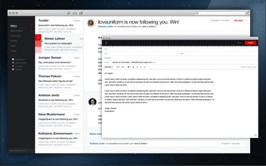
Initially starting out with the goal of “redesigning the classic email client”, Tobias Van Schneider’s .Mail (dotmail) concept wowed many when he first shared it, prompting calls for it to be made into a real app. Van Schneider did just that, and has today shared the first progress update on the project.
Emerging soon after the announcement that the Sparrow team would be joining Google and ceasing all work on its popular iOS and Mac apps, the .Mail project saw a nice flurry of early interest, with more than 22,000 users signing up for more information within two weeks, to receive early access to the beta app.
Van Schneider says in that time, the dotMail team has already sent and received the first email with the app, work on centralised attachments is almost complete and Actionsteps (a way of flagging emails and ordering them by their importance) have been implemented.
Considering Actionsteps, attachments and notifications are three of the central features to the app, progress appears to be steady. Van Schneider says that work on notifications and boosting performance is ongoing and that there is “still a lot to do.”
What is .Mail?
If you’re new to the .Mail concept or simply want to know how it works, here’s a short rundown.
The original concept highlighted the point that “Emails aren’t just emails anymore. Mark as read is useless and is not fit for a modern creative workflow.” This prompted the decision to make a client that has a clean and clutter-free interface, demonstrates perfect spacing and clean typography, and only show what you need.
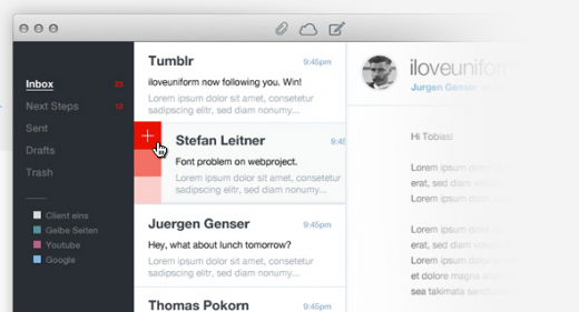
In comes Actionsteps. These three red squares allow you to set the importance of an email and filter out what is important and what isn’t. Think of it as a mini To-Do list, that ranks your emails by three different levels of importance.
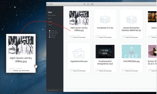
Next up is attachments. Nearly all existing email clients will show that an attachment has been added to an email, but finding that file after a period of time can be difficult and time can often be wasted searching for them. With centralised attachments, .Mail mimics the OS X Finder to sort and list all of your attachments by date or name, so you can drag and drop them to wherever you want.
.Mail will also feature native notifications and show avatars of the people emailing you, by pulling data from social sources. Brand emails (notification alerts from Facebook and order updates from Amazon etc) will show the logo of that company, making it easier to recognise.
Moving forward
Van Schneider notes that .Mail will not raise funding in any way, ruling out VC or investments (calming those of you who cried out in dismay when Sparrow shut its doors and headed to Google).
Beta testing will be opened to those who have signed up via the .Mail website but it isn’t known when this will begin. However, when it does launch, the app will be a paid download (likely via the Mac App Store) but it won’t “cost more than a good hamburger with bacon, fries and a good beer.”
If you lunch at The Ritz, that could be expensive, but our guess is that it will tread a similar path to Sparrow, which costs $9.99/£6.99 on Apple’s Mac App Store.
In fact, there are a lot of parallels with Sparrow (which can be seen as a good or bad thing, especially if you’re looking for a fully supported Mac email app to move over to) as .Mail will likely emerge on iOS, which could mean both an iPhone and iPad application. Initially, the focus is on the Mac, but other platforms may follow soon after.
If you like the look of .Mail, head over to its official website and sign up. That way, you will be able to jump on the beta release and get a good hands-on before it is released to the public. With Sparrow in its death throes, this could the next pretender to the throne.
Looking for more great apps? Check TNW Apps right now.
[Image Credit: Mary Hutchinson]
Get the TNW newsletter
Get the most important tech news in your inbox each week.


