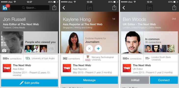
LinkedIn is revamping user profiles on its mobile app, making a big design change as it seeks to help its members, their interests and other details stand out.
“Your LinkedIn Profile is your professional identity of record. It’s also the heart of LinkedIn. Your new profile helps you tell your story to other professionals when they’re looking for you on the go,” the company said in a blog post.
The new profile is certainly more visual. It lists out mutual connections, in addition to basic details like name, employer, job title, etc. LinkedIn explains that the idea is to enable you to get a quick feel for shared interests and connections with a person before you meet them, or indeed connect with them on the service.
Here’s how it looks when you view your own profile, profiles of people you already connected with, and those of people who are outside of your network. (Oops, I just sent Ben an invite… I’m not a heavy LinkedIn user.)
There is also an easy option to update more information in your profile right from your device, which could come in handy for those who continually preen their presence on the service, or are big users of it for networking.
It isn’t just the visuals though, the app includes ‘Insights’ — which send you an alert whenever someone looks at your profile, as Business Insider reports.
The new profiles are launching on mobile first because the company says that the platform “forces us to innovate and radically rethink, focus and simplify what’s most important” — while mobile also accounts for 43 percent of visits from its users too, LinkedIn said.
Update: The new profile design is available on Android, iOS and the mobile website.
Headline image via Ben Scholzen / Flickr
Get the TNW newsletter
Get the most important tech news in your inbox each week.


