LinkedIn’s Website gets a huge redesign to be less confusing.
If you’re like me, chances are you’ve used LinkedIn a few times while looking for a job, filled in your information, and then rarely touched it again.
LinkedIn’s new design overhaul wants to make sure you stick around.

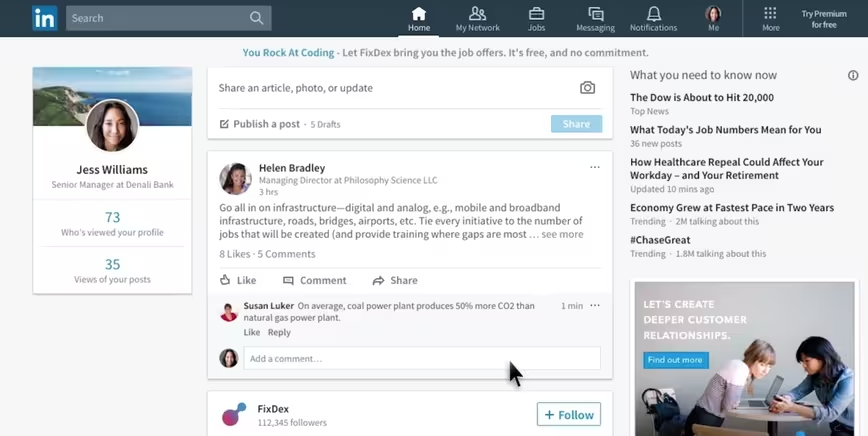
The company is calling it “the largest desktop redesign” since LinkedIn’s inception. It’s largely inspired by the company’s mobile apps, with a cleaner, modern design (as opposed to something that looked like it belonged back in 2006).
LinkedIn says its goal is to help you more easily access “the most relevant professional conversations, content and opportunities whether you’re on our mobile app or on our desktop experience.” Tweaked color palette aside, there are a few changes it’s making to achieve this:
- Large icons at the top of the site for easier navigation.
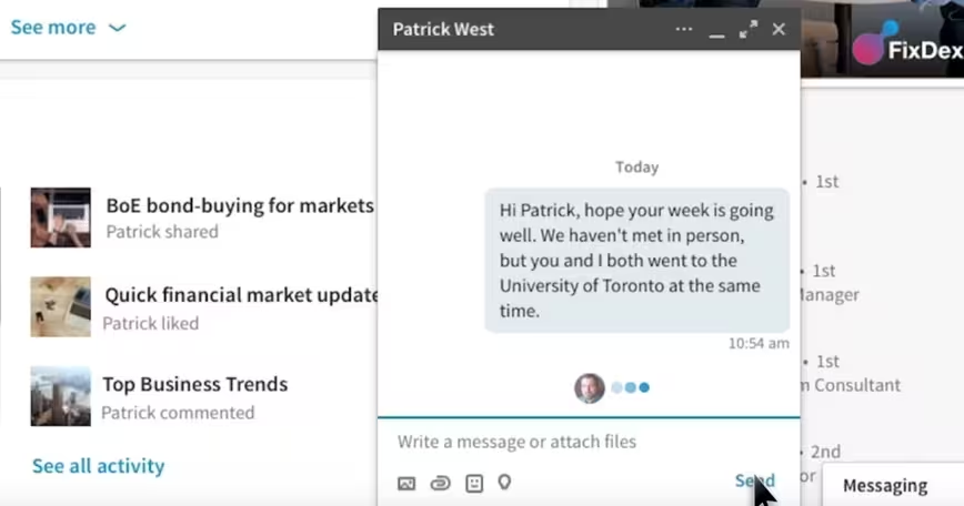
- Facebook-like chat windows that are persistent no matter where you are on linked in.
- LinkedIn will encourage conversations on its site by suggesting people to chat with if you have a connection at a company.

- The feed has been fine-tuned with a combination of algorithm and humans. The company promises new ways for reading about specific topics you care about too.
- A single universal search bar for everything across the site (as opposed to a different one for each section).
- Insights on who’s reading the content you share.
- More suggestions on how to tidy up your profile.
More than anything though, the cleaner look is easier to digest. It’s more Facebook-like, which for a lot of people – especially new members – will mean something more familiar. Anything that gives people a reason to stick around is a win for LinkedIn.
Get the TNW newsletter
Get the most important tech news in your inbox each week.


