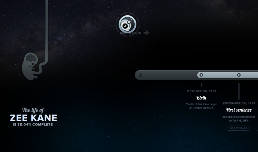
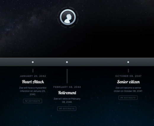
![Lifepath: If only everyone’s life looked as beautiful as this. [invites]](https://img-cdn.tnwcdn.com/image?fit=1280%2C720&url=https%3A%2F%2Fcdn0.tnwcdn.com%2Fwp-content%2Fblogs.dir%2F1%2Ffiles%2F2011%2F07%2FPicture-929.png&signature=90fd8b4bd4a3daafd74abd8ebaebe448)
I came across Lifepath via a random tweet; “this is interesting…” it said. Clicking through, as you would, I was greeted with an astonishingly beautiful timeline of the tweeter’s life from birth to death. Everything from first words to puberty and even a heart attack, had a place on this person’s timeline and bizarrely it even included the person’s date of death.
The timeline, or “Lifepath”, was a work of art. Every minute detail seemed as if it had been given days of attention: colors, gradients, fonts, the metamorphosis of the person, from fetus to old man, above the timeline.
In my line of work, when you come across a site that has been given this much care and attention, you can’t help but dig to find out who’s behind it. Fortunately, I didn’t have to dig too deep, a quick Twitter search for Lifepath revealed the man behind the tool…Dustin Curtis. I wasn’t surprised.

I’ve been a fan of Curtis’ work for some time after enjoying the masterpieces he publishes on his personal site. I highly recommend you take a gander, one of my favorite stories begins here. Frankly, it’s somewhat depressing because a large part of me would similarly love the opportunity to devote one or two days on merely designing the posts we publish on TNW, as Curtis does on his own site.
But I digress.
Clearly Lifepath is Curtis’ work, this level of attention to detail is his hallmark.
I reached out to Curtis for an invite for some coverage on TNW and he happily obliged but not without making abundantly clear that it was very early days for Lifepath and it was by no means ready.
“I built it mainly as a technology demo, but considering the huge amount of interest it has received, I decided to build it out into a proper webapp. It’s going to take a little while, as I’m still polishing some basic features and making sure the animations/styles degrade at least half-way decently. “
In fact Curtis preferred I waited until a full featured and polished 1.0 release was complete, I convinced him otherwise. There are just far too many people out there who would be willing to look past the incomplete set of features and simply admire the concept, details and stunning UI.
After receiving my invite, I dove right in. And while – yes – it is very limited in functionality, what’s there is a bizarrely immersive and elegant experience. It took a matter of seconds to put together my own Lifepath, you can see it here, but it is important to note the majority of the dates set aren’t chosen by me but rather Lifepath itself. Complete editing features simply aren’t available yet.

One of my personal favorite details is what you’ll see here when you try to sign up to use Lifepath yourself. Yes, there’s a $5 fee just to try out the product in all its unfinished glory. And yes, even I thought it was a little on the cheeky side – heck even Instapaper only charges $1 a month for a subscription and I use it on a daily basis. On the other hand, there’s a touch of genius about it. Early adopters, people who really care and will contribute to the development of the product, will pay. Plus there’s the added benefit of a little cash to help the developer get the product finished.
Fortunately for you, dear readers, you don’t have to pay. We’ve got 10 (free) invites to give away. To gain access, visit this Facebook comment thread and leave your email along with a short description of your favourite life moment. We’ll give away 10 invites to our favorite responses.
Get the TNW newsletter
Get the most important tech news in your inbox each week.


