There’s no shortage of personal finance-management apps out there, with the likes of Simple serving up real-time data about all your incomings and outgoings, linked directly to your bank accounts. But alas, it’s US-only. Then there’s Dollarbird, a smart calendar app for tracking your income and expenses.
The latest entrant to the market is Level which, similar to Simple, links up with your bank accounts to deliver real-time metrics on your spending, savings and general financial standing. Available for the US market only, Level gives a snapshot of all your available ‘spendable’ income for that day, week, and month.
The company has also just announced a $5 million Series A funding round, so now seems like a good time to check out the app and see what it offers.
How it works
Unlike Simple, Level is putting all its bets on mobile to begin with – there is no Web-based version as of yet. Indeed, for launch, it’s only available for the iPhone, though an Android version is in the works.
It’s also worth stressing here that Level isn’t about sticking all your purchases in categories, such as ‘travel’ and ‘groceries’. There are other apps for that.
Level basically automatically analyses and calculates a user’s total income, recurring bills and recommended savings each month. Based on this, it delivers the spendable balance broken down by day, week and month. And every time a transaction is complete, these numbers are updated accordingly.
Before you sign up, you can opt to take a tour of the various features, or just get involved from the get-go, linking up your various cards and bank accounts.
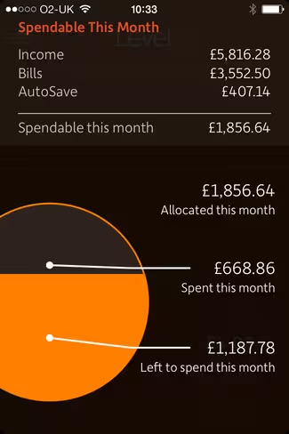
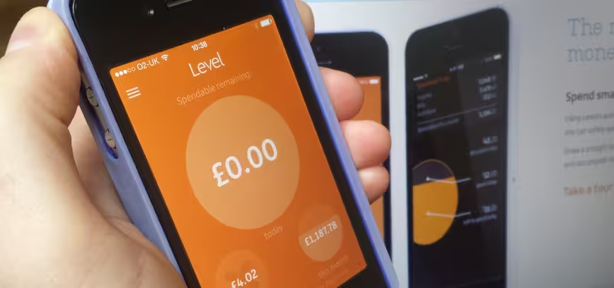
For those who have already linked up and set their incomes, budgets and saving levels, this screen on the right is what you’ll see when you first launch the app.
This default homescreen of ‘spendable remaining’ adopts a very visual approach, using circles to separate out how much you have left to spend today, this week, and this month.
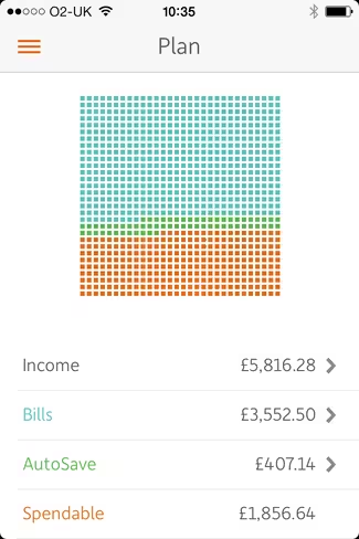
Tapping on the big circle takes you through to more details, including your income, bills and how much you’re looking to squirrel away each month. Tapping one of the smaller circles simply turns that into the main ‘big’ circle, and then lets you tap again to dig in for more data.
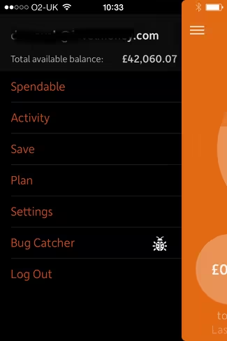
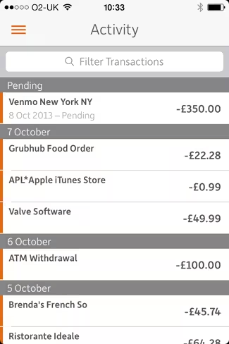
The main menu has a number of different sections, one of which is ‘Activity’. Here you can see any upcoming transactions (e.g. direct debits or recurring bills), and you can also look back over your history to see what’s going where.
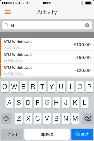
The filter option lets you manually eek out very specific transactions – for example, if you want to see all your ATM withdrawals.
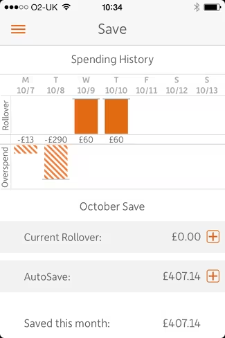
Elsewhere, the ‘Save’ menu option gives you a snapshot of your spending history – you can scroll back in time and see at a glance how much you’ve been spending each day. This includes an ‘Overspend’ layer, which enters into ‘minus’ figures for those days where you overstep the mark on your spending.
It’s in this section where you can tweak the default AutoSave amount, a figure that’s automatically deducted from your monthly income and pushed to one side. And you can also see any rollover figures if you underspend.
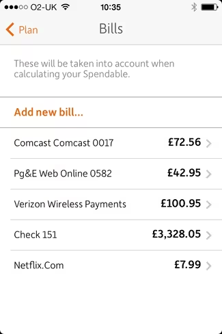
The ‘Plan’ section is where you include all your vital stats – income and bills. Though this is automatically garnered from your accounts, you can edit and add to this here.
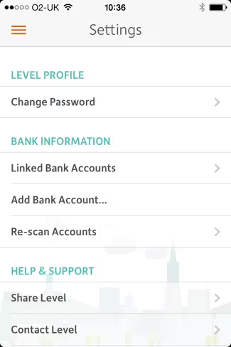
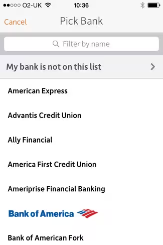
In the main settings menu, you can change your password, view your linked bank accounts and add more bank accounts too.
The verdict
Though there are similarities with the likes of Simple, Level seems to be going for a slightly different consumer-type. Not everyone wants or needs to see all their spending split by category for example – if all you’re looking for is a simple (if you’ll pardon the pun), real-time snapshot of how much you have to spend at any given time, then Level will serve you well.
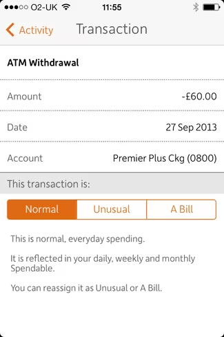 More detail would be good, however. For example, when you click through for more details on a specific transaction, there’s no way of seeing where the transaction took place.
With Simple, you can see maps and even photos of where you spent that $25. It would be nice to see similar detail with Level too.
Also, going mobile-only is an interesting move from the company, as is launching for iPhone-users only. By not being cross-platform, that’s a massive segment of its potential market cut-off right there. But of course, there is scope to build this out once it has iterated and established what users do and don’t want from the service.
“Our generation doesn’t think about money the way our parents do,” explains Level CEO and Co-Founder Jake Fuentes, who previously worked for Visa and Citigroup. “We need a totally new approach to finance that’s mobile-first, radically simple, and completely effortless. Budgeting is dead, and that’s why we’ve taken the ‘quantified self’ approach’; instead of applying the technology to personal fitness, we’re applying it to personal finance.”
So, what Level is essentially trying to be is a Fitbit for the personal-finance market. But it has some way to go before it can lay true claim to this. What Level is trying to do is keep things simple, but this so-called ‘quantified self’ approach has become almost synonymous with very detailed data about everything we do, and it feels like Level could offer more in this regard.
Level for iPhone is live now.
➤ Level
Disclosure: This article contains an affiliate link. While we only ever write about products we think deserve to be on the pages of our site, The Next Web may earn a small commission if you click through and buy the product in question.
Get the TNW newsletter
Get the most important tech news in your inbox each week.

