Last week we caught wind of a new-look design being tested by Last.fm. Today, it’s rolled out to all users, as documented on the music data and streaming company’s blog.
The changes are most visible on artist, album and track pages, with bigger images, a redesigned music player and more listening stats. As Last.fm’s Simon Moran notes in today’s blog post, “These pages are very rich in information, and as the site has developed we’ve added more and more content to them. Our user research indicated that it was time to step back and take a fresh look at how the pages were laid out.”
Meanwhile, the left-hand navigation bar has been moved to a more subtle location at the top of the page across most of the site and Moran says that the new look takes the first steps towards responsive design that automatically adjusts to look good on whatever screen you’re using, whether it’s a mobile phone or a full-size browser window.
Further changes are planned for the future. A quick request to the Last.fm team from someone who spends plenty of time checking his own listening data: it would be great to get user profiles refreshed in line with artist, album and track pages.
Can’t get enough of good Web design? Check out TNW Design & Dev.
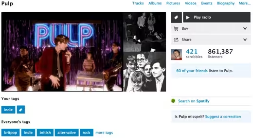
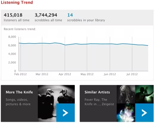
Image credit: Jonty Wareing
Get the TNW newsletter
Get the most important tech news in your inbox each week.

