![Last.fm is testing a subtle but tasty redesign [Screenshots]](https://img-cdn.tnwcdn.com/image?fit=1280%2C720&url=https%3A%2F%2Fcdn0.tnwcdn.com%2Fwp-content%2Fblogs.dir%2F1%2Ffiles%2F2012%2F07%2Flastfm-stickers.jpg&signature=d2eb770333b993801274c61422af0744)
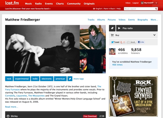
Last.fm is currently prompting some users to try out a new design of parts of its site. While not a major departure from the current look, it is a welcome refresh for the site which has largely looked the same for a couple of years.
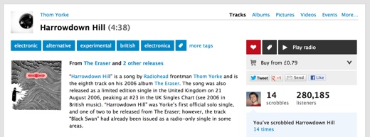
A page explaining the changes being tested says that artist, album and track pages are getting refreshed, along with the navigation menus across the site.
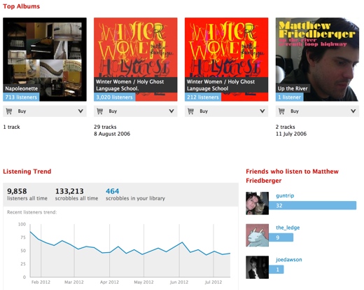
The most noticeable change on artist pages is improved listening data, with a graph of how many listens the artist is getting over time, and a chart showing which of your friends also listen to that artist.
Meanwhile, music players on the redesigned pages have a new minimalist look.
We reported on plans for a redesign of the site last year, and it seems safe to assume that this new look will get rolled out to more users in coming weeks. While Last.fm’s importance as a listening destination has declined in recent years, the CBS-owned property is still an important and valuable source of data about our listening habits and in an age where ‘big data’ is getting more attention than ever, Last.fm isn’t going anywhere.
Thumbnail image credit: Jonty Wareing
Get the TNW newsletter
Get the most important tech news in your inbox each week.


