Ever since I was very young, I’ve been fascinated by the tools that people use in science fiction movies. I was obsessed with the design of starships and their controls. The Millenium Falcon’s cockpit; how exactly a tricorder worked and what exactly was Spock looking at in that hood thing on the science station?
I even had Michael Okuda’s Technical Manual, explaining in intricate detail how the Enterprise NCC-1701-D was constructed.
So, when I came across Jayse Hansen’s post about his work on the user interfaces in the movie The Avengers, I knew I had to reach out to talk with him a bit about how he does what he does.
Jayse is a freelance visual artist working remotely from Las Vegas, NV for film and television. He has built a solid reputation in the industry as a creative-art director for print, web and motion design with clients ranging from Symantec to MTV and Fox. His latest work has been in the niche area of fictional UI and data design for feature films like 2012, Rise of the Planet of the Apes and The Avengers.
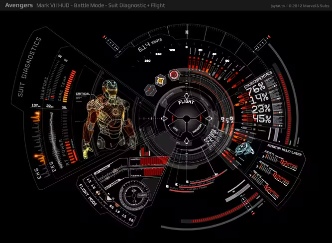
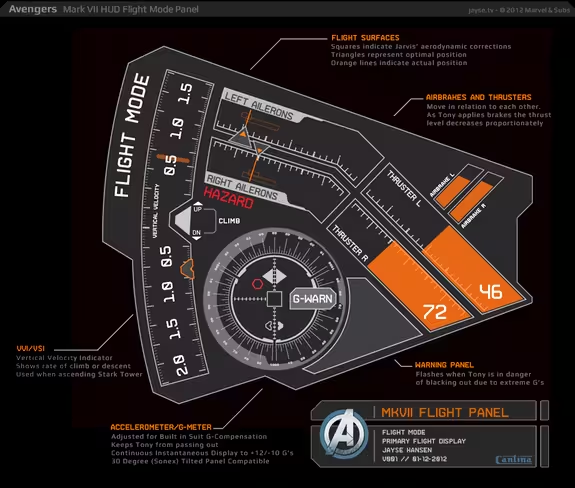
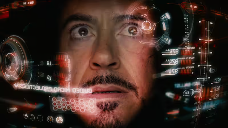
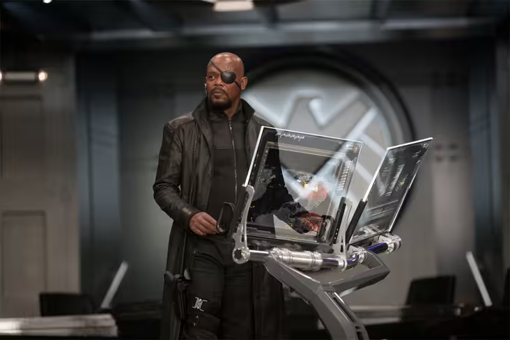
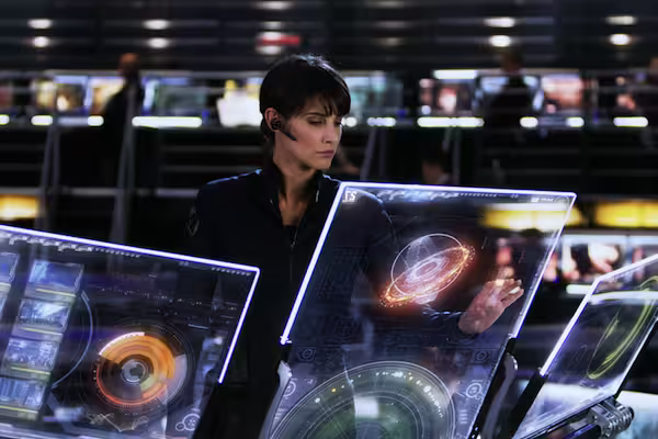
For The Avengers, Jayse worked on the heads up display, or HUD, that you see any time actor Robert Downey Jr’s face is inside the Iron Man helmet. He also worked on the various computers used on the bridge of the S.H.I.E.L.D. Helicarrier, its mobile command post.
You can see more of Jayse’s work on his site at Jayse.tv.
How did you get your start with UI design for movies?
I was the kid who was always trying to freeze frame the displays in films and read what they said. I always knew there was some cool stuff hidden in there. I loved art and design, so I started teaching myself graphic design and motion design and began designing interface themes for Windows and Mac.
I met Stephen Lawes — Former Creative Director of The PLF, now Cantina Creative — when we were both presenting at MGLA — Motion Graphics Los Angeles. He asked me afterwards if I was interested in collaborating on future projects. One of them turned out to be Avengers.
What is your basic workflow? Tools used, problem solving process, inspiration, that sort of thing.
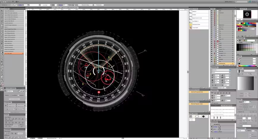
The basic workflow is usually trying to figure out what the director is trying to say, what the story is and how to make it all look sexy on computer screens, HUDs, or whatever medium your work will be displayed on. As for tools, I keep them simple – Illustrator, Cinema 4d and After Effects. I usually design everything in Illustrator, then take that to C4d or After Effects for Animation.
You said on your site that Iron Man’s Mark VII HUD was designed with input from an A-10 Fighter Pilot, is that something you like to do, take real-world experts and use them to inform your designs?
Yeah, I really love the research process. Since film production timelines are so short, the best way is to find people who are already experts in a particular field and get their input. With the HUD I knew I had to understand a bit of how real HUDs worked in order to take them to the next level, so I used flight sims, space shuttle sims and read books on glass cockpit instrumentation.
But the most pertinent info came from a combat pilot himself, because I could ask him how he’d want his HUD to function in a very specific situation. It’s fascinating and something I’ll continue learning more about because I still can’t fly a real jet fighter. But maybe one day!
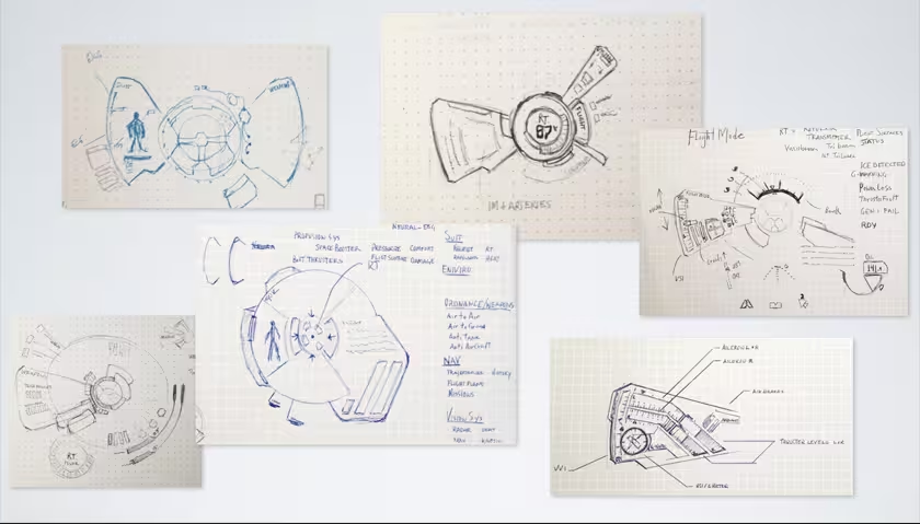
I notice you said that you start on paper. What is it about starting with the sketch that makes it an important part of your process?
Yeah, I like thinking on paper. I was fortunate enough to take a class with an amazing concept designer named Iain McCaig. He’s designed some of the most iconic figures in film history, including Darth Maul, Queen Amidala.
He taught me a great process: Imagine it and draw it badly, research it to fill in your gaps of knowledge, then redo it with your newfound knowledge. And that’s pretty much why I start on paper – I just dream it up and give myself ‘permission to draw badly’. It’s easier to think outside the box when you’re not using rulers.
Do you focus on (potential) usability, or visual appeal first and foremost when designing movie UIs? And how do you reconcile one with the other in the Avengers?
That’s actually a fantastic question. I trade them back and forth as I go but the real winner is always the story. Enriching the movie, helping the story, that’s my first goal with any design I do. But it’s also about the characters. For instance Fury’s screens are designed to mirror his hard-edged, no-nonsense self. Once I know story-points, then I, or the team, will research and gather up a lot of real-world examples. I’m one of those ‘reason for everything’ type designers and I feel that a screen that just looks cool but isn’t well thought out won’t feel right when it’s viewed on-screen. So I try to think my stuff out as much as possible.
But lastly, when designing — you have to allow yourself the freedom to go far outside what’s ‘real’ and enter into something that’s more fantastical. A lot of the time, with film UI’s, you’re attempting to show what’s going on behind the screen; to show graphically what the computer is doing. Whereas, with real UI’s, you’re usually attempting to hide it. So allowing for non-real, non-usable creativity is essential to a good story-telling UI. Someone once called it an NUI — or non-usable-interface — and I kind of liked that. You do have to break some usability rules to make it dynamic enough.
How much input did you have in the final designs, was it pretty much anything goes or did the visual effects director have a lot of input?
There was a ton of input from all sides – a lot of meetings. But the UI that I came up with in the first week is exactly the UI that ended up in the film. So I guess that means I had a fair amount of input. Venti Hristova — Cantina Creative’s VFX supervisor — and I had lots of conversations about the possible widgets and readouts on each screen. She’s awesome to brainstorm with, and she led the whole production of too many screens to count.
On the production side, most of the meetings tended to be about story-point graphics, timing, compositing, how many pieces should be animating, blinking etc. Or what distracted you from the actor’s performances vs. what enhanced their performances. That’s where a lot of the time is spent: getting it just right.
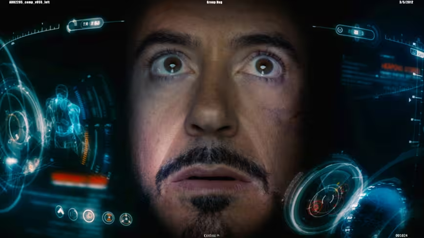
With the HUD designs, I actually created a HUD Bible – a physical 11×17” printed book with a breakdown of every major component of the HUD, its purpose and the previous designs for all previous five suits. (The first suit, the Mark I, didn’t have a HUD.) Some of those designs I actually recreated by studying framegrabs, as the original graphics were lost.
Then I proposed my designs for the new Mark VII, and how each piece had a purpose and how the new design was upgraded. I think presenting my designs this way allowed them to trust my vision for it – so there actually weren’t many changes – more like color shifts to red, and density shifts as we worked out the balance of how much graphical craziness should be on the screen at a time.
Was Joss [Whedon, Avengers’ director] hands-on with the UI, as it was such a big part of the S.H.I.E.L.D. scenes, and Iron Man’s HUD?
Yes indeed. It was actually quite nice to see how involved the discussions of these screens were. You could tell how important they were to the story. For the HUDs, each scene had a very specific message to deliver, like ‘he’s about to target all the aliens’, or ‘Jarvis has just found a tight corner for him to zig-zag through.’ And those graphics had to all enhance Robert Downey Jr.’s performance. That’s the particular challenge of designing and animating the HUD graphics – you’re not just designing it from a normal, front-on view – but also a back view – a side view – and it all has to look cool and amplify RDJ’s performance rather than distract from it.
Tablets and smartphones are all going the ‘touch’ route. It seems like an easily grasped 1:1 way to interact with computers and it’s appearing as if this is the direction that UI will be headed for a while. Do you have any thoughts about the future of UI as ‘touch’?
I’ve been ready for it for a long time. I’ve used a Wacom Cintiq for a while and even though it’s a pen based input, having that 1:1 interaction really does ‘feel’ different while you’re working. Like you’re more connected to the work. I also use a Asus EP121 tablet, which is both touch and on-screen-stylus – and I love the way it works in particular, because some things just work better with the precision of a stylus. I’m particularly excited about glass touch screens.
What about gestural input, or ocular interfaces like Google’s Project Glass? (side question, any thoughts on Project Glass?)
I think gestural input is finding its place and becoming more normal – as games like the Wii and Kinect make it fun. I think it’s interesting that these games are unintentionally developing a natural kinetic language that will be second nature to future generations.
And, it may be obvious that I’d be a huge geek whenever it comes to augmented reality and enhanced vision displays. So yeah, I’m excited about the ‘google goggles’. I’m excited that they’re heading into uncharted territory, even if it’s not perfect. I see the potential and it’s huge. Helps with the push towards freeing yourself from ‘the box’. Getting out there and living your life while still remaining ‘connected’. And this is part of that exploration that needs to happen – yesterday. Physically I think it looks really geeky at the moment though, which isn’t awful. But I’m the type that can rock a retro-futuristic Japanese LED watch. However, once they pair it down to snap on a regular pair of sunglasses, everyone may just have to have one.
As far as whether it’s distracting or useful – of course it’ll be distracting at first – until people get used to it, just like anything else. Then it will become useful. The POV pictures will probably be fun like Instagram – “here’s what I’m seeing right now” kind of thing. I’d want to make art with it – like art that augments your physical space as you look at it.
Or I’d just want to be able to zoom in on things while traveling the world, analyze them, look them up in a visual dictionary, find out where to buy them or what their purpose or history is. With the way google’s ‘search by image’ currently works, that probably is not too far off.
I’d definitely want to design my own interface for it though, haha.
How practical do you think holographic UIs are and how far away are we from making them happen?
I think they’re very practical, especially for medical, engineering, entertainment, education and advertising. They’re actually not far off at all, depending on how you think of them. There are many variations right now – but that’s because a lot of technologies are converging right now to make it all happen.And all of them are exciting.
If you think of them as the holograms on your credit card, those are being developed into holographic TV’s that can display 3d much more naturally than current 3d and without glasses – reducing headaches and such because they allow you to focus your eyes at the same point as they converge, just like you normally do in the real world. They’re main problem is refresh rates at the moment but it’s just a matter of time before you start seeing more about them.
If you think of them as displays you can manipulate, like Tony Stark does in Iron Man 1 by trying on virtual parts of his suit, Microsoft is making progress in that department with their ‘HoloDesks’. It’s behind glass, but you can already tell there will be a lot of power in that type of display. There are also 3 dimensional signage displays being done with LED Cubes and spinning globes, which is both simple and brilliant. So I expect to see holographic signage in Vegas and NYC soon – and the sci-fi geek in me really can’t wait to see all the tacky stuff they do with that.
If you’re thinking of holographs in terms of being able to view the displayed objects in full 360°, then you’re actually talking about volumetric displays, and those are what I’m most interested in. This is a display that can present an object or animation that you can walk around, and also look above and below. USC has worked this out already with interactive light field displays.
Sony already has a pretty sleek prototype. They can even stream live video through it. They’ve solved a lot of the issues with different users’ points of views by integrating different types of head tracking, similar technology that the X-box Kinect, or even your basic point n shoot camera, has nowadays. Another barrier they’ve overcome is occlusion – so the objects don’t need to be transparent as we once thought. Volumetric displays are usually projected on spinning mirrors – but some people have also been able to use less solid surfaces, such as an artificial mist or fog.
The holy grail of holographic displays, a display in mid air, without needing mist, fog, glass or mirrors, is something people are still working on – but really – with these other options we may not even need that. They have been able to get dots to ‘float’ in mid-air, forming 3d shapes, with laser plasma emissions. It’s a really simple display at the moment, just dots, but remember that dots are also how your current monitors started out – they just use smaller dots packed more tightly together.
In the next few years holographs and volumetric displays will be the hot topic. I could even see it being worked into something like Google’s Project Glass – where it becomes an augmented-reality type of thing while you’re wearing the ‘google goggles’. Who’s to say everyone needs to see the hologram? Maybe it’s just you and the people all wearing ‘google-glasses’ around you that see it and can interact with it. That would work just as well. That way you could have life-sized holographs and not require any crazy hardware setups. So dimensional displays will definitely become a part of our lives soon – and the UI design for them is a pretty cool challenge for any forward thinking designer.
Whose idea was Galaga ’88? (If you missed it, Robert Downey Jr.’s Tony Stark calls out a S.H.I.E.L.D bridge crew for playing Galaga ’88 on his monitor. The payoff, in which the crew member really is playing it, garnered big laughs in my audience.)
Haha — great question. I believe that must’ve been Joss’s idea because that was in the script. That was done on set with, I believe, just a video-screen-cap of the game. So they just flipped from the on-set playback monitor graphics to the pre-recorded video of the game. When I saw the first rough edit before we started designing the glass screens, I thought, ‘I really hope that makes it into the final cut – that’s pretty funny.’
Our thanks to Jayse for sharing his thoughts with us. If you’d like to check out more of his work, be sure to hit up his site at Jayse.tv.
All images ™ & © 2012 Marvel Studios, Google Glasses image © Google
Get the TNW newsletter
Get the most important tech news in your inbox each week.

