Data visualisations can make sense of topics we otherwise wouldn’t understand at all.
Even if you’ve previously not taken notice of the Italian blogosphere, social media analyst Vincenzo Cosenza has done such a beautiful job of mapping the connections between, and influence of, the country’s blogs that it’s fascinating to examine.
The study aimed to understand the ‘information ecosystem’ formed by the connections between blogs in Italy. Cosenza started with the top 500 blogs, examining the most frequent inbound and outbound links.
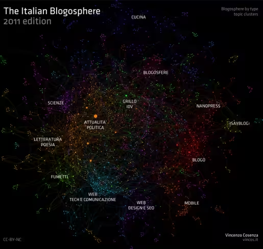
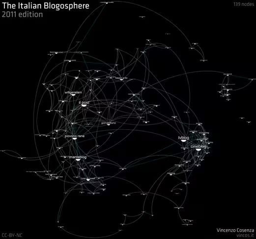
From there, he produced a series of visualisations, mapping relationships between blogs, and colour-coding them by theme.
Cosenza’s website hosts an interactive map of the Italian blogosphere which is well worth a try, but here’s the map of its thematic clusters, followed by one showing the relationships between the 139 most cited blogs. These maps are the prefect blend of data science and art.
Get the TNW newsletter
Get the most important tech news in your inbox each week.


