Updated: Facebook has confirmed that they are testing these changes in an email to us:
“We are currently testing different variations and designs of our Publisher. As with many of our features and products, we’re constantly making tweaks to test performance and usability.”
We have noticed that Facebook seems to be testing a new status bar interface on the Home view, that has the bar collapsed by default, requiring the user to click on an icon first.
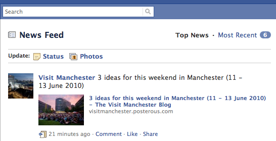
At present, we’re only seeing icons for “Status” and “Photos” but at the very least that will most likely be expanded to include “Videos” and “Links” as well as installed applications/Like pages as is in the current status bar. Of course, this could also include other services such as Facebook’s “Places” location service if/when it is released. The change in the status bar seems to only be on the Home view, and not in the Profile view as well.
Also, once an update is published, it shows up under the icon bar as “Last Update”:

Facebook of course has made many design changes over the last few years, and is often tests new features and design changes among a limited number of its roughly 500 million users. This apparent test was noticed by Martin Bryant, our UK Editor, and we have not seen it yet in the US – if you are seeing this new view, please let us know in the comments.

Get the TNW newsletter
Get the most important tech news in your inbox each week.

