Apple’s keynote presentation at WWDC yesterday clearly answered the question of how Jony Ive’s influence would be felt in the design and, more importantly, function of iOS.
It’s as if Ive imagined the OS as a physical computer made up of sliding panes of frosted glass, with surfaces activated by touch and color. You slide those panes of glass around to access various functions and, as you do, they interact to provide context and a sense of place. Then, he took that and translated it to software.
That sense of context is pervasive throughout iOS, which is really where we’re seeing the platform begin to mature. Initially, iOS was based on the concept of an information appliance, where every screen or function of the device took it over completely and transformed the object in your hand into that ‘gadget.’ This concept, whether it was consciously understood by users or app designers, informed the way that apps were designed for the first five years of the iPhone.
That’s all about to change, because Apple just added a massive amount of depth to the base OS, and it’s clear that it wants it to stand as an example for developers. Instead of a rigid ‘gadget-like’ interface with button allegories and opaque panes that convert the device into a new object, there is a series of translucencies and live animation effects that provide the user with a sense that there is more to it than what they’re doing ‘right now.’

The 💜 of EU tech
The latest rumblings from the EU tech scene, a story from our wise ol' founder Boris, and some questionable AI art. It's free, every week, in your inbox. Sign up now!
This change is a reflection of the fact that there are 600 million devices out in the world, but there are billions yet to be sold — and most of those will be sold to a future generation that has come of age in the era of touch computing. The allegory of a ‘transformation’ into a physical device has had its day, and now we’re ready for a more complex diet.
When I said on Twitter yesterday that you really had to see iOS 7 in action in order to ‘understand’ it, what I really meant was that it’s now a product of more than still images presented as a result of interaction.
The new design language of iOS revolves around animations as primary storytelling elements, not pixel art.
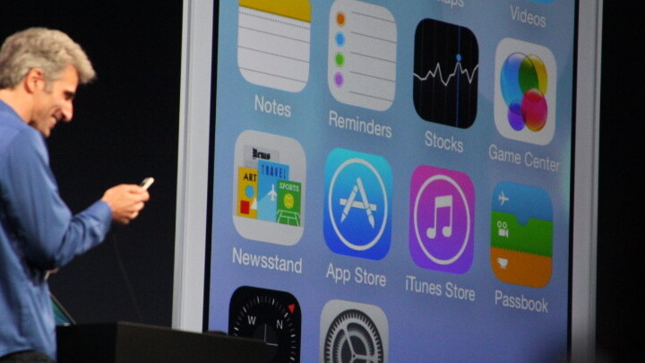
One good example of this is the Messages app, which now features colorful bubbles that vary in spacing depending on the speaker and the size of the text block. When you scroll Messages, the bubbles move closer to one another and further away in a sort of ‘squishy’ motion. They also feature the far deeper rounded corners that appear throughout iOS 7. The overall effect is less formal and more conversational. There’s a mutability to the designs that is a far cry from the rigid, crystalline bubbles in iOS 6.
That feeling of immateriality, for the lack of a better word, is what I think is tripping people up in their initial impressions of iOS 7. Yes, the icons are almost comically symbolic representations, but that’s been done for a reason. The icons are no longer the point, it’s the functions that they represent that are taking center stage here.
And that’s reflected throughout iOS now with the use of text as buttons and edge-to-edge content. The courage shown by Apple with iOS 7 is the willingness to allow its design to fade away, to sacrifice the overt statement of intricacy and craft on the altar of function and flexibility.
It will be interesting to see how developers adapt their apps to reflect the changes in iOS. I think that many will jump to the conclusion that a redesign of the app and mostly the icon are in order, but the best will realize that the changes are far deeper and more profound than a visual reduction. The analogy that Apple has used for so long is no longer valid, and developers will have to decide whether to get on board with the new one.
iOS 7 is an operating system that’s designed to be elastic enough to handle not just the next couple of years’ worth of features and functional additions, but the powerful extensible future of portable computing. I have no doubt that many of iOS 7’s changes will actually snap into understanding once we see them on the iPad, because they’ve clearly been designed to support not just a handheld computer but also the future of Apple’s personal computers.
There is plenty of things to debate and get distressed about in iOS 7. There are inconsistencies in design language and communication here. The up arrow below the ‘swipe to unlock’ message on the home screen, for instance (which can be disabled) is incredibly confusing and the subtle ‘left to right’ animation inside the lettering doesn’t have enough visual volume to counteract the instinct to swipe up instead. And some of the icons feature conflicting lighting sources and design choices.
But I have no doubt that things like this will be tweaked and dialed in a bit better over the coming months. As was repeatedly stated during the presentation, this is the biggest change to iOS since the introduction of the iPhone, so the normal rules which may have precluded anything but small changes to icons and design from an early beta don’t apply here. I wouldn’t be surprised at all to see each new beta being significantly updated from the one before design-wise.
More importantly, however, Apple seems to have undertaken and completed a redesign of the way that iOS actually functions in just six months. And they’ve managed to do so while introducing an evolution of the information appliance concept that they can build on for the next decade.
Get the TNW newsletter
Get the most important tech news in your inbox each week.