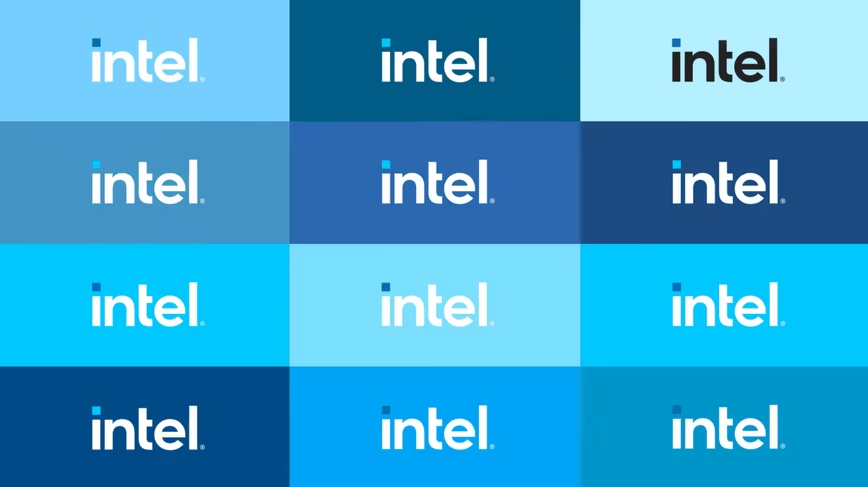
Intel is the latest big company to introduce a new, simpler (or more generic) logo. The company today announced new branding to coincide with its 11th Gen Tiger Lake processors; the look is both new and familiar.
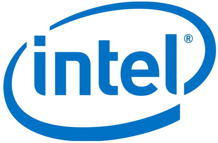
For reference, here’s the old logo the company adopted in 2006:
And here’s the new one:
![]()

The 💜 of EU tech
The latest rumblings from the EU tech scene, a story from our wise ol' founder Boris, and some questionable AI art. It's free, every week, in your inbox. Sign up now!
Which in turn calls back to Intel‘s original logo used from 1968 to 2006:

I don’t mind the change too much. The ‘swirl’ of the previous logo looks a little outdated by modern standards, and while the new logo is quite generic at first glance, the way Intel is using it is a bit more modern.
The company is embracing a wider palette of blues to go along with the logo, and for the most part, appears to be emphasizing a white typeface on a blue background. The little square dot above the ‘i’ is colorized blue in all instances, and represents processors. Because, you know, processors are rectangles.
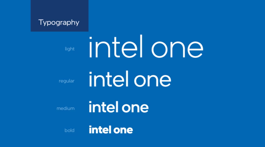
Logo aside, you’ll also see the company use a related typeface called ‘Intel One’ throughout its product lineup:
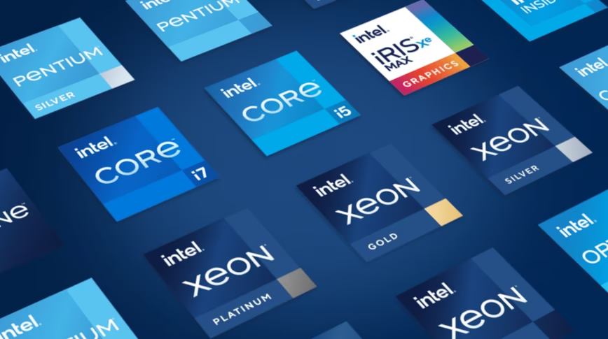
So those little ‘Intel Inside’ stickers that come with your new laptop will get a new look too:
So all-in-all a cleaner look, if a little less unique. What do you think?
Get the TNW newsletter
Get the most important tech news in your inbox each week.