Alexander Huls is a freelance writer whose work has appeared in The New York Times, The Atlantic, Esquire and other publications. This post was originally published on the Shutterstock blog and has been reprinted with permission.
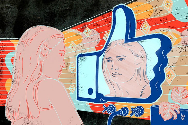
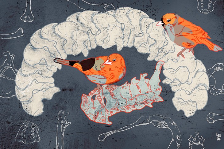
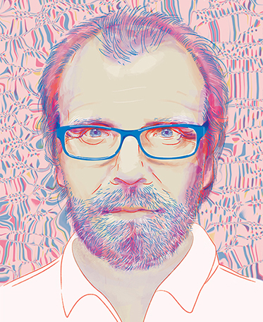
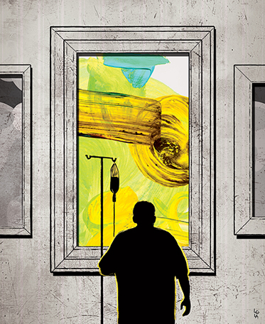
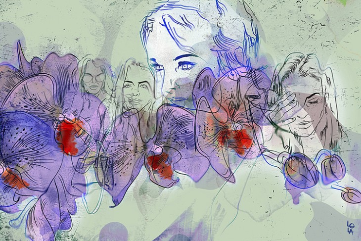
Canadian designer Lola Landekic‘s illustrations have appeared in a variety of newspapers — The Toronto Star, The Globe and Mail — and she’s forged a fruitful relationship with the phenomenal online (and print) magazine Hazlitt, which has provided a particularly vibrant outlet for her richly colored illustrations. Landekic also works at OCAD University, collaborates with book publishers, and is part of the trifecta behind popular website Art of the Title.
To provide insight and inspirations to other aspiring illustrators, we spoke to Landekic about her experiences illustrating for newspapers and magazines, what her advice is for those pursuing a similar career path, and how she goes about turning words into beautiful images.
Shutterstock: When you’re working with outlets like Hazlitt or The Globe and Mail, what’s your process like after you’re assigned an article to illustrate?
Lola Landekic: If I’m lucky, I’ll have a finished piece, and that’s always wonderful, because you have something to properly think about and illustrate. As I’m reading, I highlight things that jump out at me, because people often have specific turns of phrase that they use that really lend themselves to an image.
The absolute best is being able to read, step away from it and let it percolate. It’s like a subconscious process that happens. A couple of hours later, I start sketching. I sketch dozens of ideas. Then I finalize on a couple that really stand out.
Do you have to collaborate or check in a lot with publications before settling on a final image?
It goes one of two ways: With Hazlitt, I submit my final and they run with it. With newspapers, I submit concept sketches, they have feedback and then I do a final.
Newspapers often work on brutal deadlines. How quickly do you have to turn around illustrations for the ones you work with?
Turnaround is incredibly fast — especially with Op-Ed sections. You get a day’s notice. That can be really stressful, because you do need some time to process and passively think about the subject. The way I think about illustration is that you sometimes do have to step away and look at it in your periphery.
Then things tend to jump out at you in a different way. When you’re doing Op-Eds, you don’t have the luxury of time. You just have to plow through. It’s a battle every single time, but it’s really rewarding when you reach something.
On that note, what’s the ultimate goal when illustrating for magazines or newspapers?
With the illustration, you want to encapsulate the message as strongly as possible. You also want it to be directly related to the story and speak to readers on an immediate level. It’s about that first impact. If you create an image that doesn’t have any impact, you’re missing the point.
You mention a love of metaphor on your Website. Do you feel that’s a reliable way to create impactful illustrations?
Metaphors are king because they work on two levels: If you’re doing it right, they work on a level that is immediately affecting — the image is powerful in its own right. But once you step back, you also have to take a second and think about what it’s conveying.
What would your advice be to a designer thinking about getting into illustrating for a magazine or newspaper?
Look at editorial pieces and see how they function — how they differ from other illustration pieces — because they’re deeply rooted in metaphor. I would also say that the best illustrators are also the best readers. If you don’t know how to read a piece, and get to its core, you’re not going to know how to illustrate it properly.
What does your process look like in terms of actual logistics? Do you sketch things out? How much do you use design programs?
I start with a notebook, just swirling around with pen and pencil. Then I move into Illustrator. I tend to work in an unconventional way compared to most illustrators. I illustrate digitally, and then move from Illustrator to Photoshop. I work with Illustrator first to draw things out, and then I edit in Photoshop and draw my colors and add textures.
I work in Illustrator because I want absolute freedom if I need to make changes. If I draw everything out, or paint it on paper, I find it really limiting. If you need to make a line thicker, or move something that was in the front to the back, there’s so many more options if you start that process digitally.
Do you have any favorite digital tools?
In Illustrator, I love the pen tool. I know a lot of people find the pen tool counter-intuitive when they first encounter it. They’re not sure how to use the curves and all the technical aspects of it, because it’s not how you would think to do a line drawing. But that’s my go-to. In Photoshop, the channels are now my favorite.
Just being able to work with the values and the hues in a way that you didn’t previously, is a really fun experience. I often take about an hour just to figure out my colors. It’s like icing a cake.
You obviously love strong colors. Why do you think they’re so important to effective design?
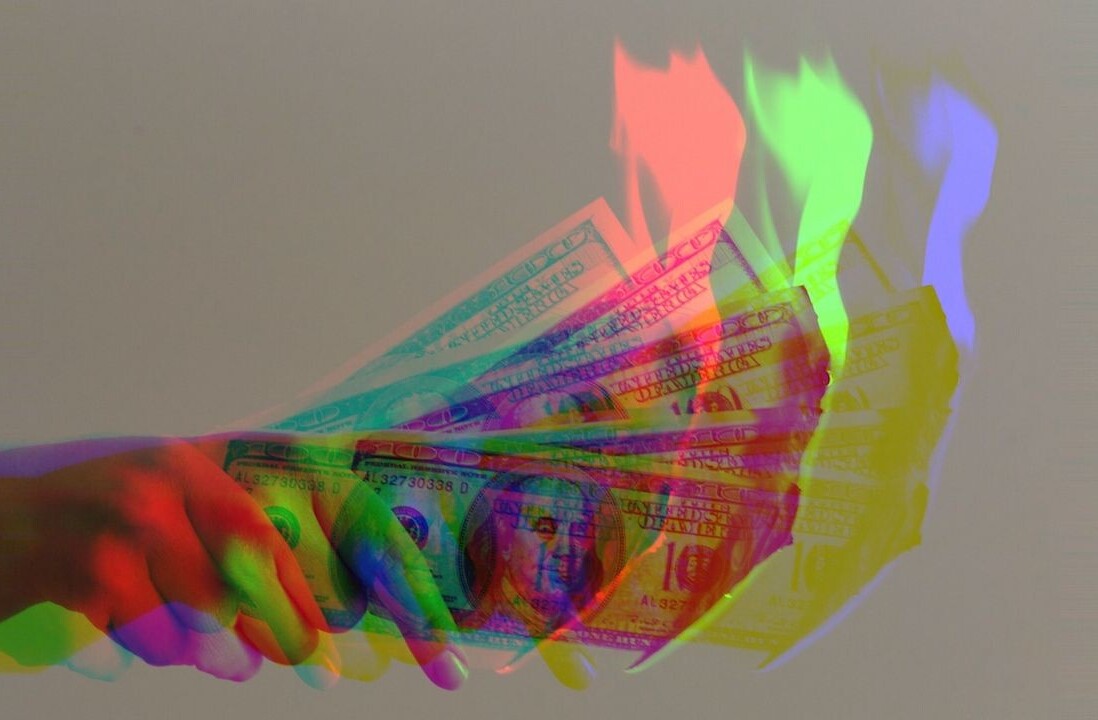
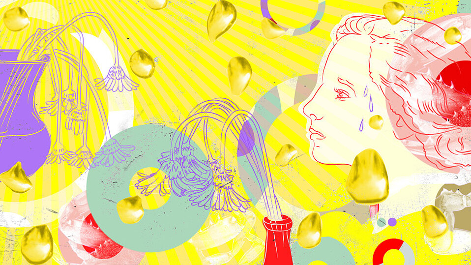
Color is something you experience very viscerally. It’s something that affects you in such an immediate and powerful way, and you respond to it on a subconscious level. When you see the color yellow, you can’t help but cheer up a little. But on the other side, yellow also represents sickness. So there’s two sides to every color, and that’s something I love about it, too — it’s such a powerful tool in the way you yield it.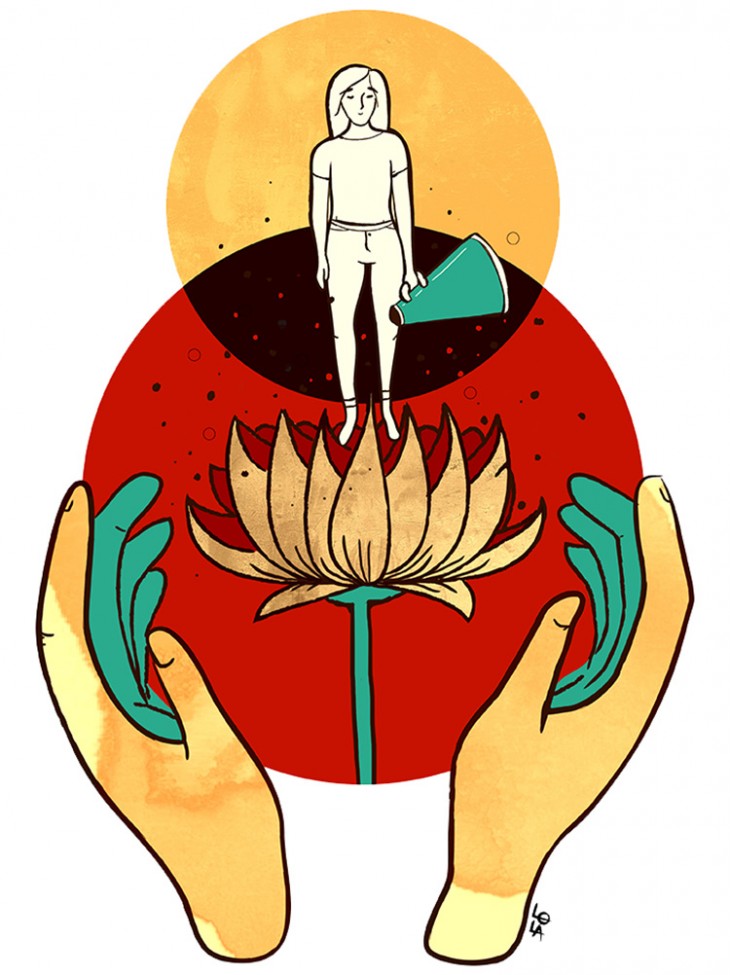
In addition to strong colors, you also show a wide range of styles and techniques in your work. Is that a conscious choice?
I think it’s just an extension of my personality. I want everything all the time. I can’t really decide which particular way I want to bend my voice. I think it’s wonderful if an illustrator is able to decide early on that they have a style that will become their particular brand. But for me, illustration is a world of exploration.
Being able to pull in a lot of different things is very freeing. I hope I’m always looking at my work and trying to find new ways to make it interesting.
If you could go back in time and meet your younger self, what advice would you give her?
Draw every day. Have the strength and the fortitude to allow yourself to draw without an end game. Draw for the sheer joy of it. Draw out all your stupidest ideas and see where they land and return to them months later and make them into something.
I wish I had developed that habit early on because I know there’s so many things that could exist now if I had done that. I don’t know why we doubt our ideas and whether they’re worthy of putting down on paper. Just stop thinking and do.
All images © Lola Landekic
Get the TNW newsletter
Get the most important tech news in your inbox each week.
