STANFORD, CA – DECEMBER 17: Books sit on a shelf at the Cecil H. Green Library on the Stanford University Campus December 17, 2004 in Stanford, California. Google, the internet search engine, has announced a long-term project to put 15 million books from seven of the world’s most prestigious libraries online and make them searchable. […]
 Credit: Getty Images
You may have noticed that with the introduction of iOS 7, the design of iBooks and iTunes U remained unchanged. Today, Apple released a new version of both apps to bring their look and feel in line with the rest of its mobile operating system.
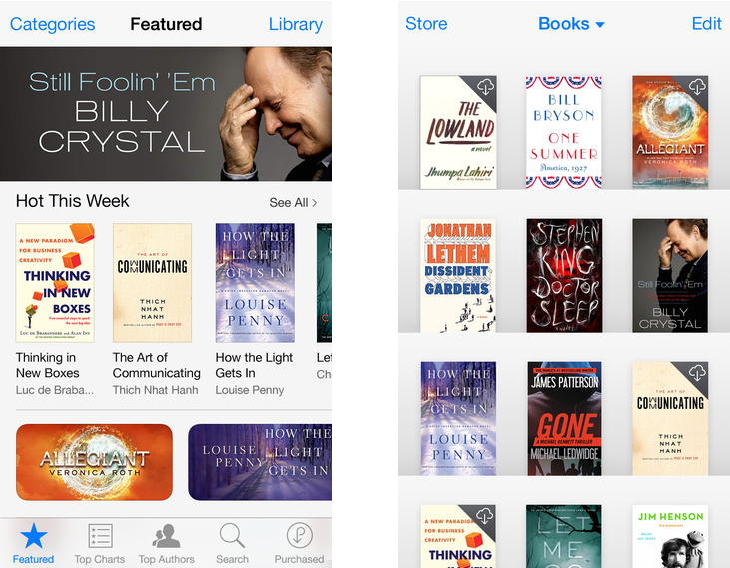
In both apps, the wooden bookcase has been replaced with a flat, grey background. Titles still stand in a formal grid though and the shading behind each title creates the illusion that each ebook or digital title is standing on a flat surface.
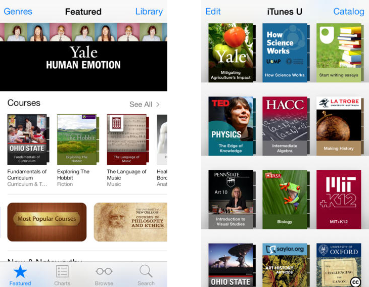
The storefront for each app has also been redesigned, dropping the black bars on the top and bottom for a predominantly white, sparse aesthetic. From a features standpoint, it doesn’t look like much has changed in either app. For iPhone and iPad users though, greater consistency across Apple’s range of pre-installed apps should be a welcome sight.
➤ iBooks | iOS
➤ iTunes U | iOS
Disclosure: This article contains an affiliate link. While we only ever write about products we think deserve to be on the pages of our site, The Next Web may earn a small commission if you click through and buy the product in question.
Image Credit: Justin Sullivan/Getty Images
Get the TNW newsletter
Get the most important tech news in your inbox each week.
Also tagged with


