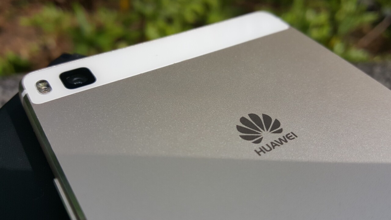
Huawei’s P8 has put me in a bit of a bind.
The company’s newest flagship device, launched last month, picks up where the P7 and P6 left off, but also brings some key changes (like an improved camera) aimed at making the handset more appealing to a wider market – and therefore a more worthy competitor for the likes of Samsung’s Galaxy S6, the HTC One M9 or LG’s brand new G4. That means it has higher expectations to live up to and a higher quality bar to achieve.
I’ve spent the last couple of weeks using the device as my primary handset to see how it fares in the real world.
Design and hardware
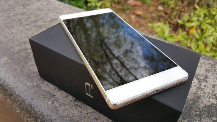
The P8 is the first of Huawei’s flagship devices that I’ve spent any significant time with, and from a styling perspective it’s on the right track.
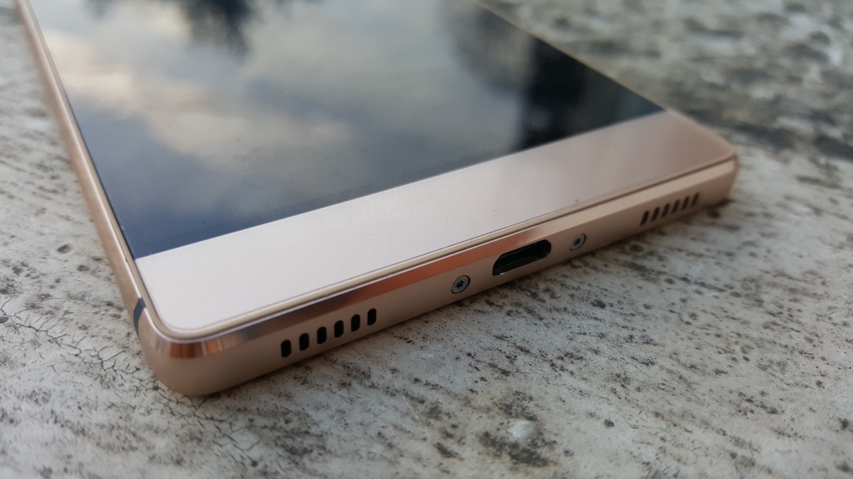
The device is an all metal chassis — and at first glance it looks very similar to the Sony Xperia Z line of devices, particularly the Z3. This is largely the result of the square-edged appearance and how it feels in your hand, as noted in our quick hands-on.
The 5.2-inch full HD (424PPI) display doesn’t quite fill the full length of the front, so the model I tested has a white surround above and below the screen.
It’s not quite fair to say the P8 is completely square-edged — its chamfered edges, narrow bezel and rounded corners do take away the worst of it — but it’s still not the most comfortable phone to hold. It’s not that it feels overly large, it’s just that I find the combination of a completely flat-backed metal handset and quite square edges makes it feel quite drop-prone. Officially it measures up at 144.9 x 72.1 x 6.4mm and weighs 144 grams.
I suspect that the larger P8max variant is even more unbearable to try and grasp in one hand for a long time, though I don’t have one to test.
Despite my inherent clumsiness making it a bit of precarious affair (disclosure: I did drop it a few times, and it didn’t break) the overall look of the phone isn’t unpleasant. Revolutionary mobile design? No, probably not, but it’s not a bad looking phone still, and doesn’t command quite the same price tag as something like the S6 Edge.
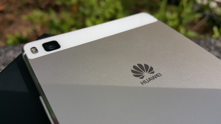
The camera is on the rear of the phone in the top-left corner, so you need to be careful not to cover it with your finger when you’re taking a photo.
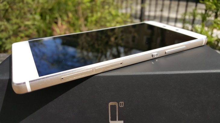
Down the right hand side, there’s the a volume rocker, power button and combined SIM/microSD slots.
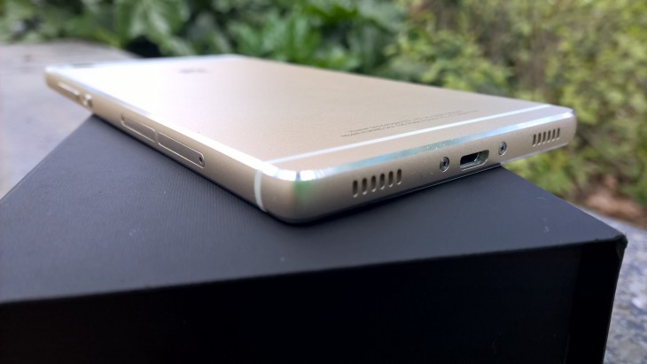
The speaker is at the base of the handset.
Under the bonnet, there’s 3GB RAM, 16GB of onboard storage and a 2.0GHz octa-core processor to keep things ticking over, which they did nicely. No stutters or slow-downs here.
Software and in use
The early version we first looked at ran a heavily modified version of Huawei’s UI aimed at the Chinese market, but the review model has an altogether more familiar feel to it.
At stock it runs Android 5.0 (Lollipop) with Huawei’s Emotion UI. I actually came to appreciate a couple of the software tweaks, such as universal search by swiping down from the middle of the screen.
There’s still no app drawer though, so you’ll have to keep things nice and orderly if you want to be able to find anything.
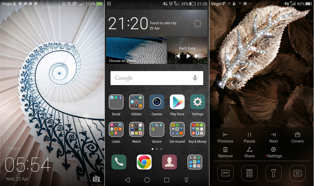
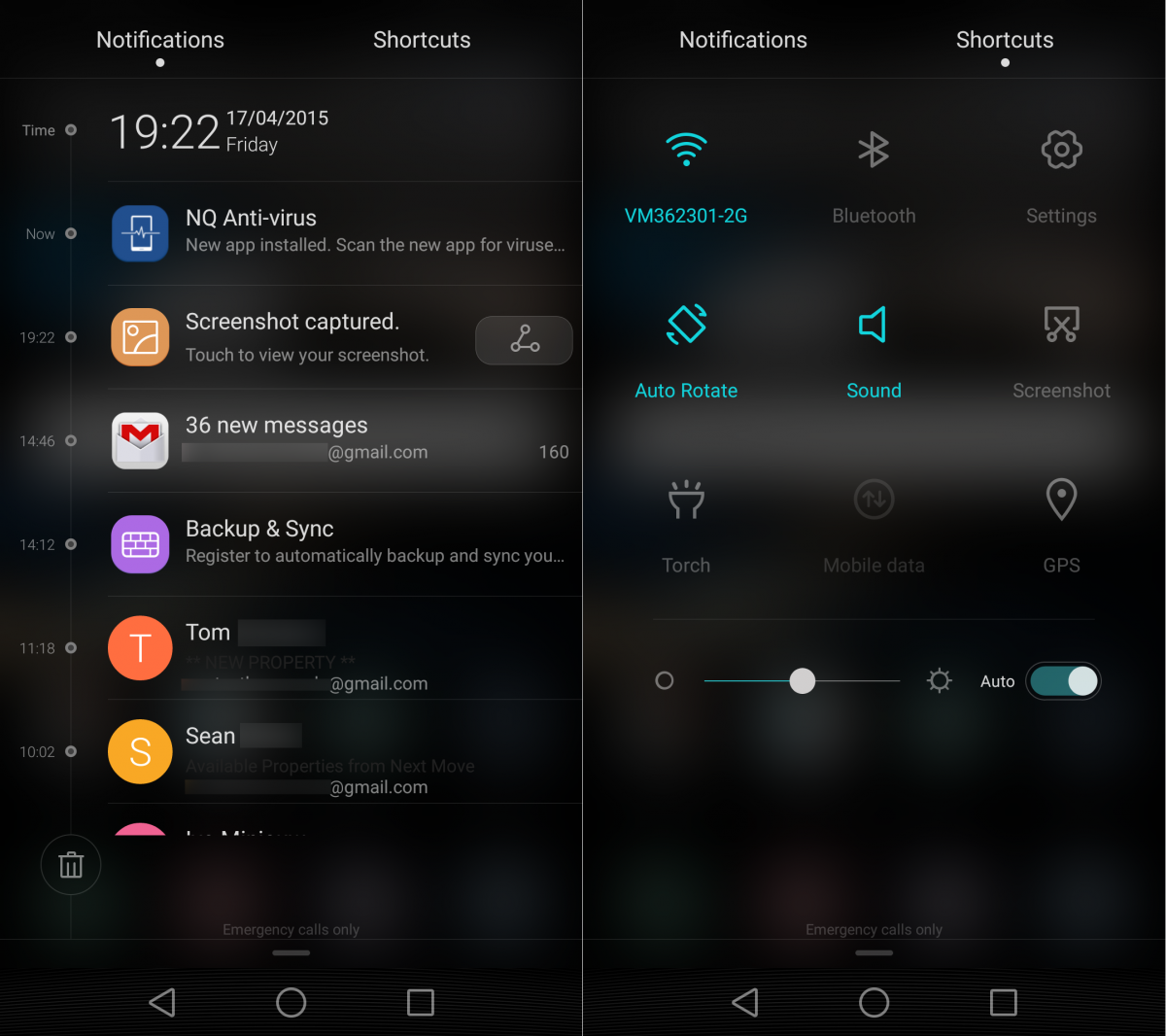
While it comes with Google services ready to go, there are Huawei’s own apps for things like the clock, calendar, notepad etc. There’s also a built-in flashlight shortcut placed in a couple of convenient locations (like on the lock screen, and accessible via the notifications bar) that switches on the camera’s flash.
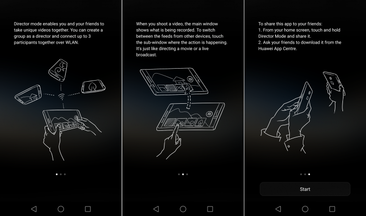
There’s also a new Director mode that allows you to shoot a video with friends from multiple angles, provided they each have a P8 too. I don’t know anyone else with a P8 to test this, which could very well end up being a real-world problem for this feature in general.
The pull down notification bar still lets you quickly switch between Notifictions and Shortcuts, and I particularly like the way in which updates are displayed in a neat timeline. It’s not a big departure from stock Android, but it’s the little things that count.
There are also other Huawei features here too, like a one-hand UI mode that shrinks the entire screen down to help you navigate more easily and a lock-screen pop-up menu that lets you quickly switch between lock screen covers with little faff.
However, there’s also one feature here that ruined the overall experience for me – the new ‘knuckle-sensing’ technology.
The theory is that the phone can tell the difference between your knuckle and your fingertip, and will still let you operate it or take a screenshot when using the former, where most phones wouldn’t.
While it sort of works – results are hit and miss, at best – the side-effect is that it constantly thinks my finger is my knuckle. I have countless screenshots on there that I have no idea how I took, set with a different timer on each occasion, when all I was trying to do was operate the phone normally.
The overall effect is that it’s hard to work out if the screen is unresponsive or if the software is so broken that it’s not so much that it can’t tell the difference between a knuckle and a finger and more like it has no real idea of what either of those things are and just responds when it feels appropriate.
Generally, what happens is you try and draw the notification bar down from the top of the screen or move between a home screen (or do anything else) and it draws a line across the screen, instead of doing what you wanted.
I also found it a bit of a hit-and-miss affair in answering calls – I was never quite sure if the first swipe would answer or not. Not useful, Huawei.
I had a couple of other issues too, like some of my apps needing to be granted ongoing access to notifications.
This worked fine, but it was never a persistent change – meaning I had to go in and grant them access every time I wanted to use them, which quickly became unworkable. I didn’t find any fix for this either, though I’d suspect it’s the unmovable NQ Anti-virus app tripping it up somewhere. While I seemingly managed to disable the anti-virus, I couldn’t find any way to uninstall it and the problem persisted.
The battery life isn’t the best-in-class experience you might hope for, but it’s not terrible either.
I tend to use the phone connected to Bluetooth headphones, listening to podcasts for at least a couple of hours most days. Doing this, installing and testing apps, making calls and messaging was enough to wipe it out within a day.
If you’re a heavy user you’ll get a full day if you’re willing to turn down the screen brightness and use some of the power-saving settings.
If you get really desperate to spare your battery, you can enable ultra power saving mode, which switches off everything except calls and messaging.
Camera and audio
The audio here isn’t going to worry HTC’s One M9 (or One M8, to be honest) and while it’s loud enough for podcasts, movies and the occasional bit of music, you won’t want to use it without headphones for prolonged periods as it’s a bit on the tinny side and lacking in bass.
It’s also really easy to block the speaker on the phone with your hand, or if you put the phone down on a soft surface.
The camera is another area that won’t wow you. It’s solid enough, and there are some test shots below to give you a better idea of how it comes out, but it’s not going to blow you away either. If photography isn’t really your priority on a phone, or you never look at the pictures on a larger screen, then it won’t be a problem.
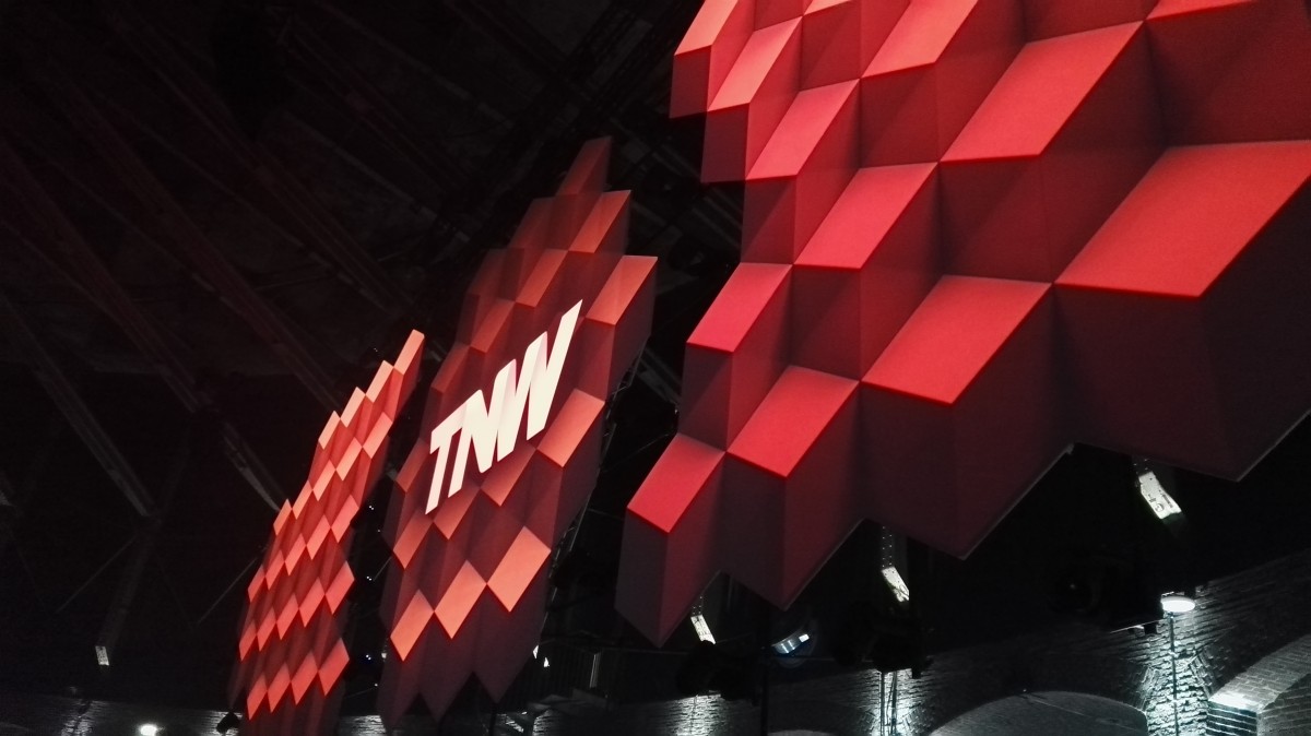
The images below were taken at our annual TNW Europe Conference last month in Amsterdam. You can see that the darkest parts of the first one look a little grainy, but that the shadowed light in the background has been captured sharply and with atmosphere.
The show below was taken at around 8am and captured the bit of morning light reflected in the canal well.
The images above and below, while clear and sharp enough for everyday life feel like they’re lacking in ‘pop’.
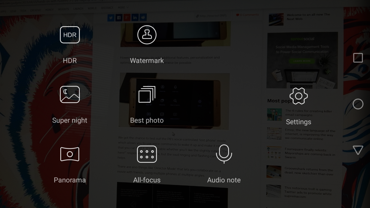
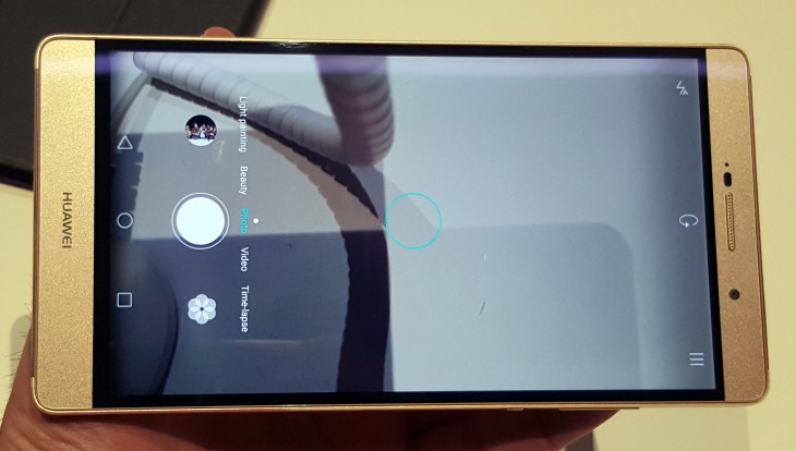
There are a few options and different modes to play around with – like Time-lapse, Light painting, Beauty, Video, etc. You can also take a burst of up to 18 shots rapidly by holding your finger down on either side of the volume rocker while the camera app is open, which is a handy control to have if you use this option, as there’s no dedicated shutter button.
As also noted in the hands-on, the UI doesn’t orient itself correctly when you switch into portrait mode, which can make things a little more awkward than necessary if you need to adjust settings.
A considered disappointment
I love underdogs, that’s why I wanted to love the P8. Plus at the launch event, my initial hands-on was mostly positive and the design shows Huawei is serious about trying to make inroads into rivals’ European market share.
In fact, the hardware itself isn’t anything to complain about and I quite like Huawei’s Emotion UI, except for the lack of an app drawer. The UI doesn’t seem to slow things down too much either – I never really experienced any lag in switching applications, for example.
However, the knuckle mode makes it unbearable in the longer term. It’s not 2008 any more and having to paw at a flagship phone’s display several times to carry out an action isn’t really acceptable, even if it’s only a few times per day – and it must have happened at least 5-10 times every day.
If we’re holding it to the same bar as better established rivals, which we are, then the P8 isn’t good enough to worry any of the big name manufactures out there. It’s priced from €499 (~$565) and if it didn’t suffer from that one software problem, it’d be a competent range-topping smartphone that offers a slightly different take on stock Android at a lower price than rivals. That said, it doesn’t go to the same lengths to offer additional services or features that Samsung, Motorola, Sony and others strive for either.
I’d suspect a software update will roll out soon enough to fix the knuckle recognition feature, but until that happens, it’ll remain a slightly frustrating experience that ruins an otherwise solid device.
Read next: Samsung Galaxy S6 and S6 Edge review: Almost perfect, but the Edge lacks a ‘killer’ feature
Get the TNW newsletter
Get the most important tech news in your inbox each week.

