With more and more engineering-focused companies trying to become design-centric, they’re no doubt trying to adopt design thinking.
But it’s not as simple as saying, “Just use design thinking.” Saying it does not make it so.
What exactly is “Design Thinking”? Let’s take a step back and hear from the man who helped shaped the methodology as it’s used today, Tim Brown of IDEO. As he writes:
“Design thinking can be described as a discipline that uses the designer’s sensibility and methods to match people’s needs with what is technologically feasible and what a viable business strategy can convert into customer value and market opportunity.”
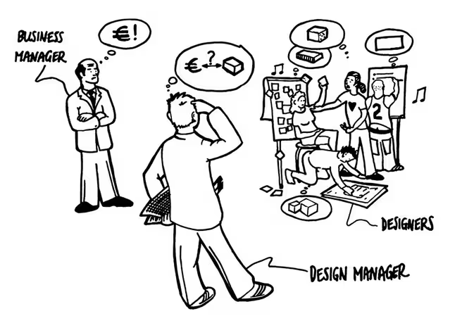
“Design thinking” is really just another way of saying “problem-solving.” How do we find the right problem, then design a technically feasible and commercially viable solution?
Photo credit: Design management. Creative Commons.
Got it? Maybe? Don’t worry, you’re not alone. Many others have tried to pin down exactly what design thinking is in practice, including some leaders in the design community, such as Bryan Zmijewski of ZURB and Mark Payne of Farenheit 212.
In this post, we’ll walk you through how to put design thinking into practice so that you can drive your project forward.
The Parts of Design Thinking
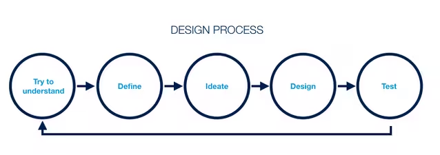
Before we dive into making design thinking actionable, let’s review the parts that make it up, as outlined by Stanford’s D School.
Photo credit: Marcin Treder
- Empathy: This is one of the indispensable traits of a designer. You have to empathize with your users. This means getting to know them through interviews, observations and learning how they would possibly interact with your product.
- Define: From that empathy, you can start forming hypotheses and asking further questions. All the while keeping the user’s perspective in mind.
- Ideate: This is the exploration phase, where no idea is off the table. Burn through bad ideas to get to the good ones.
- Prototype: Put your ideas to the test. Building a prototype allows you to see how your product might feel out in the wild.
- Test: Now this is where you can put your prototype in front of users, learning how they interact with it and thus allowing you to refine your ideas.
With an overview of the design thinking process, we can now see how to put it into action.
Get to Know Your Users
Empathy is the foundation of design thinking.
In order to identify the right problems, you need to think and feel like the people you’re trying to help.
Joe Gebbia tells this wonderful story of Airbnb’s early days when investor Paul Graham told them, “Your users are in New York and you’re here in Mountain View (Ca) — what are you doing here?”
Photo credit: Google Maps
What Paul was telling them was to go meet and learn from their users. So the team talked to users, and they learned things they never would have discovered from within the walls of the building.
As outlined in our free e-book, “The Guide to UX Design Process and Documentation,” there are few ways you can build empathy while strengthening your relationship with users.
Let’s take a look at a few:
- Field studies: Directly observe how someone uses current products (including your own) in their natural setting. You’ll be able to get context for how users interact, while asking follow up questions to better inform your own product. Usability expert Jared Spool even calls it the best tool for discovering user needs.
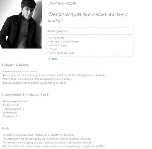
- User personas: Informed by user research (like field studies), personas represent different user profiles. By creating lifelike personalities, you’re better able to understand the user’s psychological, behavioral, and professional background. Personas help you design based on the user’s needs, fears, and ambitions.
Photo credit: Persona Tool
3. User experience maps: This is a user’s journey through your product, outlining what he or she accomplishes at each step. Experience maps help you better understand how the user feels before, during, and after using your product.
4. User interviews: There’s nothing like going out and sitting down with your user. Ask them plenty of questions, let them interact with your prototype, and record everything. User interviews are cheap, simple, and inform other types of user research. To learn more, we recommend checking out designer Whitney Hess’ advice.
Understanding your users isn’t a one-time thing. Neither is empathizing with them. You always need to consider what the user thinks and feels before, during, and after using your product.
Come Up With Some Wild Ideas
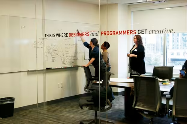
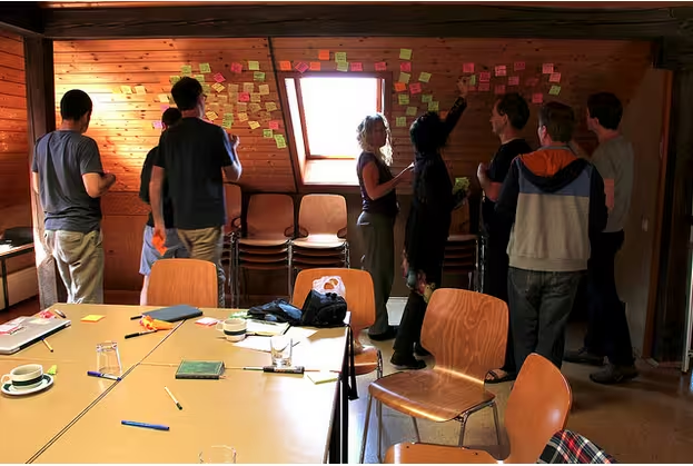
Another way to define your product is to explore any and every possibility. Known as divergent thinking, you want to “think broad to get narrow.” Involve all relevant stakeholders at this early stage (e.g. marketing, sales, engineering, product dev, etc.). Keep things open and flat.
Source: “UX for Good Breakout. WIAD DC. Creative Commons.
Using the “How might we …“ approach, make sure everyone understands the right questions to ask. You’ll want to take a design studio approach to encourage creativity and hold a kickoff meeting with everyone who has an interest in the project. Leave no one out.
A few tips to ensure everyone stays energized during the kickoff (as outlined by Kevin Hoffman):
- Pick a big room. Make sure there’s enough space to accommodate everyone. You don’t want everyone crammed into a tight space where it’s difficult to have one-on-one conversations.
- Everyone participates. A successful brainstorm requires participation. You can involve others by giving them paper and pencils to sketch their own ideas. If they’re shy about drawing, you could even encourage them to write out their ideas instead.
- Set time limits. Hoffman suggests 10-minute increments for discussion and sketching, which we’ve found to be a realistic guideline. You don’t want to give people too much time, or else they’ll start polishing up details when the idea is what truly matters.
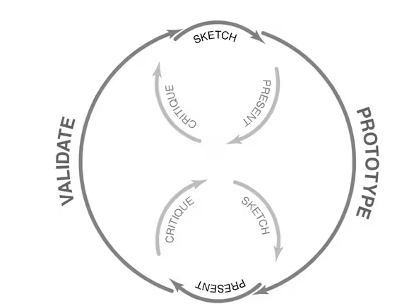
Keep everything focused on the problem at hand. When everyone’s ready, it’s time to present and critique the ideas. Everyone discusses which ideas have potential, and you have the final say in which ideas move forward.
As you come out of the session to iterate on the selected ideas, it’s time to shift to convergent thinking. This will drive your decision making as you begin deciding what elements to keep or toss, how much fidelity, etc.
Build a Prototype
A prototype doesn’t need to be a fancy bit of code. It can be a series of sketches, a paper prototype, a series of mockups or an interactive wireframe.
Prototypes are a great way to build upon those one or two ideas that you’ve narrowed in on. Or, if you’re working with people comfortable with design, you could even encourage paper prototyping in earlier divergent thinking.
Photo credit: User Testing & Design
Prototypes help gauge feasibility as early as possible without expending too much effort or money, which always saves you headaches once you push live.
We’ve discussed several different types of prototype in the free e-book “The Ultimate Guide to Prototyping” Let’s review them:
- Sketch/Paper Prototype: Sketch out roughly the product’s flows and interfaces. Cut them out and you have a paper prototype (with yourself acting as the “human computer”). Product design company ZURB uses this form of lo-fi prototyping as part of their process.
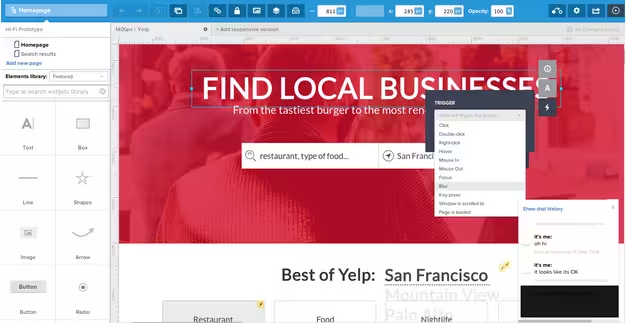
- Interactive Wireframe: Advances in prototyping tools have helped bridge the gap between static wireframes and interactive prototypes. Build your wireframe, then add interactions for a fast prototype. For example, using a tool such as UXPin, you can also create an interactive wireframe that will show the interactions on a page or flow.
- Coded prototype: This is essentially a mockup that’s been done in code and allows you to get a feel for how a product will possibly feel in the wild.
Prototypes put something in your hand to get genuine reactions from stakeholders and users. Using designs is much more powerful than just showing them. You simultaneously verify whether you’re designing for the right problem, and whether your solution is usable.
Test Your Designs With Users
Remember when we said that your relationship with your users is ongoing? Well, here’s where you maintain that relationship.
We highly recommend Google Ventures’ design sprint methodology. They’ve condensed design thinking into a 4-5 day highly-focused, no-BS process. They sketch, develop a prototype, and run fast usability tests with users all in under a week.
Source: “Booksprint Futurish ‘14.” Time’s Up. Creative Commons.
In fact, usability tests are a great way to involve other members of the team that might not have direct contact with user, such as PMs, developers or stakeholders.
By working collaboratively, you’re involving these roles in customer development, giving them a quick reality check. Everyone is forced to question just how much product they need to build, which always helps prevent feature creep. As Jeff Atwood points out, nothing makes products spoil faster than throwing features at it.
Another benefit of involving others is that your team will have a greater sense of ownership over the product. It’s amazing what people can learn when they see real users interacting with something they built.
Here’s a few tips for conducting effective usability tests:
- Test your target users. You want to narrow down your test group to those most likely to actually use your product.
- Come up with a plan. Outline how you’re going to conduct the test, including what you’re testing for, as well as how and when you’ll do it. We recommend Tomer Sharon’s one-page stakeholder summary.
- Ask open ended questions. If you’re conducting a test in-person, you don’t want to ask any leading questions. Give them some breathing room, watch how they behave, then ask careful follow up questions to capture their thoughts.
If you want to learn about further techniques and the different types of usability testing, you can check out the free e-book, “The Guide to Usability Testing.”
Try to conduct a round of usability testing in between each major iteration. For example, if you started with a paper prototype, test it with users before working on a digital mockup. Once you’ve added “skin” to your prototype, test it again to make sure the visual design isn’t confusing. Remember that mistakes not caught in usability testing may cost you millions after launch.
Photo credit: Rosenfeld Media. Creative Commons.
The ultimate goal of design thinking is inserting user empathy at every step. Nothing gets you closer to the user than actually testing your product and watching their behavior and hearing their feedback.
Conclusion
Design thinking may seem like a concept that’s hard to wrap your head around. But it all starts with knowing your users, learning as much as possible about them, exploring wild ideas and putting those ideas into a prototype that you can test with those users.
And if you hadn’t noticed, the common theme in all of these tips is the user. Now it’s time to stop reading this article and go where your users are.
Read Next: How designers earn & keep their seat at the table
Image credit: Shutterstock
Get the TNW newsletter
Get the most important tech news in your inbox each week.
