How do you know if a speaker is any good?
The answer should be obvious. If you like the way it sounds, then it is good. I’m not here to tell you what you like doesn’t actually sound good. But I am here to help you make more educated purchases.
Speakers don’t exist in isolation; most of us want to know we’re getting the best sound for our budget and setup. So how can you tell if one speaker is better than another without direct comparison? How do you know your impressions — or those of reviewers — aren’t being influenced by expectations about a speaker’s price and reputation? And what do you do when you don’t have a chance to listen to a speaker at all before buying it?
That’s when you turn to speaker measurements and objective data. Knowing how tounderstand frequency response graphs is one of the most valuable skills an audiophile can have.
Lucky for us, speaker engineers and psychoacoustics researchers have been studying the nature of ‘good sound’ for decades. This research has led to powerful insights which show that, to a substantial degree, your preference for one speaker over another can be predicted by data — frequency response measurements in particular.
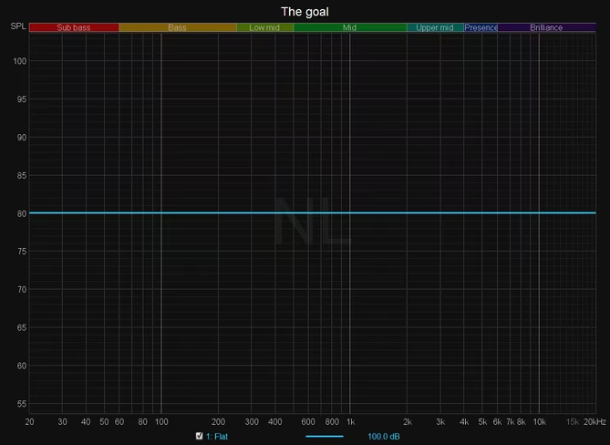
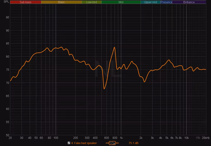
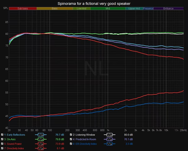
My hope is that by the end of this article you should be able to look at a graph like this…
…and know whether you are likely to enjoy the speaker it represents. This same graph can tell you what some of the speaker’s audible coloration and flaws might be.
Most of what I know comes from reading what I consider the most important book for any science-loving audiophile: Sound Reproduction: The Acoustics and Psychoacoustics of Loudspeakers and Rooms. Written by Dr. Floyd Toole, perhaps the most renowned expert on the psychoacoustics of speakers, it summarizes decades of research on acoustics and listener preferences.
I’ve since measured dozens of speakers and have found a remarkable correlation between my listening impressions and measurements, which are almost always performed after weeks of hearing the speaker in my own living room. This guide will hopefully help you understand how to correlate that data with your own impressions too.
Okay, so why should I care about measurements? Can’t I just read the review?
Some audiophiles believe listening to a speaker is the only way to know if a speaker is any good. We all have different tastes in music, after all, so surely speakers are the same?
The problem is, when it comes to sound reproduction, not music, you’re probably not that special.
Research suggests that a significant majority of people will rank speakers similarly once you eliminate variables like a speaker’s price, reputation, or aesthetics. The gold standard of this preference research is the double-blind comparison.
In these listening tests, 2-4 speakers are placed behind an acoustically transparent screen, and neither the listeners nor researchers know which speaker is playing music. In the most advanced implementations of these tests, listeners can switch speakers on the fly using a machine that can swap speakers in less than four seconds. This video gives you an idea of how Samsung-owned Harman Audio performs its double-blind speaker tests:
Two of the most important studies on speaker preference were published in 2004 by Harman researcher Dr. Sean Olive (who worked with the aforementioned Dr. Toole). In the first one, a tightly controlled study with 13 speaker models, Olive found preferences could be correlated with comprehensive on and off-axis measurements to essentially 100% accuracy.
A second, more generalized study with 70 speakers found it could predict speaker preference from measurements to approximately 86% accuracy. And these are just two studies of many suggesting similar results over the past few decades.
Though the research isn’t without flaws, these are remarkable results. Imagine if you had that kind of predictive power with all of your purchasing decisions — if you could look at a graph or two and be reasonably confident you would prefer a certain phone, TV, laptop, microwave, bike, or whathaveyou over another. While you can of course compare the data for any of these devices, it’s rare to have research to correlate that data directly to preference.
With speakers, we have that rare luxury. I’d go so far as to say that speaker measurements are more important than written reviews — if you know how to interpret them, anyway. I’d be completely happy if the people who read my own reviews skim over my written listening impressions and jump straight to the measurements and analysis.
Although measurements are most useful when combined with listening, listening impressions alone are fickle and subject to biases — and even your mood that specific day. Meanwhile, properly performed measurements can be replicated across different measurement rigs to a high degree of repeatability. Knowing how to read measurements gives you a much better chance of buying something that you know you’ll like.
So which speakers are the best?
Double-blind tests have consistently shown the best-performing speakers tend to exhibit three qualities:
- Flat-ish frequency response on the primary listening axis. This is the frequency response as measured in anechoic conditions (free of reflections) in order to isolate the sound that travels directly from the speaker to your ears in a line of sight. The is often called the ‘on-axis‘ sound.
- Smooth ‘directivity’ or ‘dispersion.’ This is how the speaker’s frequency response changes at angles away from the primary listening axis. This is important because a speaker’s sound is affected by both the direct sound and the sound that reflects off our walls. This is often called the ‘off-axis‘ sound.
- Ample bass extension. Few speakers extend all the way down to 20Hz, so it’s an improvement when these frequencies are present. You could argue this is just another facet of a flattish frequency response, since missing bass means the frequency response is no longer flat within our entire hearing range (roughly 20 Hz to 20 kHz).
There are other things that can have an influence at the highest levels of performance, but these three qualities are by far the most important.
It usually doesn’t matter what type of listener you are. Engineers, researchers, audiophiles, reviewers, and everyday consumers tend rank speakers similarly in double-blind tests, even if their listening skills differ.
Personal taste doesn’t completely disappear, but the best speakers do trend toward having the above qualities. It doesn’t matter if they’re studio monitors or hi-fi speakers. The basic acoustic principles remain the same.
What does a great frequency response look like?
A flat line.
That’s it?
I mean, basically.
So why aren’t all speakers flat?
Because it’s really hard to do right. Also, some designers don’t agree with the science mentioned so far and prefer to tune things ‘by ear.’ And most speakers can’t extend all the way down to the lowest bass frequencies.
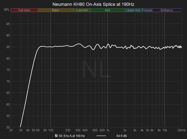
Still, aiming for flat is a good goal, one that means that the speaker is likely to reproduce the recording accurately. To give you a more realistic idea of what to expect, here’s an actual speaker with one of the flattest responses I’ve measured.
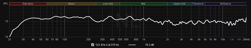
This is fantastic performance; flatter than this and you are pushing the limitations of my measurement system. Here’s another one, albeit with less bass output:
There are some things you should know though.
When I say ‘frequency response,’ I again mean the anechoic on-axis response — a measurement that does not include the effects of room reflections. This is the direct sound that heads from the speaker straight to your ears in a direct line of sight.
The most popular methods for capturing an anechoic response include an anechoic chamber, a fancy robot called the Klippel Near-Field Scanner, or a less accurate DIY method called a ‘quasi-anechoic‘ measurement to eliminate reflections from data. I use the latter method because I ain’t got that kind of money.
The anechoic response is important because although rooms do affect the sound of a speaker, our ears are quite good at hearing a speaker ‘through’ a room (especially above the bass frequencies). This is much the same way you can tell your friend’s voice apart from someone else’s whether you are in your apartment, a restaurant, or an airport.
Perhaps more importantly, studies show that even if speakers sound a bit different in different rooms, people will tend to rank them similarly regardless of the listening space.
How do I understand deviations from flat?
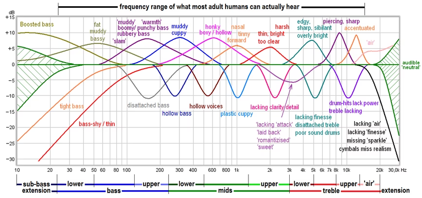
Frequency response is typically divided into the lows/bass, mids, and highs/treble. Different sources divide the frequency ranges differently, but generally speaking, 20-250 Hz covers the bass, 250 to 2,000 or 4,000 Hz covers the mids, and everything above is the treble.
If the frequency response dips in a certain region, it means that part of the sound will sound quieter during playback. If it is higher, that region will be more audible. For example, this fictional (very bad) speaker…
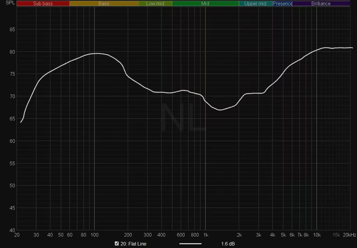
…might be described as having an exaggerated bass, a recessed midrange, and/or bright treble. A bit of deviation in any single region isn’t necessarily a bad thing — sometimes a bit of extra bass is even enjoyable for the extra tactility — but the presence of multiple broad deviations is a problem.
If you want to get more nitty-gritty about how deviations in different frequency ranges affect different parts of sound, here’s a handy chart from DIY-Audio-Heaven:
And here are how different instruments correspond to different frequency ranges, courtesy of the Independent Recording Network (an interactive version here):
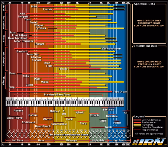
(In case you’re wondering why the piano only goes up to the mids, it’s worth noting that ‘treble’ as used in acoustics does not necessarily line up with treble as used in music.)
A few more things to keep in mind. Firstly, it’s worth noting peaks in the frequency response are generally a bit more audible than similarly-sized dips.
Second, a large, shallow dip or dip or bump in the frequency response is often more be audible than a narrow dip or peak. This is because while we can be very sensitive to changes of less than 1 dB in the frequency response, we’re more likely to hear them when the deviation covers a wide range of frequencies.
Lastly, most people can’t hear very well beyond 10kHz, and our hearing gets worse the older we get and the louder we listen to music. There also isn’t much music content up there. While it doesn’t hurt to keep this range flat too, deviations in this region are less likely to be problematic than most other places in the frequency response.
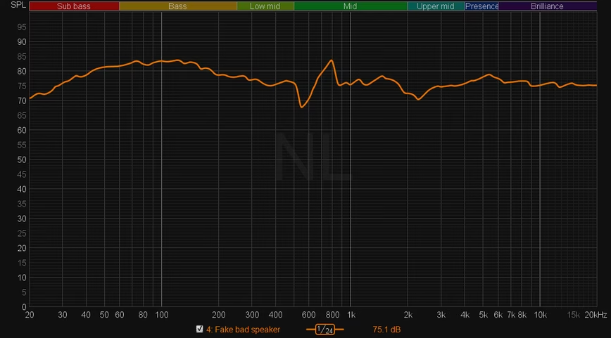
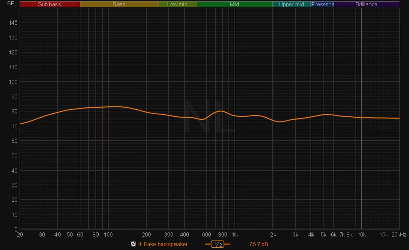
I saw a manufacturer post a super smooth frequency response! That’s good then?
It might be good. There are two things you should be particularly careful about when looking at a frequency response chart especially when it’s posted by a non-independent party like a manufacturer.
Vertical scale
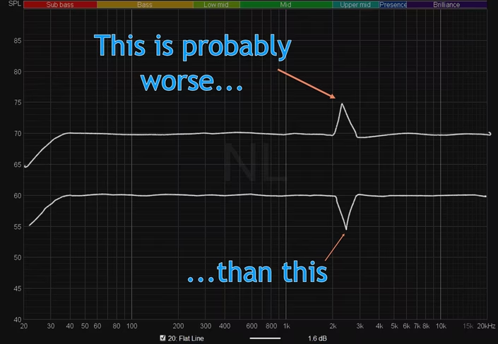
One of the easiest ways of tricking someone into thinking a speaker is better than it is by using an exaggerated vertical scale. A typical standard, and the one I use for all of my measurements, requires 50 dB on the Y-axis to be equal length to the distance between 20Hz and 2kHz on the X-axis.
This aspect ratio highlights flaws more than most measurements posted online. But here is the same exact measurement with a compressed Y-scale:
That looks way better than the speaker actually is. You should always look at the Y-Axis scale before making an assessment about a measurement.
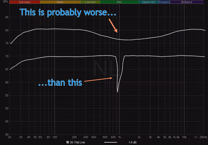
Smoothing
It’s exactly what it sounds like: smoothing out the frequency response. For example, I use 1/24 octave smoothing, and generally don’t like to see anechoic responses using more than 1/12 octave smoothing.
But it’s common to see measurements at 1/6 to 1/2 smoothing to hide flaws and make a measurement look prettier. Combine a tall vertical scale with smoothing, and you can easily clean up a messy speaker. Here is the same measurement again with both a compressed Y-axis and exaggerated smoothing.
Smoothing can be useful for assessing trends while ignoring harmless minor deviations, especially for in-room measurements. But when it comes to anechoic measurements, it should only be used in conjunction with higher resolution measurements.
Luckily, it’s usually pretty easy to spot smoothed measurements because they look unnaturally smooth. Even the best speakers have some jagged bits to their measurements.
Tell me more about that ‘smooth directivity’ stuff
When we listen to speakers in a room, we don’t just hear the sound that travels in a straight line towards our ears — what we call the direct sound. A speaker emanates sound in all directions, and indoors, these ‘off-axis’ sounds will eventually reach our ears after reflecting on a variety of surfaces.
For a small time window of a few milliseconds, some delayed sounds actually contribute to the tonality of a speaker. The strongest contributions typically come from the very first bounces off of your walls, floor, and ceiling; we call these the ‘early reflections.’
It makes sense if you think about it — and not just with speakers. After all, why don’t we hear all the reflections when someone is speaking in a small room?
It’s because that’d be annoying and we could never understand each other or pinpoint where sounds are coming from. So instead, our brains ‘add’ these loudest reflections to the direct sound to create a single apparent sound source (thanks brain!). It is not until the reflections are delayed for much longer that we hear them as distinct sounds, (think echoes and reverb in a large venue). You can learn more about this phenomenon by reading up on the precedence effect.
You can hopefully now see why having high-quality early reflections is important. If the direct sound is perfectly flat but the cumulative early reflections have a large dip in the midrange, for example, the speaker will sound like it is recessed in the midrange to at least some degree. Likewise, a speaker’s spatial presentation or soundstage tends to become fuzzier and less stable when the early reflections do not resemble the direct sound closely.
One important thing to note: Because our ears are horizontally aligned, having smooth horizontal directivity is important for both soundstage and tonality. That’s why vertical directivity is usually worse than horizontal directivity; it has less of an impact on the soundstage, so speaker designers don’t usually optimize for it, although it still makes important contributions to tonality.
Nonetheless, when people say ‘smooth directivity,’ they’re usually focusing more on the horizontal portion.
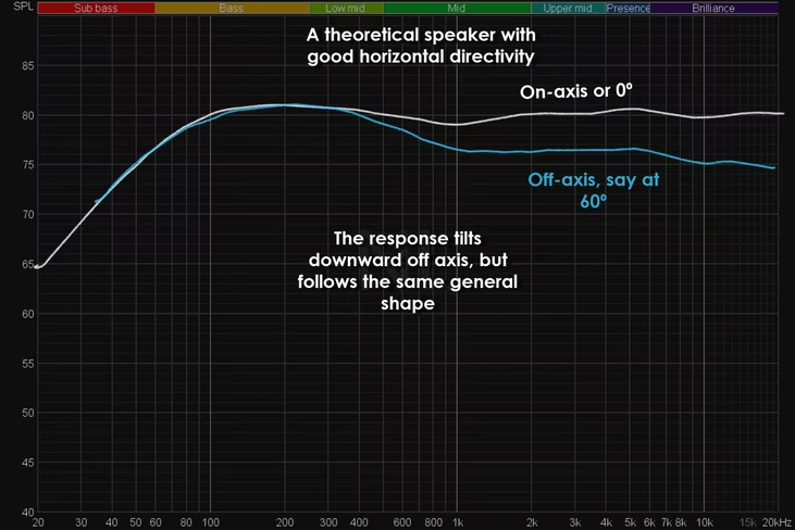
What does smooth directivity look like?
There are many ways of displaying a speaker’s directivity performance. The most basic way — and my preferred method — is by simply graphing a speaker’s frequency response at different angles.
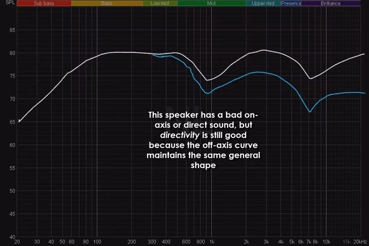
A typical speaker will have a frequency response that tilts downward as you move further away from the on-axis sound, but it should maintain the same basic shape. Here’s a fictional speaker at 0 and 60 degrees off-axis:
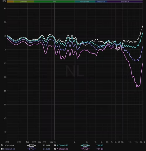
Now here is a more typical off-axis graph of a real speaker (a very good one):
You can see the response changes smoothly as you move further away from the on-axis sound. Usually, only the front hemisphere is included because it makes the largest contribution to the sound.
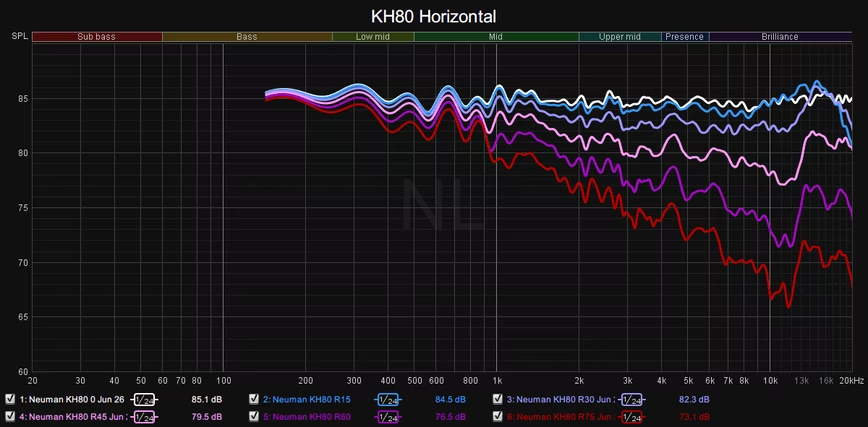
Now here is a speaker that does not have good horizontal directivity:
(You don’t usually see speakers quite this bad nowadays, but they do exist.)
Even though it maintains a fairly linear direct sound, that off-axis dip suggests that the soundstage will be fuzzy and/or unstable, likely to fall apart if you are not perfectly centered in front of the speaker.
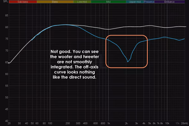
Here’s one more situation. What happens if the direct sound is awful, but the directivity is still good? It might look something like this:
This speaker will clearly have compromised tonality due to the large dips in its response, however, the relationship between the on-axis and off-axis curve is nonetheless still smooth. In practice, this would likely lead to a speaker with uneven tonality but a good soundstage.
For reasons beyond the scope of this piece, the good thing about such as speaker is that you might very well be able to apply EQ to them to fix their tonality. Bad on-axis frequency response can be fixed with EQ, but bad directivity cannot; it is inherent to the speaker’s design.
It’s worth noting that a speaker can have ‘good’ directivity in different ways. For example, some speakers will opt for ‘wide directivity,’ which shows up on a graph as measurements that tilt less off-axis. Other speakers have ‘narrow’ directivity, which means a more tilted off-axis response.
There aren’t strict definitions for what is narrow and what is wide, so these terms are best used when comparing two speakers. Neither is better than the other, and this is just a matter of preference and interaction with your room.
Wider directivity speakers mean louder reflections, which tends to mean a larger soundstage at the expense of some imaging precision. Narrower directivity speakers may have more focused imaging, but a smaller soundstage.
For example, this speaker…
…has wider directivity than this speaker…
…as the response on the former doesn’t tilt as much. You can see how by 60 degrees (the pink line), the latter speaker’s response has tilted downward much more. I’m simplifying things a bit, but this suggests the wall reflections will be quieter, and the speaker will likely have a narrower, but perhaps more ‘precise’ soundstage.
There are other ways of demonstrating directivity, with the most common alternative being a polar map (sometimes called a contour plot, heat map, or beamwidth graph). Here’s an example of a great speaker:
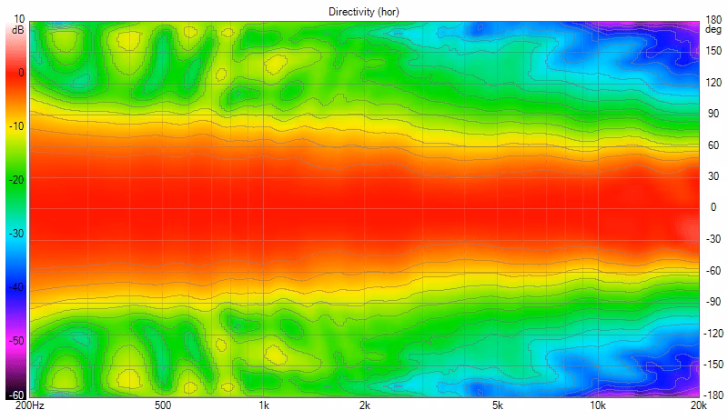
You can read more about these here.
Many times directivity measurements will also be ‘normalized’ to the on-axis response meaning that rather than showing the true response at off-axis angles, they show how much the measurement varies compared to the on-axis.
Frequency response and directivity together: What is a ‘spinorama?’
The single most important graph you’ll see me use in my reviews is called a ‘spinorama,’ so-called because creating one requires rotating a speaker about its horizontal and vertical axes to capture the frequency response at 70 angles.
It’s a measurement format that has become increasingly popular in the past few years among objective reviewers, developed by the researchers at Harman and now part of the ANSI/CTA-2034-A standard for speaker measurements.
It is basically a speaker measurement Cliff’s Notes, summarizing a speaker’s frequency response and directivity in one handy image. Although analyzing a speaker’s performance can require some nuance, and comparing two very good speakers may require more information than present in the spinorama, this singular graph is usually enough to separate the ‘good’ speakers from the ‘bad’ speakers.
Here’s my summary of what each of the above lines means (note that the colors are not standardized, these are just the ones I typically use).
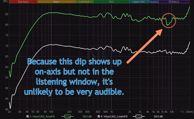
The On-Axis (green) and Listening Window (white) curves represent the ‘direct’ sound of the speaker before any reflections, and they should be relatively flat.
The On-Axis is measured with the speaker aimed directly at the microphone. The Listening Window is an average of 9 angles (H represents horizontal, and V represents vertical): 0°, ± H10°, ± H20°, ± H30°, ± V10°.
The Listening Window accounts for the fact most people don’t sit perfectly still or centered, so it is generally the more important of the two, especially for living room listening. It also helps eliminate inaudible deviations in the frequency response that sometimes only show up when the microphone is exactly on-axis.
As the first and loudest sound to arrive at our ears, the direct sound has a huge impact on our perception of tonality. The other curves, meanwhile, represent the ‘off-axis’ sound — the sound that will reflect off your walls.
The Early Reflections curve (blue, top) is particularly important, as discussed earlier. It is calculated by taking the average of five averages, each representing the sounds that are likely to reflect off the walls in most rooms:
- Front: 0°, ±H10°, ±H20°, ±H30°
- Side: ±H40°, ±H50°, ±H60°, ±H70°, ±H80°
- Rear: ±H90°, ±H100°, ±H110°, ±H120°, ±H130°, ±H140°, ±H150°, ±H160°, ±H170°, 180°
- Ceiling: ±V40°, ±V50°, ±V60°
- Floor: ±V20°, ±V30°, ±V40°
The ER curve should generally tilt down a few dB from 20Hz to 20kHz; how much will depend on the speaker’s directivity characteristics. The most important thing is that its shape roughly matches the direct sound, indicating the reflected sounds are similar in character.
The Sound Power curve (red, top) represents an average of the speaker‘s sound in all directions. It’s not as useful as the other curves for speakers that mostly radiate sound forward, but it should generally look like an even steeper version of the ER curve.
The Predicted In-Room Response curve (purple) estimates how a speaker will measure in a real room by combining data from the LW, ER, and SP curves. It is, in a way, a refinement of the ER curve. For the majority of speakers, the PIR curve looks very similar to the Early Reflections curve but tilting a tiny bit more, so it is often omitted.
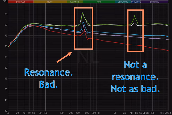
If there is a bump in the response that persists in each of the top curves, it is likely to be a resonance in a speaker. Resonances are bad, as they tend to be extra audible, often the cause for a specific type of boominess or harshness in a speaker.
The Directivity Index (red, bottom) and Early Reflections DI (blue, bottom) curves tell us how similar the off-axis sound is to the direct sound. These are calculated by subtracting the Sound Power and Early Reflections curves from the Listening Window, respectively.
Smooth DI curves are a quick and easy way to assess directivity performance. However, one flaw of the spinorama standard is that it does not distinguish between horizontal and vertical performance when the latter is more important for the soundstage.
For this, I personally choose to calculate a ‘Horizontal ERDI’ (yellow, dashed) which only considers the horizontal elements of the ERDI curve. This line in particular should be very smooth for a good soundstage.
An ideal spinorama might look something close to this:
But again, no speaker is quite this good. Meanwhile, a godawful spinorama might look something like this:
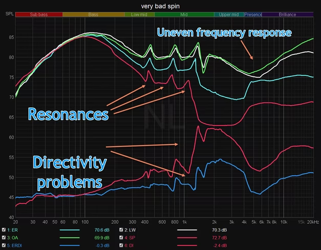
Thankfully, I haven’t seen a speaker quite this bad.
So are frequency response and directivity everything?
No, but they sure get you really close to the full story.
You might’ve noticed I’ve said nothing about distortion so far, the classic audiophile bugbear. That’s because quantifying what qualifies as ‘bad’ distortion is really hard. There’s no reliable research I’m aware of that shows a clear link between a certain amount of distortion and speaker preference.
In the aforementioned preference studies, distortion was measured for each speaker but was found to have few links to preference.
Moreover, the types of distortion measurements available to most reviewers are fairly rudimentary. And while distortion may sometimes correlate with some artifact you’re hearing, more often than not it can be described by something in the frequency and directivity.
To quote Dr. Toole on the subject:
“The result of this is that traditional measures of harmonic or intermodulation distortion are almost meaningless. They do not quantify distortion in a way that can, with any reliability, predict a human response to it while listening to music or movies. They do not correlate because they ignore any characteristics of the human receptor, itself an outrageously non-linear device. The excessive simplicity of the signals also remains a problem. Music and movies offer an infinite variety of input signals and therefore an infinite variety of distorted outputs. The only meaningful target for conventional distortion metrics is “zero.” Above that, somebody, sometime, listening to something, may be aware of distortion, but we cannot define it in advance.”
When it comes to distortion, I personally only worry about it if I can clearly hear it.
Although not distortion in the traditional sense, one type of deviation to keep in mind is what is often colloquially referred to as speaker ‘compression’ or a ‘limiter.’
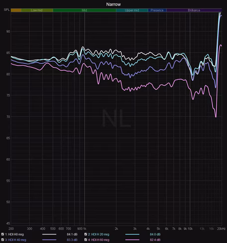
Many modern speakers with built-in amplifiers use DSP to push bass performance beyond what they’d be able to do in a traditional design. In these situations, the DSP is programmed to reduce bass output once you turn up the volume beyond the speaker’s comfort zone. This means that the speaker’s frequency response will actually change significantly at different volumes (directivity remains the same). In these situations, I will typically capture a frequency response at different levels to give you an idea of the speaker’s output.
Lastly, I want to reiterate that this article is about a speaker’s anechoic performance. Below 300-500Hz, the room begins to have a larger effect, and it has a massive impact on a speaker’s bass performance. I’ll have a separate write-up on optimizing a speaker’s performance in-room.
I’d like to learn more!
Even if you don’t agree that a flat speaker with smooth directivity sounds best, you still benefit from knowing how to interpret measurements. Let’s say you know you prefer a little more treble and bass than most, perhaps because you have hearing issues or like to listen very quietly (bass is harder to hear at low volumes); measurements can still tell you that too!
So if you want to learn more, I can’t recommend Dr. Toole’s book enough. It provides an incredible wealth of knowledge with myriad citations. If you have an hour to kill, you can check out this lecture which summarizes many of the concepts:
My friend Erin over at Erin’s Audio Corner just released an excellent and comprehensive series of videos describing measurements and more:
As did Audio Science Review:
If you want to know where to find more speaker measurements and perhaps try the data with your own impressions, here are some other resources that publish extensive frequency response and directivity measurements — some of them with spinoramas, some in other forms.
- Audio Science Review
- Erin’s Audio Corner
- Audioholics
- Speakerdata2034
- Spinorama database by Pierre Aubert
- Stereophile
- Soundstage Network
- Sound & Recording (German)
- AudioXpress
There might be others I’m missing, but hopefully, this provides a good selection of resources to get started. Better yet, the amount of available speaker measurements is increasing all the time. It’s a great time to be an audiophile — at least one who sees value in the data.
Get the TNW newsletter
Get the most important tech news in your inbox each week.