
When working with developers you really need to see things from their perspective. By learning the basics of how development works you’ll gain a better foothold to expand your ideas into dev-related territory.
As a designer, it’s your job to not only create usable interfaces but to clarify how they work to the people building them. Strive to build sanitized mockups that anyone could understand. In fact, you should even maintain a style guide to act as documentation for each project.
Photo credits: OpenSourceWay. Creative Commons
This piece covers more “big picture” design tips along with some tools for improving designer & developer communication. All parties should actively work towards clarifying their intentions and seeing each problem from the others’ point of view.
The following tips & tricks should help you see design from the developer’s side and foster a more free-flowing collaborative environment.
Follow Good Hygiene for Visual Design
As a designer, you’re obviously expected to create high-quality flat and interactive designs, but the delivery method affects the quality of final implementation. When it comes to good design hygiene, make sure you’re thinking about what developers need (not just your own organizational preferences).
Photo credit: Brett Jordan. Creative Commons.
Organize individual resources into folders so that developers know where to find items like icons and font files. Beyond just web-based resources, you should also consider adding HEX codes for colors and possibly demo content with actual text (no Lorem Ipsum).
As described in the free guide Web UI Design Best Practices, here’s a small list to get you started:
- Include hover states and describe animations as clearly as possible (either verbally in a quick over-the-shoulder meeting, or as notes affixed to early wireframes).
- Create diagrams and/or storyboards to convey where each link should lead.
- Label each font family and include 3rd party files for any webfonts. Check that all paid fonts also have proper licenses for Web use.
- Graphics, tiles, icons, and photos should be appropriately named and organized. It’s better to format these files yourself rather than expect developers to do resource management.
- Include HEX codes for all colors and gradients.
Treat Style Guides as a Collaborative Tool
When it comes to implementing these details consistently in your designs, you’ll find that style guides are an excellent tool for designer and developer collaboration.
Designers can see how to create reusable UI patterns (down to the atomic components like button treatments and labels), while developers have a quick visual checklist and can even speed up their implementation if the style guide includes reusable code snippets.
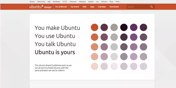
Source: Ubuntu
Style guides are a solution to design pandemonium. These guides are created as either HTML pages or PDFs which contain information related to a company’s brand, color scheme, graphics, fonts, and other similar features.
Here’s some of the benefits of creating a style guide:
- Consistency – Style guides organize a cohesive design that reflects a common visual language. Visual and interaction design elements like color palettes, font families, and animations contribute to a unified user experience.
- Context – Specific ideas can be expanded upon at length to codify design choices. Great style guides won’t just show a tab-based page and scroll-based page but will also explain the proper context for both. As an example, Jawbone uses a scroll-based page for storytelling and a tab-based page for product customization.
- Collaboration – A reference manual for each member of the team ensures that everyone is on the same page. Collaboration becomes easier with fewer repeat questions. Style guides also streamline communication by creating a project vocabulary(i.e., defining what a “widget” or a “module” should be).
- Code standardization – Front-end style guides help to standardize HTML, CSS, and JavaScript so that designers and developers can test if a new idea deviates from established standards. These guides also provide vocabulary and mini-templates for adding similar interfaces onto different pages.
When debating a PDF vs HTML style guide, you must consider the project’s medium. All Web/mobile UI projects typically choose the HTML route because it’s much easier to update and they feel more natural to developers.
In fact, you can take your HTML front-end style guide a step further and make it a live style guide that actively updates your site’s code as you modify the style guide. For developers and designers, live style guides are therefore less of a separate document that requires maintenance and more of a connective step for design iteration.
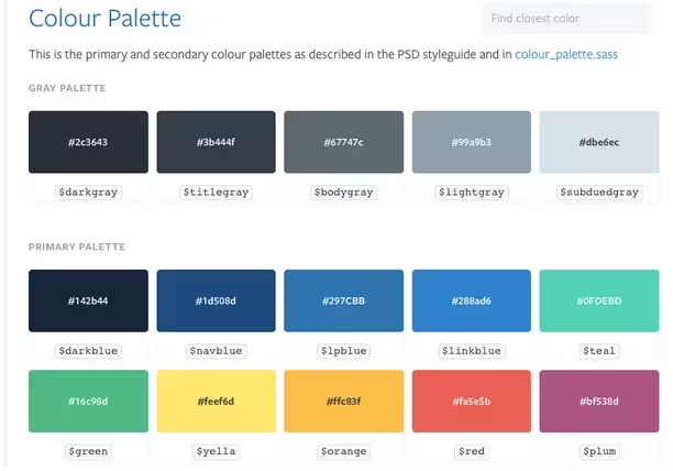
Source: Lonely Planet
On the other hand, PDF style guides aren’t as useful in a Web and mobile context – you usually see them used for projects like magazines, advertising, video production and/or animation studios. PDF guides also require digital resources but they’re typically stored in .zip files or burned to CD-ROMs/ISO files.
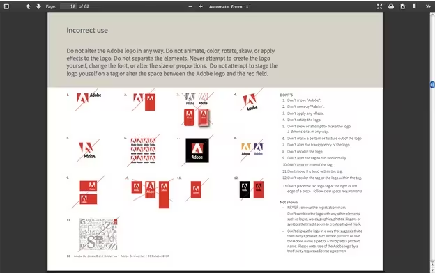
Source: Adobe
While PDF guides can be hard to come by, there are plenty of HTML style guides to be found online. Take a peek at these front-end style guide examples to see how they’re designed and how content is organized on each page.
- WooThemes – The beauty of WooThemes’ style guide is that everything feels connected and relatable since its all on a single page.
- MailChimp – This style guide’s interface is palatable to both designers and developers. The live examples and code snippets accentuate the free-flowing nature of this guide’s content hierarchy.
- Disqus – Information is condensed together and visible from a single page with dynamic hover effects.
- Primer CSS – All content is heavily structured and the vertical menu makes navigation quick and effectual.
- Lonely Planet – A technically elegant version of a live style guide that updates the site via API call.
- Mapbox – The Mapbox style guide features everything from CSS styles to animation and even instructions for writing page copy.
If you’re looking for more examples, take a look at StyleGuides.io which has a large gallery of Web-based guides (both traditional HTML style guides and more cutting edge live style guides).
Share Ideas with Style Guides
Style guides are equally helpful for designers and non-designers.
Developers can take full advantage of these guides because they’re like documentation for design resources. The best style guides cover only what’s necessary by providing guidance for anyone from development to marketing and even management.
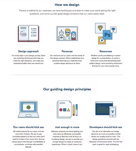
Source: Atlassian Design
As months and years pass by, employees switch positions or even leave a company. Teams tasked with updating an older project won’t always be able to just lean over and ask the original designer about colors or typographic choices.
When you dedicate time to creating and updating a style guide, you drastically reduce the amount of repetitive questions and discussions down the line (which naturally improves collaboration).
When creating a style guide, consider the following topics:
- Logo Styles – Proper size, colors, placement, white space, and positioning of the logo. Include alternate logo designs and icons/brand mascots if needed.
- Color Schemes – List all color choices and how they relate to the design. Include codes to reference these colors in either RGB, CMYK, or Pantone®.
- Navigation – Include all rules related to navigation, such as the use of search boxes, sidebars, links (if not covered in the typography section), and menus and drop-downs (i.e., what is the appropriate range of items to include).
- Fonts – List which typefaces fit into the design and in which locations. Try to include a character chart for all letters A-Z, a-z, 0-9, and symbols. Fonts that require licensing should include links to online font foundries.
- Graphics – Include any graphics related to the brand such as icons, buttons, symbols, favicons, tileable backgrounds, or vector artwork. If these items are listed in the style guide be sure to reference where actual PSD/AI files are located in the cloud or server database. Also, make sure to describe the details of execution: for example, the alignment and position of images, how to overlay text on images, etc.
- Layouts – Print and Web style guides often include sample templates for grids, margins, and different compositions.
- Reusable Code – Code doesn’t have to be an individual section (you can attach the snippets in the relevant sections). Style guides should include both CSS classes and IDs in the snippet samples. Ideally, the developers should be able to copy and paste what they need.
- Identity & Personality (extras) – Include details regarding voice & tone of the copy, the overall design persona, and anything else that describes the overall emotional goal behind the design.
The larger your product team, the more you’ll want a detailed style guide as a rallying point for designers and developers (which really comes in handy when they might not even work on the same floor anymore). In some cases, you might prefer to build separate guides relating to individual areas of design(ex: copywriting, print, Web, etc).
Take an Interest in Development
If you design interfaces, then you’re in the business of creating usable designs. Even if you never expect to learn development, it’s still a good idea to take an interest in the process. While you may not be wrist-deep in code, you’re still working in a field that requires coding.
Photo credit: Michael Coghlan. Creative Commons.
As explained in The Designer’s Guide to Collaborating With Developers, a comparable analogy for learning about development could be learning about computer hardware. Although you may never install a new graphics card or upgrade your RAM, it’s good to understand how these things work and how they affect your workflow.
So while you may never fully understand how to write CSS or JavaScript, you should understand how they affect your workflow.
Another analogy comes from this UX Stack question discussing the value of a UI/UX designer learning JavaScript:
“An architect that only knows how to use the pen can still be a good architect, but one that also knows how to pick up a hammer tends to have better insight into the types of building solutions one can come up with.”
A better understanding of development naturally improves collaboration. For example once you understand the CSS box model, you’ll be forced to see mockups as if they’re built with CSS box containers.
Then you’ll be able to craft more specific design ideas and convey them in a native tone that developers understand.
Let’s take a look at a few ways to understand development as a designer and how to communicate developer-friendly ideas.
Understanding Development as a Designer
There’s a careful balance to be found between learning how code works and learning to code. As a designer, you should mostly be interested in the former topic by studying the core fundamentals of development.
When designing mockups you should be able to “see” how they can be built from a developer’s perspective. For example, an input field is created using an HTML tag and styled with CSS.
You don’t need to know how to write this code but you should know the basics of how form inputs are generated.
If you’re stumped on a particular subject don’t be afraid to reach out to developers for support. Consider studying a few of these ideas to help you speak in a way that developers understand:
- How HTML tags are nested and rendered in the browser
- The basics of CSS and how it differs from HTML
- How CSS properties are used to create effects like box shadows
- Which elements can be created using pure CSS vs. which elements require images
- How breakpoints work in responsive website layouts
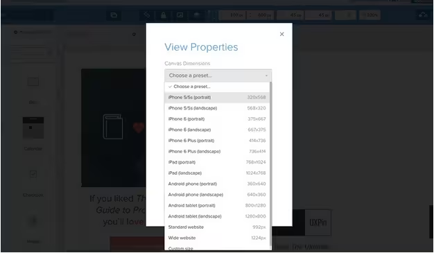
Photo credit: UXPin
If you love UX design, then it’s a good idea to expand into JavaScript as well. You don’t need to understand how to write variables or functions, but you should know a little about how JavaScript interacts with HTML elements on the page.
Communicating Dev-Friendly Ideas
Talking about ideas can be one of the most confusing aspects of the creative process – but it doesn’t need to be that way.
Developer-friendly ideas must be described in a practical manner. Brad Frost’s method of atomic Web design (composed of five tiers from atoms to complete pages) breaks down each interface into logical building blocks.
This way, you can explain how users should interact with each individual block, and how these interactions affect others elements on the page.

Photo credit: Bhaskar Peddhapati, Creative Commons.
Most developers are able to look at a live interface and understand how it works. We always recommend explaining your ideas with live examples to help developers better visualize how the final interface looks and behaves.
Since most developers know how to rebuild any interface from scratch, live examples improve comprehension and retention rate for future discussions.
In UXPin, for example, you could send a preview link of your prototype to developers for instant feedback. To explain the design, you can either annotate specific elements or, better yet, just hold a quick over-the-shoulder session to review any possible pain points.
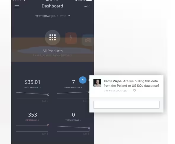
To learn more, we recommend this piece by Smashing Magazine which elaborates on 6 practical tips for communicating with developers.
List of Useful Design Collaboration Tools
Team collaboration is a complex process requiring communication, brainstorming, task management, and design presentation. While it’s possible to coordinate these efforts separately it can be much easier to rely on tools specifically crafted for these individual tasks.
We’ve compiled some of our favorite tools below.
- Google Drawings – Visual notes and ideas can be organized simultaneously with Google Drawings. This plugin runs in Chrome but can also work offline without Internet access. This can also tie into Google Drive for sharing ideas with other team members.
- Cage App – This in-depth dashboard app provides everything for smooth project management. Teams can share files and comments during every stage of the process while staying up-to-date with the latest changes.
- UXPin – Allows for low-fi to high-fi design in one tool, turns wireframes into prototypes easily, integrates with Photoshop and Sketch, supports in-app usability testing, and allows for easy collaboration and co-creation between teams.
- Slack – Large teams need large communication tools. Slack is one such tool built around 21st century communication among creative teams. All chat logs are saved and searchable from the Web dashboard and proprietary mobile apps.
- Trello – Many teams and individuals consider Trello the best free task management tool. Set schedules, share responsibilities, leave notes, and manage project files all within the same dashboard – for free!
- Asana – Asana is a more detailed project management tool. Their platform integrates with all smartphones and includes support for multiple teams with multiple projects.
- Conceptboard – Ever needed an online scratch board for taking notes? Conceptboard provides interactive workspaces with draggable elements and multi-user commentary. It’s great for everything from early brainstorming to final presentations.
Wrap-up
When working on large enterprise projects everyone on the team should be involved in all stages throughout the entire process. The best way to achieve smooth collaboration is through the use of tools and relatable terminology.
Every designer should familiarize themselves with the development process. An underlying knowledge of how interfaces really function can improve the quality of design mockups.
Similarly developers should become familiar with design language and style guides to communicate their ideas visually.
Open collaboration and communication is the best way to push through project work by maintaining a concrete level of focus. Hopefully these tips and resources will help you & your team members work together in unison with greater focus on each phase of a creative project.
For more tips on collaborating with developers, check out the free Designer’s Guide to Collaborating With Developers. Across 70+ pages, you’ll get real-world advice for including developers in all different stages of design: planning features, wireframing, prototyping, mockups, and testing.
Read Next: How to personalize your UX design without being creepy
Image credit: Shutterstock
Get the TNW newsletter
Get the most important tech news in your inbox each week.


