
There’s a thin line between getting to know your user, and stalking them. But if you can find that sweet spot of using enough user data to help them, they’ll love you for it.

Source: Netflix
Personalization is a shortcut to building a bond with your user, all thanks to special privileges through cookies and technologies like geotracking. In fact, not taking advantage of personalization can harm your site, as shown by a 2013 Janrain study.
Personalized UX makes your design feel intelligently alive. In this piece, we’ll explain the difference between personalization and customization, helpful tactics for personalizing the UX without feeling creepy, and analyze a few helpful examples.
The Peril of Being Too Personal
As warned in UX Design Trends 2015 & 2016, too much personalization makes users uncomfortable.
Much like in-person interactions, there is a limit to the intimacy people are comfortable with when first meeting. And, also like in-person interactions, over time these limits relax more and more. User testing helps determine the proper amount your target users prefer, as will this helpful research pulled from an Accenture customer survey on personalization.

Photo credit: David Blackwell. Creative Commons.
Moderation in all things is a good rule of thumb for personalization.
Abusing the availability of user data, especially intimate information like true age, will likely just creep people out when used in the wrong context. Don’t serve up a personalized experience just because you can – make sure it actually benefits the user.
Understanding Personalization vs. Customization
Before we get into personalization tactics, it’s helpful to know the difference between personalization and customization. Both serve different, but equally important roles in UX.
Personalization
Personalization refers to giving the users what they need without them having to ask for it. It is an intelligent UX that learns and adapts to the user based on behavior.
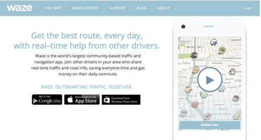
Source: Waze
A great example of personalization is the traffic and navigation app Waze, which pays close attention to usage patterns. If you leave work every day at 6pm, then at 6pm the app will ask you if you’re heading home. Personalization is perfect for this context when you consider that users are tired and want to get home to relax as quickly as possible.
The user doesn’t have to repeatedly input the same data, the app just knows. By shaving off a few steps, Waze makes life easier for their users. Even if it’s just for a moment, those seconds of delight will add up quickly.
Customization
On the other hand, customization is when the user sets their preferences among existing choices. Privacy, security, notifications, theme templates — these all fall under customization. The system is not thinking on its own, the user must first do all the work.
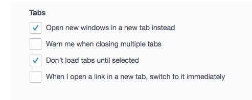
Source: Firefox (Preferences)
Customization is still an important part to the UX:
- It offers greater control by allowing user to mold the UX to their liking
- It trims the fat by only loading what’s necessary/useful
However, it doesn’t produce that special connection of personalization because outside thought is involved. That illusion of design intelligence makes all the difference.
The Main Difference
The defining factor between personalization and customization is whether your user asks for it or not. Customization is standard and expected, but personalization is still somewhat new and surprising — and so creates a kind of “passive magic”.
For example, the money-management site Mint requires the user to input financial information in order to track their budget. This is customization. But when the app makes suggestions on areas to save money and tailors budgeting strategies based on spending habits, this is personalization.
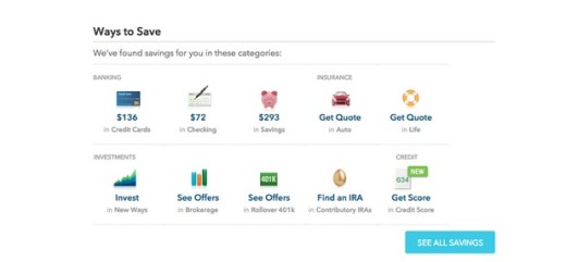
When an app or site knows you so well that it makes suggestions or shortcuts, it accomplishes two things:
- the user’s task is accomplished easier and faster
- the user feels an intuitive connection with the site or app
There’s a feeling of “magic” and appreciation (like with the previous Waze example above) that’s invaluable for user loyalty.
The Power of Contextualization
Personalization is all about contextualization. It’s a simple concept: designs are more effective if they serve up the right content at the right time for the right person.
Creating a contextualized, and therefore personalized, experience consists of these core steps:
- Know why personalization helps users — Aside from the quantitative data required for the “design machine” to learn and adapt to users, you need to know why that’s important in the first place. Conduct interviews, create user scenarios, and review any existing analytics to determine the most appropriate personalized experience based on user goals.
- Gather contextual data — Collect the user’s available data (see our Sourcing User Data section below for more details). This is primarily a technical endeavor that tries to capture information about devices, search histories, browsing/clicking behavior, IP address, etc.
- Create advanced user segments — As you gather the data, you’ll see natural patterns and clusters. You can combine what you know about the user’s psychology (motivations/fears/goals/etc.) with behavioral data to create robust segments. To identify friction points to be smoothed over by personalization, try creating user scenarios and customer journeys for each segment.
- Combine a rules-based & algorithm-based approach — Rules-based processes serve up content based on strict criteria, e.g. “Serve up X content in Y module if user is part of segment Z”. They require advanced user segmentation to function correctly. Algorithmic learning, on the other hand, happens dynamically as the user interacts. For example, if you watched 7 car videos in a row, the interface will recommend car videos. As Accenture suggests based on interviews with Dell, Adobe, Razorfish, and 13 other top companies, you want to combine both tactics.
Let’s examine Colin Eagan’s excellent article on personalization to see how this process might play out. In Eagan’s piece, he explains how he might create a personalized experience for a hypothetical airline travel app:
- First, he examines stress levels for men and women across a trip timeline from pre-flight to post-flight. Afterwards, he examines stress levels for different roles (from support to senior executive) on the same timeline.
- For the sake of time, he skips the “Why” phase (e.g. user interviews) and dives straight into creating user segments based on gender, role, and stress levels.
- Once the segments are created, he divides the site layout into different modules that will serve up content dynamically based on rules and algorithmic learning.
Contextualization is all about applying user empathy to data analysis. Rules-based processes are a good starting point, then mix in algorithmic learning to create that feeling of magic.
Common Personalization Tactics
Personalization spans a wide range depending on how much “personal” information it draws on. We’ve described the below tactics with the least personal listed first:
Related Content — The most basic personalization suggests related content based on the current content being viewed. (“You like red designer high heels? Here are some more.”) This is simple and can be done based on categories or keywords in the title, thus can be applied even to first-time visitors.
Social Connections — No less than essential for social media sites, this tactic analyzes the user’s current friends to make suggestions for people the user knows but isn’t connected with yet on the site. Facebook, Twitter, and LinkedIn use this to help new and experienced users expand their connection base, thus their interactivity.
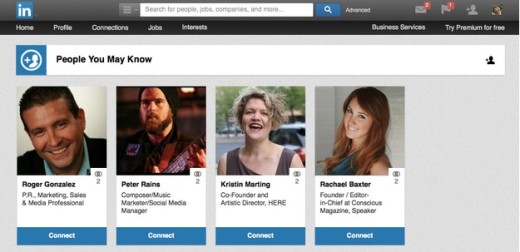
Source: LinkedIn
Recommendations — A safe middle ground for personalization. It’s no surprise this is a common feature for nearly all ecommerce sites, especially sites like Amazon that analyze both pages views and past purchases. Netflix, however, turns it into a science (literally: there’s a lot of math involved). They use a mutually beneficial system where users’s ratings of previously viewed shows improve the accuracy of subsequent recommendations, and also adds more data to help Netflix improve recommendations to others.
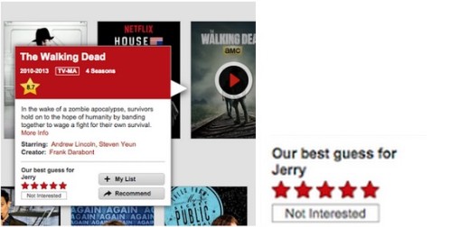
Source: Netflix
Push Notifications — Combining personalization and customization, push notifications open up new interactive options. A text from your dentist’s office wishing you a happy birthday is a personal touch, as is alerting a user of an upcoming performance of their favorite 90s-era rapper in their area. Just be wary of overdoing it and make sure users opt-in beforehand. (For advice on boosting opt-ins, read this article by Stanislas Cavalie.)

Source: “COOLIO.” (cropped). Tim Lucas. Creative Commons.
Active Personalization — The highest level of personalization is reserved for specialty apps or service sites that require it to function. The nutrition-advisory site Sage, for example, is explicitly personal with its recommendations. Users input details like their age, weight, and height, and also their dietary preferences like allergies and tastes. The site then maps out what, where, and how much they should eat.
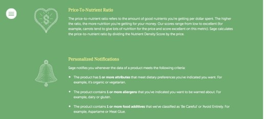
Source: Sage
Keep in mind that personalization is a highly fluid field, with great potential for innovation and creativity. These listed above are just a few common patterns we’ve noticed.
Gathering User Data
Personalization is made possible only if you gather the right data.
As explained in the free guide UX Design Trends 2015 & 2016, we can break down that data into three categories: passive, active, and usage data.
Passive Data
- Location — Whether through an IP address or a geolocation tracker, where the user is — at least a broad view — is easy to track. This is a useful personalization tool for area-specific recommendations, and for tailoring content to regional tastes.
- Device — Basic analytics can determine which devices your users choose. If you notice trends, this can lead to more potent adaptive design templates to take advantage of popular devices’ strengths.
- Previously viewed pages & past purchases — Another personalization cornerstone, seeing what pages/products your users preferred is a nearly foolproof way of noting their personal preferences.
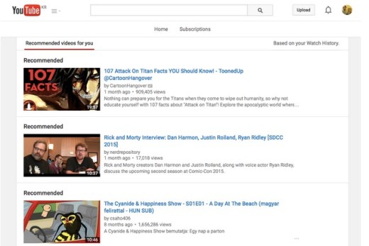
Source: YouTube Recommended
Active Data
- Sign-up questions — If you’d like to know something in particular about your user, ask them during the sign-up survey. Typically this goes no further than demographic information (gender, age, etc.) but there is room for experimenting. For example, a site for a music player might ask the user’s favorite band or style of music.
- Personalization questionnaires — For sites that offer a specific service based on the user’s personal information (like Sage above) a personalization questionnaire is necessary. These ask direct questions that the site needs to perform the service.
- Ratings — Ratings go a step further than previously viewed pages and past purchases by providing more details on the user’s emotional connection. People often view pages (and sometimes make purchases) that do not reflect their true likes and preferences — ratings clarifies which of these are genuine interests, and by how much. When applied correctly, these lead to useful recommendations (like Amazon or Netflix).
Usage Data
Adapting the experience based on past usage is another method that’s quite effective for personalization. In this sense, the product “learns” about the user over time, increasing its accuracy with more usage (which, if effective, will increase usage even more).
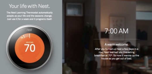
Source: Nest
For example, Nest is a self-programming thermostat that learns its users habits after the first week, then works automatically. The appeal, aside from the convenience, is that it saves energy by adjusting when you’re not home. This level of personalization can even exceed the user inputting their own preferences — chances are, Nest knows their habits better than they do. To achieve this level of intelligence, you must use a hybrid rules-based and algorithm-based learning model.
Examples of Perfect Personalization
Netflix
As we mentioned above, Netflix are masters of personalization.
Their service demands it: with a vast selection of movie and TV choices, users certainly appreciate a tip in the right direction.
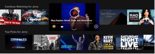
Photo credit: Netflix
According to Netflix, 75 percent of their views come from personalized recommendations. Their entire system encourages users to give their ratings on previously viewed movies and shows (whether watched on Netflix or not) and even rewards this behavior by revealing new recommendations.

Photo credit: Netflix
In fact, the interface even generates personalized content by default when you browse categories (see the “Sort by SUGGESTIONS FOR YOU” in the top right corner).

Photo credit: Netflix
Netflix also builds trust through transparency: wording like “Because you watched…” and “Because you loved…” lets the user know how their system works.
For a more technical analysis, check out Pancrazio Auteri’s of presentation on lessons we can learn from Netflix UX.
Spotify
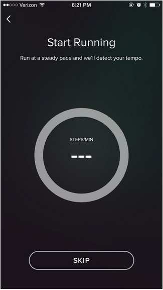
For runners, Spotify offers a personalized features that’s incredibly useful and delightfully innovative. It’s probably one of the best examples of personalization you can find.
Source: Spotify (app)
The rate and cadence of running is not something users could pinpoint if asked randomly. In fact, users would probably be confused about the value if the app asked for the data. Spotify, however, uses advanced technology to first discover this rhythm…

Source: Spotify (app)
… and then suggests a playlist of songs that match the tempo.
This satisfies all the criteria of excellent personalization:
- It provides a useful service with no or minimal user input
- The effort is handled by the design “behind the scenes”. Since the results are instantly visible, users get that “passive magic” feeling that creates emotional connection.
- It is a truly innovative style of personalization that its competitors don’t offer
Additionally, Spotify’s Discover Weekly takes recommendations to the next level by creating individual playlists catered to each user’s tastes, and delivers them every week. First, this is a great service for helping people discover new music (not to mention boost interaction with the site), but on another level it’s reminiscent of sharing mixtapes among friends — a very personal activity.
While we already explained how Facebook uses personalization features for suggesting friends, let examine how they personalize the way users view their feed on the iOS app.
John Paul Titlow, reporting for Fast Co., explains how Facebook personalizes the way users view a non-friend’s profile as opposed to a friend’s profile. Facebook’s methods involved:
- User testing — In a type of participatory design activity, actual Facebook users were asked to design their ideal non-friend profiles with pens and profile templates.
- Comparing to user data — The results of the user testing were compared with the actual data of the live Facebook site.
- Merging the results — The results were then consolidated for a better system for viewing non-friend profiles.
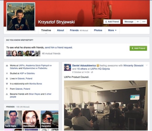
Photo credit: Facebook
The new non-friend profile view highlights any similarities the user and the non-friend have in common so that the user can quickly and effectively confirm or decline a friend request. Tthe Facebook experience becomes a bit more user-friendly, whether the user realizes it or not.
Delectable
The wine lover’s app Delectable shows that accurate product ratings and recommendations is not just for personalization, but for better business.
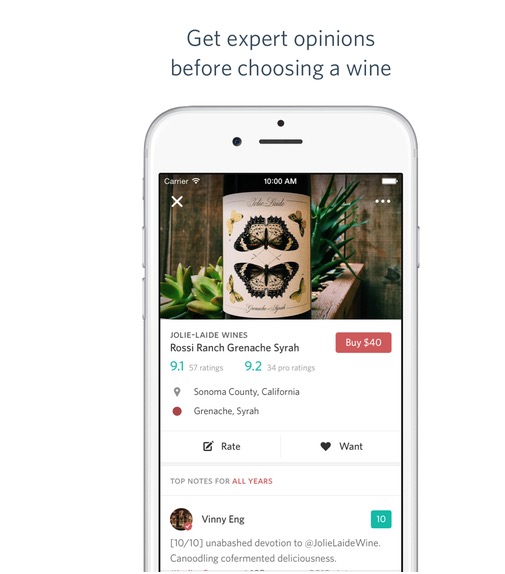
Delectable relies on a combined strategy of ratings, social sharing, and reviews to deliver to its users the wines they’ll love. Wine recommendations are generated from photos taken by the user, wines favorited, as well as wines popular with the community. The app’s entire value is built on personalization.
Source: Delectable via iTunes App Store
The user flow is stupidly simple. Users only need to take a picture of the wine bottle they want to learn about, and the app presents them with ratings and reviews from the community — mostly educated wine experts. The scans, reviews, and recommendations are free-to-use, but the app also sells wine.
Conclusion: Breaking Boundaries
Every user is different, and what some people may find uncomfortable, others may think is a delightful time-saver. For personalization, as with all other aspects of design, knowing your user is key. This reveals not only how much personalization to offer, but in what areas, and in what features.
If you found this article interesting, check out the free ebook UX Design Trends 2015 & 2016. Across 164 pages, the guide deconstructs 71 examples of excellent digital design (from companies like Tinder, Waze, Nest, and others) into everyday UX techniques for designers.
Read Next: Is Web design becoming irrelevant?
Image credit: Shutterstock
Get the TNW newsletter
Get the most important tech news in your inbox each week.


