Jerry Cao is a UX content strategist at UXPin — the wireframing and prototyping app. To learn more about how to create visually digestible interfaces, download the free e-book Web UI Design for the Human Eye: Colors, Space, Contrast.
If you’re looking at the dictionary definitions, contrast and similarity seem like complete opposites with little in common. But in web design, they’re two sides of the same coin.
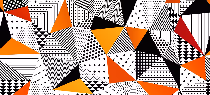
Source: Deviantart
Contrast and similarity are both two approaches to showing relationships between a page’s elements — which saves a lot of time and user effort since it’s done visually.
We’ll start by explaining how each one works on its own, then demonstrate how they can be applied simultaneously to enhance each other’s effects.
Contrast
As discussed in the free e-book Web UI Best Practices, contrast — when used properly — can instill drama and intrigue and highlight important differences between functionalities. It boils down to primitive human instincts: we’re hard wired to notice differences, because it helped us survive at one point in our evolution.
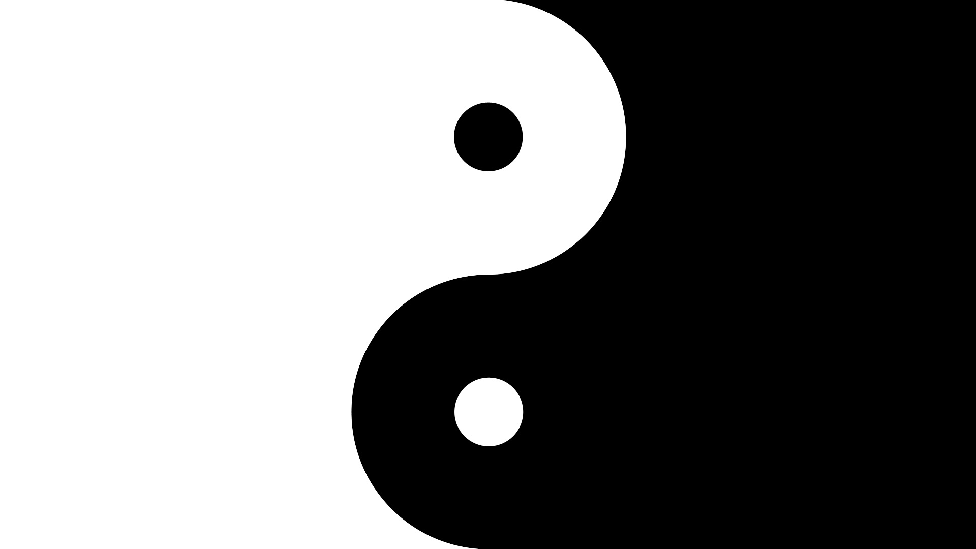
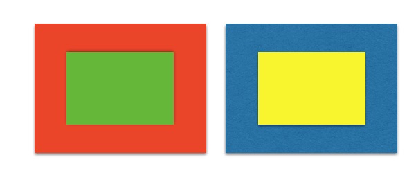
Contrast is explained in more detail by Brandon Jones, who looks at how these affect first impressions of objects in an interface. When most people look at the below image, they don’t just see two circles, but a blue circle and a green circle. The significance of this great, especially in interface items — differentiation is a generic and common human response.

Contrast also instantly communicates boundaries in the layout. For example, contrasting the color of the top navigation from the main content immediately tells people where the information is located.
Light and Dark
Everyone who’s used a computer or smartphone in the last decade is aware of the light and dark contrast applied to buttons.
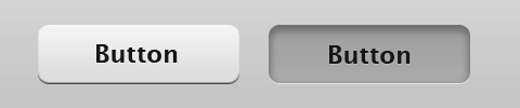
Source: Usability Post
The central idea behind this is that the darkening out of “pressed” button makes it seem more realistic, mimicking shading in the 3D world. Aside from that, the differentiation signals to the user that some action has been performed. This kind of contrast goes beyond merely improving the visuals, it’s actually a quite useful tool when designing an interface.
As Dmitry Fadeyev, founder of Usaura, points out, the light/dark contrast can be applied in two useful ways to web UI design:
- It accents anywhere you want the impression of depth — buttons, sliders, switches, etc.
- You can guide the user’s attention more to light objects by contrasting them with dark.
Even if your site leans more towards a flat UI treatment, at the very least, the shading and darkening will still add a 3D appeal. The German design agency Dunckelfeld is a best-in-class example of the power of proper color and contrast, but let’s take a look at how they treat their buttons. On the main menu, the buttons reverse contrast as you hover over them, providing users instant feedback and adding an extra level of interaction.

Contrast remains a core element in their interaction design, as you can see below. Again, this minimalist treatment reverses the contrast on hover, helping to blend navigation into the main content without feeling intrusive.
Clashing Colors
Using contrast in colors is a vital technique to grasp, as it can help guide the user’s eye, affect their mood, signal cues, and give your site its own distinct style. When discussing contrast, colors can be divided two conflicting groups: warm and cold.
- Warm Colors — Reds, oranges, yellows. These tend to be invigorating, energizing, or otherwise aggressive.
- Cool Colors — Greens, blues, purples. These lean closer towards relaxing, calming, subduing, and passivity.
How can you use this to your advantage?
It’s simple if you know one easy rule: warm colors tend to dominate cool colors. For example, making a call-to-action button red can help attract attention to it, but setting that red call-to-action button against a blue or green background will draw even more attention.
 See how clearly yellow stands out over the blue in the above example? Likewise, the red takes the attention from the green, almost shrinking it.

Source: TV Safety.org
Contrast between warm and cool colors can draw attention to — or away from — certain areas of the interface. Just look at the above example from on TV Safety.org, especially how the red navigation buttons stand out because they’re offset by the green. We talk a little bit more about this can be used in design patterns in our Web UI Patterns 2014.
Foreground & Background
While each Gestalt Principle addresses similarity and contrast in some way, contrast is critical to determining the relationship between figures versus the background and asserting visual dominance. As designer Steven Bradley of Vanseo Design points out, too much contrast will ruin the harmony of design, so let’s look at two important applications:
- Foreground & background — Upon first impression of a design, we naturally distinguish between figures and the background. This important relationship provides the context for the design. Therefore, they must contrast otherwise users won’t even be able to separate the two.
- Points of focus — These elements are designed to stand out from surroundings (through contrast), and the most noticeable element is considered dominant. Remaining elements that also stand out (but to a lesser extent) are considered focal points.
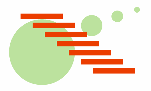
Source: Connecting & Separating Elements Through Contrast & Similarity
As you can see in the above example illustrated by Bradley, the green circles are similar to other green circles, and the orange bars are similar to other orange bars. But they stand in direct contrast compared to each other.
Remember to use contrast sparingly. If everything tries to capture the user’s attention, then nothing will stand out. Pick just the most important elements that must stand out, then move on.
To learn more about contrast as a means of visual hierarchy, check out this great piece by Steven Bradley.
Similarity
As we mentioned in the first chapter, similarity between objects’ appearances communicates similarity between their functions.
For example, on most navigation menus, the text of each object is the same size and font to signal that each is a clickable option. While this UI pattern is useful on its own, a savvy web designer will delve deeper, exploring different levels of similarities and how they create different relationships between objects.
Not all types of similarity are created equal. Some communicate strongly, while others are more subtle — and don’t forget about the context. Let’s explore the types of similarities and how they apply to web UI design.
The 3 Main Similarities
Expounding on the Gestalt principles, Andy Rutledge analyzed the use of similarity in web design and described the main types of similarities, and how strongly they suggest a relationship. We’ve found his work on the topic of similarity to be some of the most thorough and practical advice available.
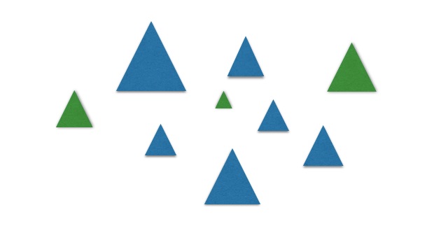
Take a look at the first illustration and see which objects below look most related.
 Even though the objects are all the same color, most viewers cite shape as the relationship that is the clearest. Despite differences in size, the small triangles are related to large triangles, and the small circles are related to the large circles. Pretty simple, right?
But what if the items were all the same shape and color?

Now, you’ll likely conclude that the large circles are related to each other and the small circles are related to each other. Because differences in size can create contrast, we can also create consistencies of size to communicate relationships.
Let’s see what happens when we use the same shapes, but change the size and color.
With all the same shapes, the viewers here will mentally divide the items by color rather than size. As Rutledge explains, that puts the hierarchy of similarities, from most to least potent, as color, then shape and size.
This hierarchy owes itself to evolutionary psychology. When scanning our surroundings, size and shape might be hard to determine due to all the visual intricacies, but colors immediately pop out to us. Just think about how you innately know that a bright red snake is not to be messed with.
But knowing about the different options is only half the battle. Knowing how to apply them is what matters.
2. Applying Similarity to Web UI Design
Every designer must provide visual hints about which interface objects relate to each other. Since users know within 10 seconds whether or not they’ll leave a site, you need to convey an immediate organization of the interface.
Let’s take a look at how to apply similarity to the treatment of links, content, and overall UI organization.
i. Links
Links always need to contrast with other text, but they must be similar to each other.
Typically sites will make links blue, sometimes underlined. As we described in Web UI Patterns 2014, this pattern plays off of users’ preexisting knowledge of blue text being links, which requires less thinking/learning on their part.
For a traditional link treatment, let’s take a look at Reddit. As you’ll see below, it’s nothing revolutionary and exactly what you expect for a site whose foundation is the links themselves.
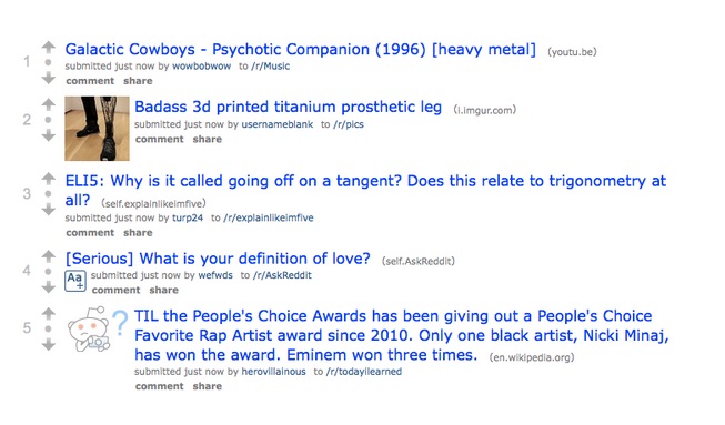 When you have different categories of links, you can apply different similarities to create more elaborate relationships. On Reddit, all blue links go to other pages. Meanwhile, grey links indicate user actions (like commenting or sharing).
The username links and subreddit links are the same color, but smaller in size than than content links. This plays into the hierarchy of similarities (color, size, shape) we just discussed: the blue color immediately indicates that all blue text are links, while the different size of the username and subreddit indicates they’re not the same as links to content.
Now let’s look at the comment and share links. The designer’s priority is ensuring the user understands that these links prompt user action. In that case, changing the color is the quickest way to visually communicate the difference. But to ensure the text still stands out as a link, the designer bolds the text (which is a slight change in shape).
As Andy Rutledge explains in his analysis, AIGA takes this diversification a step farther:
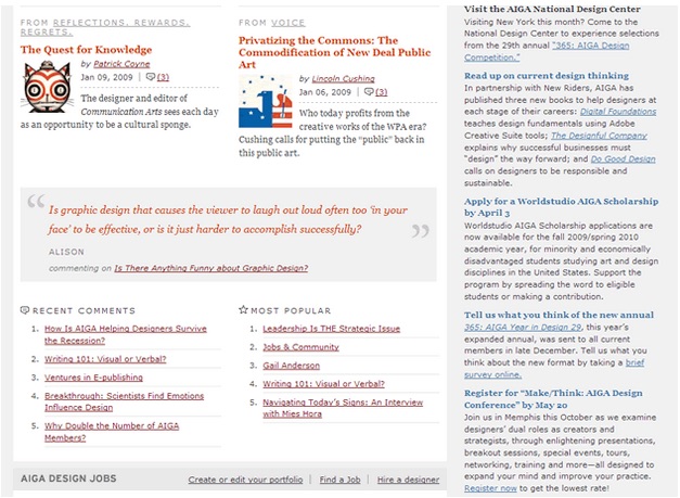
Source: Gestalt Principles of Perception-2: Similarity
There are lots of different types of links here: articles, authors, comments, site sections, etc. Each type of link has a different distinction, whether it’s the color, underline, or italics. It’s a much more complex link hierarchy than Reddit, but the same principles of similarity apply.
Sidebar links are blue and underlined to create contrast between the sidebar and primary content. Within the primary content, we see even more diversity. Four colors are used for link text. Some links are underlined while others aren’t. In terms of font, we see normal and italicized text, serif and sans-serif, bold and standard weight, as well as caps and mixed-case.
Despite all the variations, these elements help create an easily understood categorization of links:
- Article Titles — These are represented by orange, bolded, non-underline, serif links.
- Categories — Categories like “Voice” are represented by light gray, underlined, capitalized sans-serif links.
- People or Comments — These are represented by reddish underlined links.
- User Actions — Actions like “Find a Job” (which appears in the category for “AIGA DESIGN JOBS”) are represented by dark gray, underlined, mixed-case links. To further associate the action with the category, the link also shows up against the same gray background.
The link categorization feels complex when we break it down, but it’s actually quite visually intuitive. As long as you use color, shapes, and size to create the right layers of meaning, you can achieve the same effect.
ii. Content
Aside from categorizing links, one of the designer’s most important tasks is displaying relationships between content. When created correctly, these relationships reinforce hierarchies and imply structure without needing to “wall off” sections of content.
Let’s look at how the ZURB homepage communicates relationships through similarity.
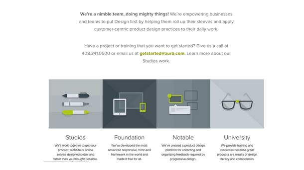
ZURB applies a consistent visual treatment to its different products. The similar color palette and square shape immediately communicate that the 4 objects are somewhat related. Once you read the description for a product, say Foundation, you can quickly assume that all the other similarly styled objects are also products created by ZURB. In this case, consistency of visual presentation suggests consistency of category and context.
Because the square treatment contrasts so much with the other content on the page, the visual similarity between products stands out even more. As such, we don’t need to use methods like a title that reads “products” to explicitly call out what these square objects represent.
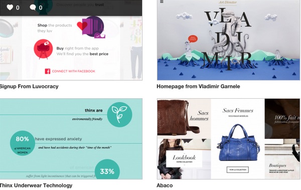
Now, let’s take a look at PatternTap. This site uses similarity to convey that every card represents a link to the UI pattern. All the cards also display the same behavior when you hover over them, creating an experience that reinforces the similarity.
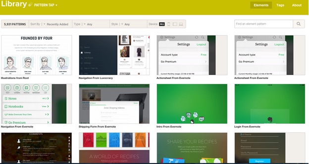
As we discussed in Web UI Patterns 2014, this split-second visual understanding is why cards are one of the most effective patterns for content-heavy sites. In fact, Intercom has even gone so far as calling it the future of the web.
iii. Organization
According to Rutledge, similarities in design also creates page-wide structure. You can see in the below example that no distinction exists. Every element looks the same, so they all look related.

Now, let’s see what happen when designer you play around with color. You can see below that color can create shapes (in this case, a column) out of elements that otherwise look the same.

We can also split the elements into two categories. The blue squares look related and the green squares look related. Every element has the same physical characteristics (squares of the same size), yet our eye sees two separate categories.

The takeaway here is that you don’t need physical structure to create page structure and relationships between content. You can suggest structure purely from clever use of contrast and consistency.
For example, let’s take a quick look at Craigslist. Yes, we know it’s not the prettiest site and could benefit from a visual overhaul. But it does do a few things right with its content structure.
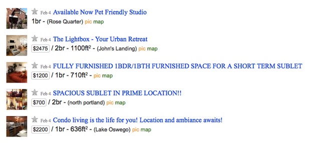
Each of the listings follows the same format: picture at left, clickable title at top and in blue, plus the price, date, space size, and location all in the same place. If any of the listings deviated from this similarity, it would raise suspicion and suggest the listing were somehow different.
Craigslist keeps it stupidly simple. The site feels like a low-fidelity version of a real site, but one of the few reasons it’s still usable is because it’s structured logically.
Harmony Between Contrast & Similarity
As Steven Bradley puts it, contrast and similarity are just two different ends of the same spectrum for showing relationships.
While effective on their own, using contrast and similarity together can accent each and make the relations clearer. The two are not mutually exclusive, nor should they ever be used in isolation.
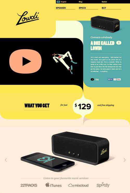
As Bradley describes, the site for Lowdi masterfully takes advantage of similarity and contrast in its color choices.
Source: Connecting & Separating Elements Through Contrast & Similarity
The background colors easily break up the sections, with the yellow sections drawing out the uniqueness of the black, green, and peach ones. Also notice how the price is wholly set apart from the rest of the page, eventually leading the eye down towards the product image.
For even more examples of harmony between similarity and contrast, check out Codrops’ article featuring 25 examples of emphasis in web design.
Takeaway
Don’t make the mistake of deciding whether to use either contrast or similarity, use both for the best results. Leaning too much on one will reduce the impact of the other, so a clever designer strikes a balance between the two — after, of course, mastering the nuances of each. If you ever feel lost in this area, just take a quick look around the web: you’ll see the subtle uses of contrast and similarity of every page.
To learn more about how to create visually digestible interfaces, download the free e-book Web UI Design for the Human Eye: Colors, Space, Contrast. Visual case studies are included from 33 companies including Tumblr, Etsy, Google, Facebook, Twitter, Medium, Intercom, and Bose.
Read Next: How to change user habits with interaction design
Get the TNW newsletter
Get the most important tech news in your inbox each week.