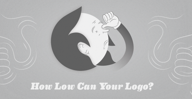
We are testing your capacity to willingly create that which you spend your entire life trying not to create: the worst logo ever. Participants have the chance to conjure up design demons from the darkest nether regions of their inner world and be purged of them forever. The process looms with graphic doom and will undoubtedly leave the best among us contorted in pain. But may the lowest of the low-brow win! The logo lancelot with the worst design will surely bask in the glory of industry infamy for generations to come.
You can see all of the submitted works over here. Be sure to read the Brief though, it might remind you of some, if not most, other Briefs. What can you expect? Here are some cool but hidious concepts:


Get the TNW newsletter
Get the most important tech news in your inbox each week.

