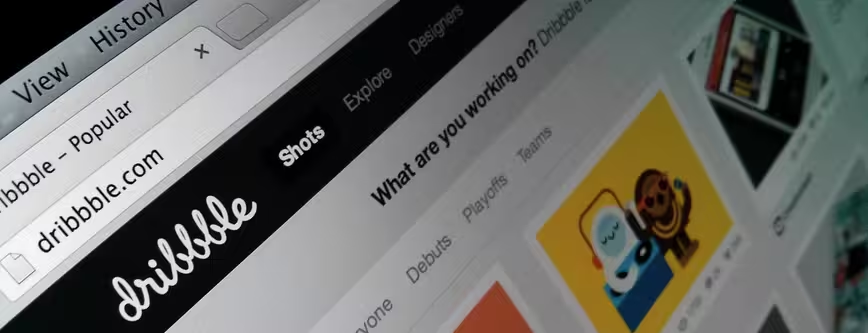
Design is paramount to the success of any new or developing startup. While the original idea and core functionality should always take precedence, there’s a growing demand for attractive services that offer a beautiful user experience.
Dribbble is one of the most reputable and discussed online communities for designers and illustrators at the moment. The service has managed to encapsulate some of the most abstract and compelling parts of the creative process, such as finding new sources of inspiration, requesting feedback from fellow designers and taking a sneaky peek at peers’ upcoming projects.
The concept behind Dribbble isn’t a new one though. DeviantART was founded in 2000 and now boasts one of the largest online social networks for artists and art enthusiasts. Behance, meanwhile, was set up in 2006 as a single destination for creative professionals to upload and promote their work.
Dribbble appears quieter in its ambitions, yet already commands a far greater influence on the international design scene. While its growth appears to have erupted from nowhere, the reality is that some carefully planned elements and features have been brought together to make it the knock-out success story known today.
Let’s shoot some hoops
To an outsider, basketball and graphic design have little in common. The former usually takes place outside or on a polished indoor court, involves heaps of physical exercise and is broadcast on TV to millions of fans both in the United States and abroad.
The latter, meanwhile, often requires sitting at a desk, with paper and various art materials, or spending hours in front of a Macintosh computer with a copy of Adobe Illustrator or Photoshop humming in the background. It’s not a spectator sport – not until the project is finished anyway – and doesn’t command a dedicated section in the New York Times every day.
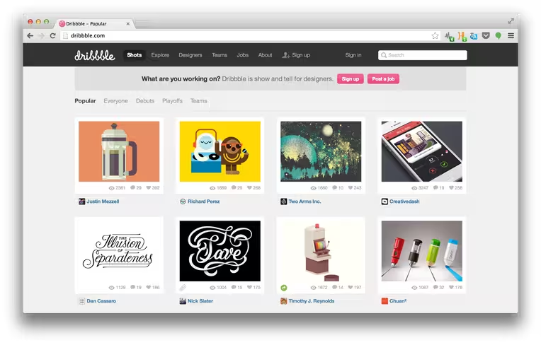
Yet Dribbble is all about basketball. New images are called ‘shots’, groups of images are called ‘buckets’ and recent uploads are known as ‘debuts’. In the world of Dribbble, retweets and reblogs don’t exist. Instead they’re called ‘rebounds’, which the user accumulates until they hit the ‘playoffs’ – a trending section for only the most popular projects.
“The name Dribbble came about from the dual metaphors of bouncing ideas and leaking your work,” Dan Cederholm, co-founder of Dribbble says. “We added an extra ‘b’ because that domain name was available. Early on, there wasn’t an intention to make it the sports metaphor so ingrained, but as we were creating the experience, things started falling into place. Many of the terms from the basketball world just worked.”
The verbiage is a consistent reference to the name of the platform and the company’s pink basketball logo. It’s also incredibly charming and means that the product is memorable for new and prospective users. The unintended – or perhaps intended – side-effect of this widespread branding is that Dribbble is very easy to talk about.
![Dribble co-founders Dan Cederholm and Rich Thornett [Photo credit: Samuel Fine]](https://media.thenextweb.com/2013/08/e7gHmonJoT97iHgzZU394tQFc3K2JtDOibyHLIINisg.avif)
Quality, above all else
I can remember, in fairly vivid detail, the first time I was told about Dribbble. One of my housemates at university was a graphic designer and was hooked by the idea of becoming a ‘player’ on the service. (That’s not to say he was a hit with the ladies by the way, it’s just the term given to Dribbble’s users.)
It was a few years ago now and at the time, the service was still invite-only. A limited number of invites were randomly assigned to users, controlling the number of designers that were ‘prospects’ and ‘players’.
Dribbble quickly became the web-equivalent of a college basketball team. Everyone wanted to be involved. It was a trendy place to be seen. The platform appeared to be accepting only the very best designers and with it came a sense of status and respect.
The exposure and hype surrounding the service quickly grew and despite Dribbble’s relatively low userbase, the number of people interested in the site grew exponentially.
“The primary reason for invitations was to keep us sane while we were balancing Dribbble along with full-time jobs,” Cederholm adds. “We were fortunate to have a lot of momentum right out of the gate, but until revenue was a point to allow us to focus on Dribbble only, the invitations ensured we could scale this thing gracefully while worrying about other things. Like making a living!”
Dribbble has become a little more open since then, although registering a new account still requires secondary approval. It doesn’t really matter though, as the initial roll-out has already solidified Dribbble’s reputation as an incredibly high-quality platform, home to only the most talented and interesting designers.
A viewing experience like no other
Pinterest, a social network that allows users to share their favorite images with ‘pins’, has grown in popularity because it successfully emulates the glossy print magazines that already cover the fashion and interior design industries.
Graphic design is a similar space. For so-long, magazines such as Creative Review and thick, dedicated hardback books have dominated coffee tables and the desks of design agencies. It was one of the few places that creatives could draw inspiration from and created an exceptionally high standard for design-based publications.
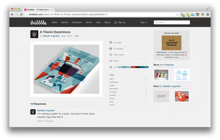
Dribbble, just like Pinterest, has effectively replaced this medium by presenting incredibly high-quality design projects with a simple, yet attractive interface. The site’s color palette is predominantly grey and black, with the occasional pink highlight thrown in to reference the company logo. The projects themselves take center stage with ample space given to comments and the relevant number of likes, shares and views on the shot page.
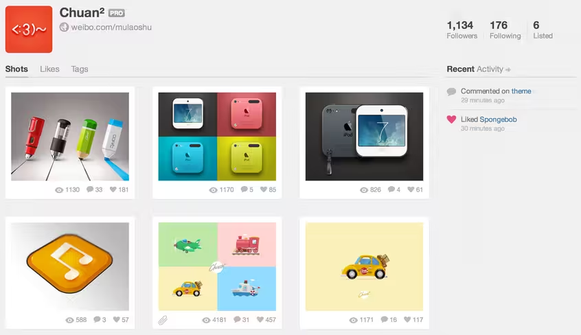
There’s even a small space for the various colors used in the project, so fellow designers can replicate the exact shade and hue in their own work.
Clicking on the file link also produces an attachment page, stripping away almost all of the traditional Dribbble interface, save for a small sidebar with all but the most basic information. Flickr adopts a similar layout when the user asks to see a photograph in all available sizes, and in Dribbble’s execution it’s near-flawless.
“The priority has always been, first and foremost, to feature the work and the designer,” Cederholm explains. “We’ve intentionally kept the UI agnostic (monochrome, Helvetica type, simple glyphs) so that the variety of work being shared takes the spotlight and isn’t overshadowed by Dribbble’s brand.
“Over time, many of the features we’ve added have been a direct reaction to how the community chose to use the site. Rebounds, for instance, were being done by members simply linking their shot in the comments. We noticed that and built a UI around that to support what was going on.”
Free of all distractions, Dribbble ensures that players’ work always looks its very best. The end result is a platform that is simply gorgeous to explore and encourages further engagement from its users.
Working oh so hard for the money
Times are tough. Many Western markets are still in the middle of a recession, applying financial pressure to small, medium and large businesses alike. Design agencies are looking to run their company with the smallest number of staff possible, while clients are trying to commission new work at increasingly lower rates.
As a result graphic designers, especially freelancers, are always looking for new work. More clients means more opportunities to earn a livelihood. It’s simple math.
Dribbble has therefore been wise to create its own jobs board, which any user can access to find new employment. It’s just a database of links that point to other listings, but it works at a basic level and has become a reliable source of business for creatives.
“When Dribbble started, we didn’t have a job board, but we sold our own ads on the site,” Cederholm says. “Companies started advertising jobs in our banner rotations. Others posted shots that advertised open positions. Pretty quickly, we realized we needed a dedicated space for hirers to advertise to the amazing talent that hangs out at Dribbble every day.
“A ton of scouting and hiring happens on Dribbble, and the more tools we can provide to both designers looking for work, and companies looking for talent, the better.”
Design has never been so important
The standards for what is deemed to be good design will only increase over time. It’s part of the reason why Apple’s recent unveiling of iOS 7 caused such a stir from the community.
Dribbble has the potential to be the center of that change, providing designers with a platform where they can improve their work and eventually be picked up by the next big startup.
Users are already developing variations on the the new interface and apps being offered with iOS 7 – in some cases even improving upon them – which only helps to highlight the quality of the work being uploaded to the platform.
“The difference now is that people are (rightly) paying more attention to it, and they’re realizing that it’s crucial,” Cederholm says. “We’ve seen large companies invest in design because they know the user experience makes all the difference in the success of a product.
“It’s an exciting time to be a designer. We’re also seeing more ‘designer founded’ startups, where design is at the forefront of the product and how it’s conceived. This is also important, as design is not an afterthought of ‘now make it pretty’, but part of the thinking and conception of a good idea. Successful companies get this. And it’s why the business world in general is now investing in design more than ever.”
What’s next for Dribbble?
Dribbble has carved out an enviable niche for itself as the de facto online platform for sharing and discovering breakthrough design work. The company is now working on a new feature, called Teams, which will allow organizations to collate designers’ profiles and post their work to a joint page, as well as their own profiles.
“Teams can also advertise jobs on their profiles as well,” Cederholm reveals. “Again, this is a feature born out of observing how people are using Dribbble. Companies were creating accounts, but they were separated from the individual designers that were also on Dribbble sharing their work.”
He adds: “We think Teams will increased exposure from their talent and vice versa. It’s coming soon, and we’re really excited about it.”
Teams seems like a logical step towards monetizing Dribbble and increasing its relevancy for larger companies. Regardless of what it does next though, the platform is unlikely to lost its status as the go-to community for professional design work. It’s already proven itself as a slam dunk, if you’ll excuse the pun.
Get the TNW newsletter
Get the most important tech news in your inbox each week.


