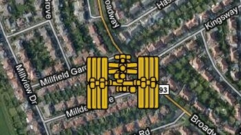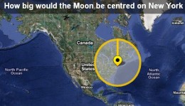
 Ever wondered how big Silicon Valley really is? How about the International Space Station, the battle of Stalingrad or even the moon? Even if you’ve never thought about it, a new site launched today may well have you thinking about the world in a new way.
BBC Dimensions is a collaboration between the BBC and design consultancy BERG. You get to select from a wide range of important objects and historical events before seeing them overlaid onto a map. The clever bit is that you get to choose the map. So if you want to see the moon overlaid onto your home town or the routes of the planes used in the 9/11 attacks overlaid onto Europe you can.
Some examples allow you to plot the length of a historic journey around your neighbourhood, allowing you to get a better idea of the distance involved. How does the distance of the first astronauts on the moon’s walk around the planetoid’s surface compare to your morning commute? Dimensions lets you plot that out.
![]() Writing on the company blog, BERG’s Matt Jones discusses the development of the project and says “”It’s a bit like a digital toy – that just does one thing, very clearly (we hope) and delights in doing so.” On the future of the site, Jones says “It’s imagined that if the prototype is successful, it will be integrated into the main BBC site for embedding into history and news storytelling online.”
Writing on the company blog, BERG’s Matt Jones discusses the development of the project and says “”It’s a bit like a digital toy – that just does one thing, very clearly (we hope) and delights in doing so.” On the future of the site, Jones says “It’s imagined that if the prototype is successful, it will be integrated into the main BBC site for embedding into history and news storytelling online.”
The potential for Dimensions is intriguing. Imagine being able to compare the size of the current Pakistan flood to a part of the world you know well, directly from a BBC News story about it. In future it is hoped that history enthusiasts will be able to upload their own historic measurements for use within the surface.
Even if many users just see it as a fun toy, BERG will be satisfied. “So long as it delivers tiny bursts of that along with the little grins of ah-ha it seems to generate, we’ll be very happy”, writes Jones.
Get the TNW newsletter
Get the most important tech news in your inbox each week.


