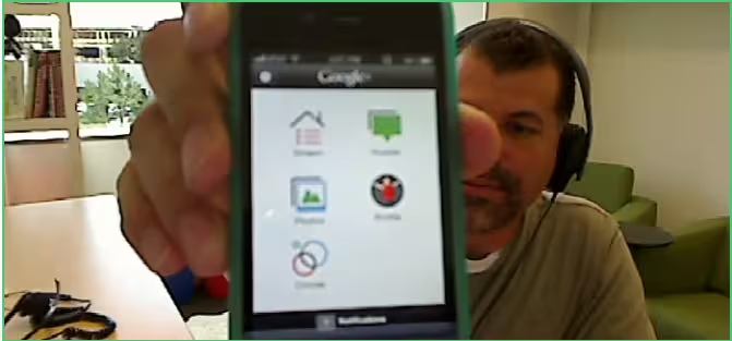
Our only gripe about Google+ via iOS right now is that we don’t have a native app. We’re told that it’s been submitted and it’s awaiting Apple’s approval, but of course we want to know what it looks like.
Fortunately, we’ve been able to acquire a (somewhat blurry) image from a Google Hangout thanks to Googler Hiraldo Hierro‘s extreme close-up with the app:
We have to send our hat tip over to Ryan Lowdermilk at Windows Phone Dev Podcast whose quick thinking got him the screenshot.
The app appears to be almost identical in design to the Android version, which is a very good thing. The native Android app is highly functional without any mess and that’s exactly what we want to see on iOS as well.
Here’s another, clearer shot of the app on an iPhone 4, from over at Newsden:
Now, Apple, can you please just let the thing get approved so we can enjoy it instead of just looking at it?
Get the TNW newsletter
Get the most important tech news in your inbox each week.
