Motorola today lifted the lid on revamped versions of its Moto G smartphone, which it says is its best-selling smartphone of all time, but do the incremental additions really make much of a difference to the handset or is it just more of the same?
We spent a little hands-on time with the device to find out.
Design
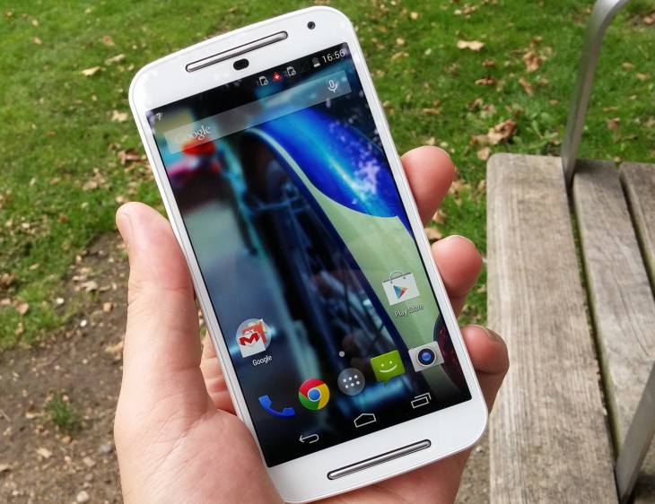
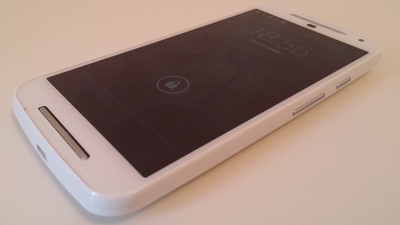
OK, first things first, if you’ve ever seen the original Moto G then the new Moto G looks just like that, except that it’s a little taller and wider to accommodate the larger 5-inch 720p display.
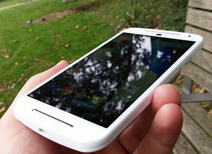
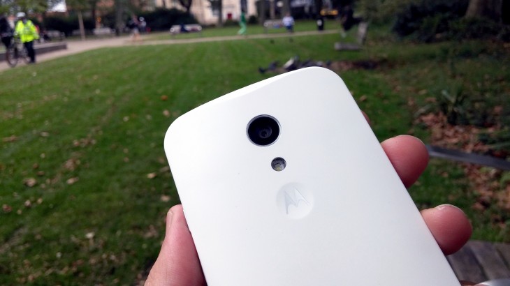
Aside of the screen, it really does look very similar indeed – meaning it keeps the non-glossy, soft-touch plastic, curved rear casing of its predecessor. That curve isn’t a design choice I particularly like, but it’s not a deal-breaker on this handset.
The increase in screen size also brought a small increase in weight too – a whole 6 grams – up to 149 grams, making just a whisker lighter than Microsoft’s freshly launched mid-range Lumia 830. Again, it’s not the lightest on the market, but it’s pretty impressive considering its £145 price tag and 5-inch display.
The rear case is removable (a necessity for the accompanying range of different colored shells) and provides access to the dual SIM slots and microSD expansion slot. It’s nice to see this included for launch this time around, although support for cards above 32GB might have been nice.
The speaker, formerly found on the rear, has been moved to the front and has been joined by another, so you now have one above and below the display facing forwards. It’s certainly plenty loud for its size, if not the best listening experience for audiophiles.
Performance
The Moto G arrives running an almost stock version of Android, which is a refreshing change from most device makers and positively necessary on devices such as this with a more middling spec list.
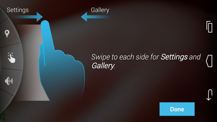
Aside of the ‘vanilla’ Android Kit (4.4.4) experience (it will be getting an upgrade to Android L when available too), there’s a non-standard camera UI and a few Motorola specific apps, although most of these aren’t new for this device.
The screen, like the former model, is crisp and sharp – although slightly less sharp than the original due to the increased screen size. While the first-gen Moto G packed 329 ppi (pixels-per-inch), the new Moto G manages 294 ppi. Still, it’s no less responsive than the first and the overall feeling from the OS is one of sprightliness, rather than one that’s about to lag out. Nonetheless, without putting it through more rigorous tests, we’ll have to reserve final opinion.
It’s a similar story with the camera too – the megapixel count has grown from five to eight, but megapixels don’t tell the whole story so we’d need to test it in a few different conditions to get a proper feel for it. That said, from what we did test, it snapped away quickly and didn’t leave me waiting for the focus for too long.
At first glance, those colors look a little on the over-saturated side too.
First impressions
Mid-range handsets tend to suffer from a number of problems, but in providing a high-quality display, microSD expansion and a pleasingly sparse version of Android, the updated Moto G looks set to continue in the footsteps of the original and sidestep some of the most annoying pitfalls.
Yes, the camera probably isn’t going to be a patch on a Lumia’s and no, there’s no 4G LTE connectivy on board (although the original Moto G 4G is still available), but with a price tag of just $179/£145, compromises have to be made somewhere.
Get the TNW newsletter
Get the most important tech news in your inbox each week.
