Jordan Roland is a staff designer/illustrator for the Shutterstock blog. This post was originally published on the Shutterstock blog and has been adapted with permission.
When developing your skill set as a designer, you also start to pick up habits. I use Photoshop differently than my coworkers, and their use of the program may vary from your own. Whatever the end result — in this case, halftoning an image — there are multiple ways to arrive at it.
First, let’s talk halftones. I use halftones predominately for screen printing artwork. The idea is that you take a solid color and break it up into a series of dots. The closer and bigger the dots, the darker (and less detailed) the image; and the smaller and more spread out they are, the lighter (and more detailed) the image. Below are a few different methods for making this happen.
Screen Printing involves taking images and breaking them down to simple colors. You print the images by running ink through a mesh screen (hence “screen” printing). Since the ink needs shapes to pass through, people use halftones to create the images. These steps will be shown in black and white, just to convey the basic method of creating the dots.
Method 1
Photoshop likes to make things easy for us, so the first trick on this list is to use the Photoshop Halftone Filter.
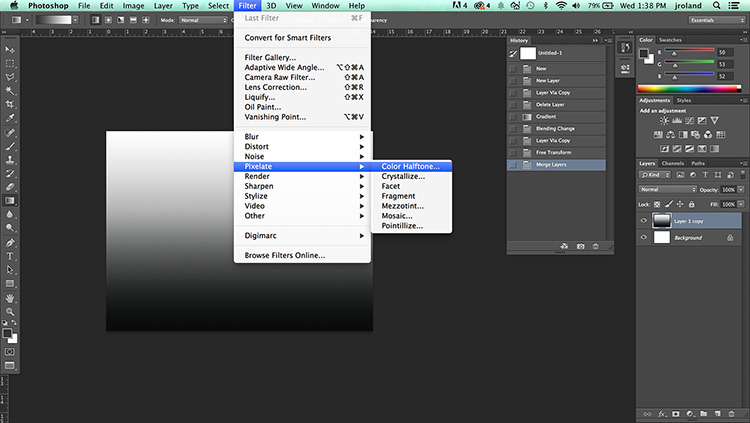
1. Make a new file and fill the document with a black and white gradient.
2. Go to Filter > Pixelate > Color Halftone


Method 2
This second method is a really good way to get a subtly different dot pattern, as well as a bit more texture and a “grungy” Xerox-like result.
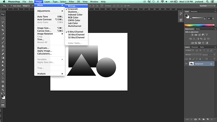
1. Once you have your art set up and your color gradients set, go to Image > Mode > Grayscale. This removes all color from the picture and sets your file up for bitmap.
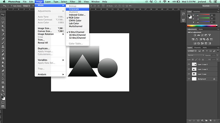
2. Repeat the same process, this time, going to Image > Mode > Bitmap, which will prompt the window below. For this method, match the resolution to whatever you set your file resolution to. (Since this is a web post, mine is set to 72 dpi.)
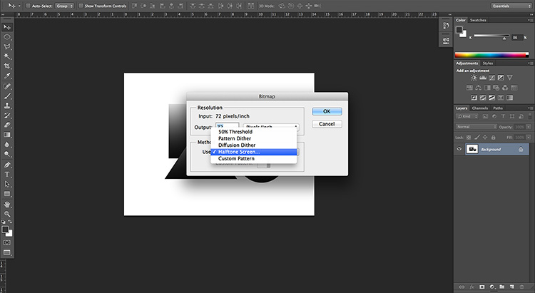
3. Select the drop-down menu under Method, and pick Halftone Screen. Play around with the next menu a bit to get a style you like for your halftone pattern. For Frequency, the lower the number, the bigger the dots. For Angle, this is the angle at which the dots are positioned.
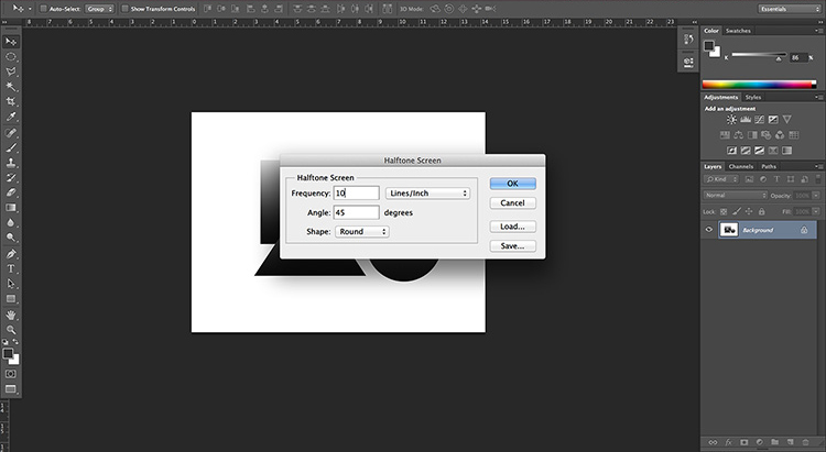
4. Once this is done, hit OK. You’ll be in bitmap mode still, so make sure to toggle Mode > Grayscale and then Mode > RGB or CMYK.
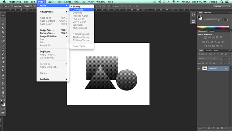
You’ll see the jagged edges and rougher look commonly used by designers going for the “Xerox” effect of an image being repeatedly copied on a machine.
Method 3
As you can see from the above two processes, this often takes a lot of trial and error — but what if you could just draw your own halftones? Illustrator Kyle Webtser has released a brush preset that lets you do just this. Below are two videos: one of Kyle quickly showing off the different styles of his brushes and the other showing how to use them in a drawing for a comic effect.
https://www.youtube.com/watch?v=0i0vgbK-qD8
You can download the halftones here ($7), and Kyle also has a great step-by-step guide on how to install them.
https://www.youtube.com/watch?v=AQSXjrEK1wU
Get the TNW newsletter
Get the most important tech news in your inbox each week.