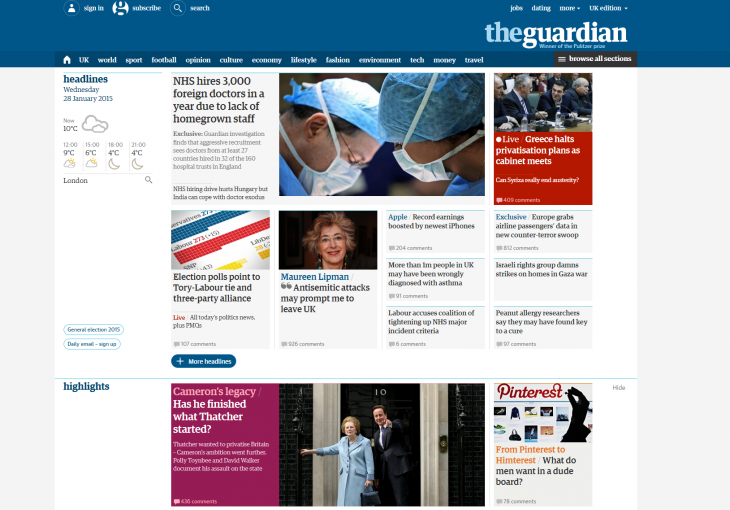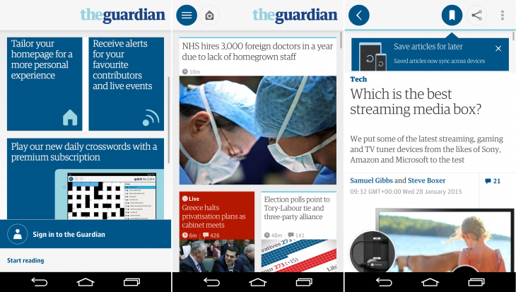
The Guardian has today announced the official relaunch of its website, which has been rebuilt from the ground up to make it easier to navigate and identify different types of content.
The launch follows the introduction of its global .com site in the US and Australia and the revamping of its mobile apps in May last year. Today, however, marks global availability of its redesigned site.
As any regular reader of the site will notice, the changes are pretty comprehensive. There’s now a whole new layout, elements of the homepage are personalizable, there are new color schemes and new font sizing. It’s been an ongoing project since the first basic beta launched a year ago.
Indeed, Wolfgang Blau, Director of Digital Strategy, told me that more than 130,000 individual pieces of feedback had been received from readers since the project began – and that’s just the ones that came via the on-site feedback form. There were yet more collected from emails, in-person interviews and internally from staff.
The transition to making a globally-facing brand relevant to everyone without alienating an existing – and sizeable – audience is a tricky balancing act to carry out. For example, after one of the earliest iterations, users were put off by the new font size, so despite it being smaller than rivals still, The Guardian reduced it by a little. Qualitative research (interviews) were combined with data and digital tools too, like heatmaps and eye tracking.
“We’ve built up a very strong data capability to be able to look at how a small percentage of the audience experiences our product, so we could have a lot more reassurance that what we were building was going to work. None of us wants to take a big risk with something as important as The Guardian,” Product Director Anthony Sullivan told TNW.
However, that’s not to say that the team were going to be fully feedback-led in their decisions. Three years ago, it took two weeks to update the website with new features, now there’s about five changes per day.
“We’ve given quite a lot of space back to our journalism. On the front page, we put a lot of thought into not just doing the standard approach there by listing things in well-known buckets, but trying to really understand how people think about our journalism… We’ve cleaned up everything along the way as well,” Sullivan said.
However, while there’s some debate on the Web of the merit of comment systems and reader feedback, The Guardian is known for providing ample space for reader feedback, which has survived the redesign, Blau explained.
“The Guardian has many well-known examples of collaborating with readers and sifting through original source material, verifying material, so of course this is crucial for us. We’ve also put some time into optimizing the discussion threads.
The Guardian is very much about collaboration, about transparency, about discussion. There are many little features that won’t move the needle in terms of metrics, or pageviews per visit or whatever it is, but that are still important, such as the ability to automatically display office Twitter handles, so you can approach them [staff] more easily.”
As well as improving the overall design to make it easier to navigate and identify content (by putting each style in its own ‘container’), the revamp has also ushered in a complete rebuild of all the editorial tools on the back-end too.
“We literally relaunched all of our ediorial tools, pictures, the tools to build articles, galleries, live blogs, and the tool to curate and edit the front pages – all of these are new, and all are so much easier to use… Our internal aim is that no one should take more than 30 minutes to be able to publish and for the first time, all of our reporters and correspondents around the world get direct access and can change their own articles,” Blau said.
With The Guardian now very much a global brand, walking the delicate line between alienating existing readers, while serving and attracting new ones is really the key to the project’s success – and for the most part, it seems to be striking that balance pretty well.
Of course, today isn’t the end of that process; it’s really just the beginning of the story for The Guardian’s new single, global, platform-agnostic site.
Get the TNW newsletter
Get the most important tech news in your inbox each week.


