SlideDeck 2, the WordPress plugin that lets bloggers create gorgeous, customizable content sliders without any code, has just become responsive.
We’ve covered both SlideDeck, created by Digital Telepathy, and responsive design on TNW a handful of times, but all you really need to know is that the plugin is now flexible enough to adjust its size and design based on what device you’re using. In the end this just makes for a better user experience.
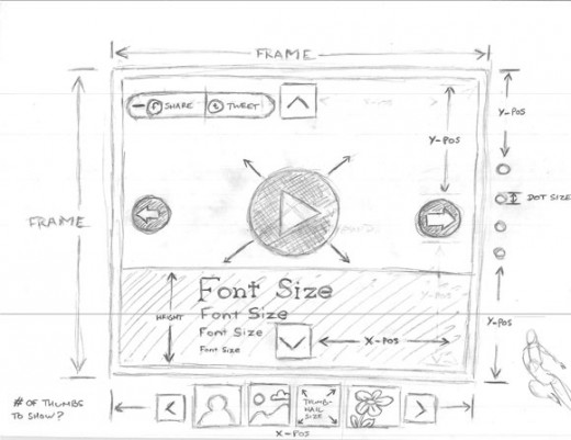
Digital Telepathy went through quite a bit of detail on how the development of the plugin occurred, which follows everything from concept sketches to RESS. With this move, the company has cut the price of the plugin by 25% (in exchange for a tweet).

If you’re curious as to how the actual results turned out, you can take a peek at a preview here and start resizing your browser window.

Check out the plugin via the link below:
For more on responsive design, take a peek at SVGeezy, which detects SVGs (Scalable Vector Graphics) on your site and automatically falls back to raster images for older browsers. How are you preparing for all of these different screens?
Get the TNW newsletter
Get the most important tech news in your inbox each week.


