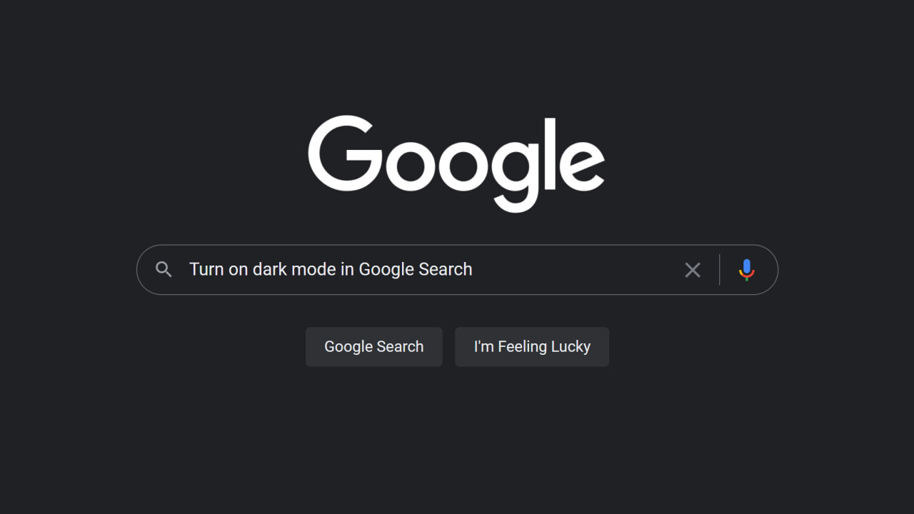
Although the Google Search homepage has received a few visual updates over the years, its overall design has remained consistent: It’s a colorful Google logo over a white background.
That’s finally changing — for users that opt-in, anyway. After rolling out a dark theme for Google’s mobile apps, the company is finally bringing some eye relief to desktop users too. You know, so you look up critical information like the history of the empanada at 3 AM without blinding yourself in a sea of white nothingness.
Notably, the dark mode setting doesn’t just turn the background into a deep shade of grey, it also turns the Google logo all white, giving the site an extra-minimalist look. I might switch over to dark mode just for the aesthetic.
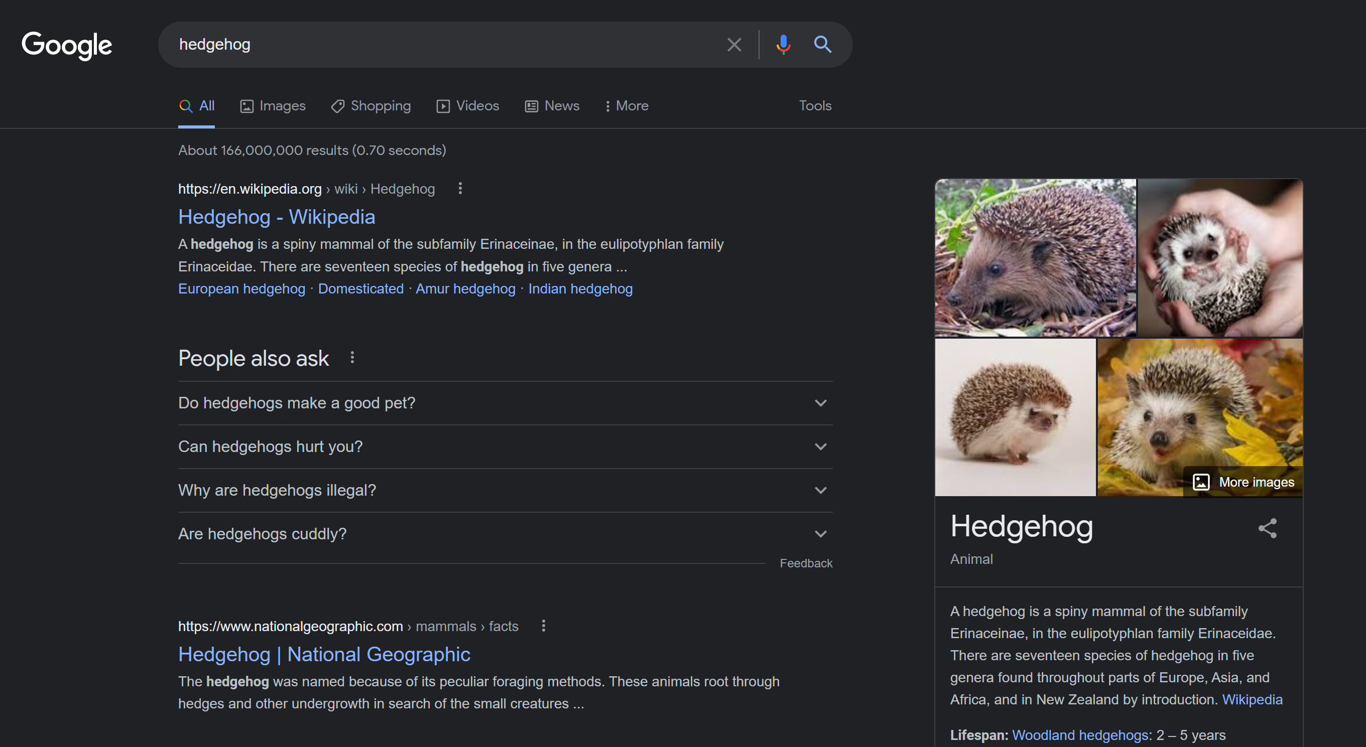
The feature is rolling out “over the next few weeks” so not everyone will have it available yet. Whether it’s available seems to depend on your specific Google account rather than your IP address; it’s available in one of my Google accounts but not the others.
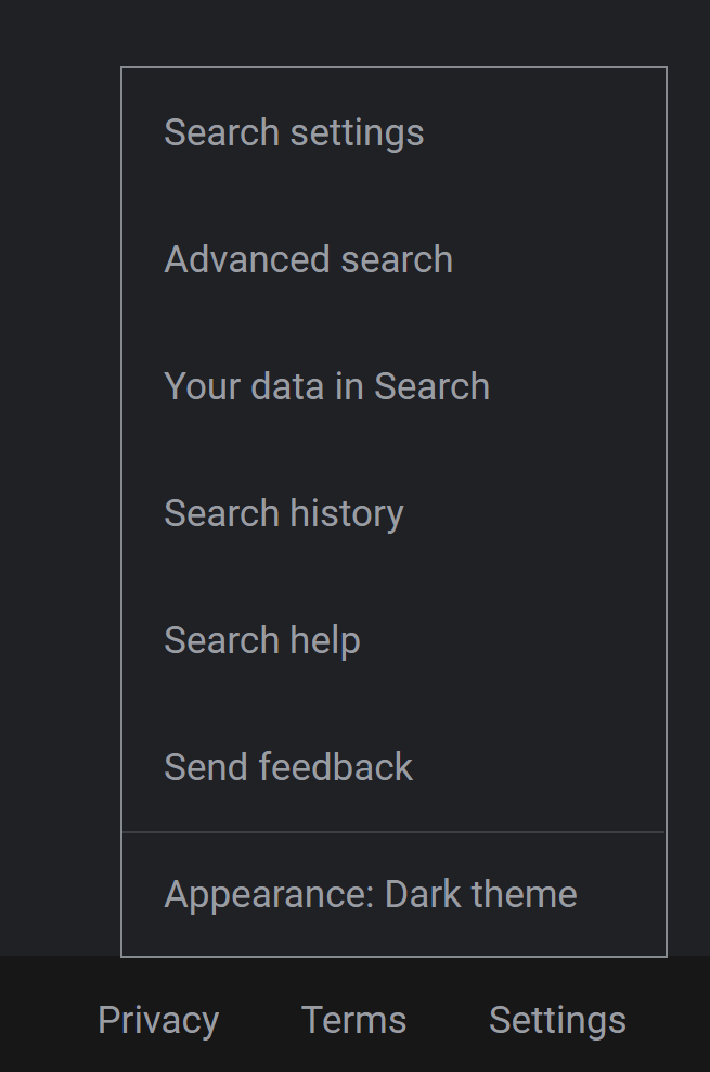
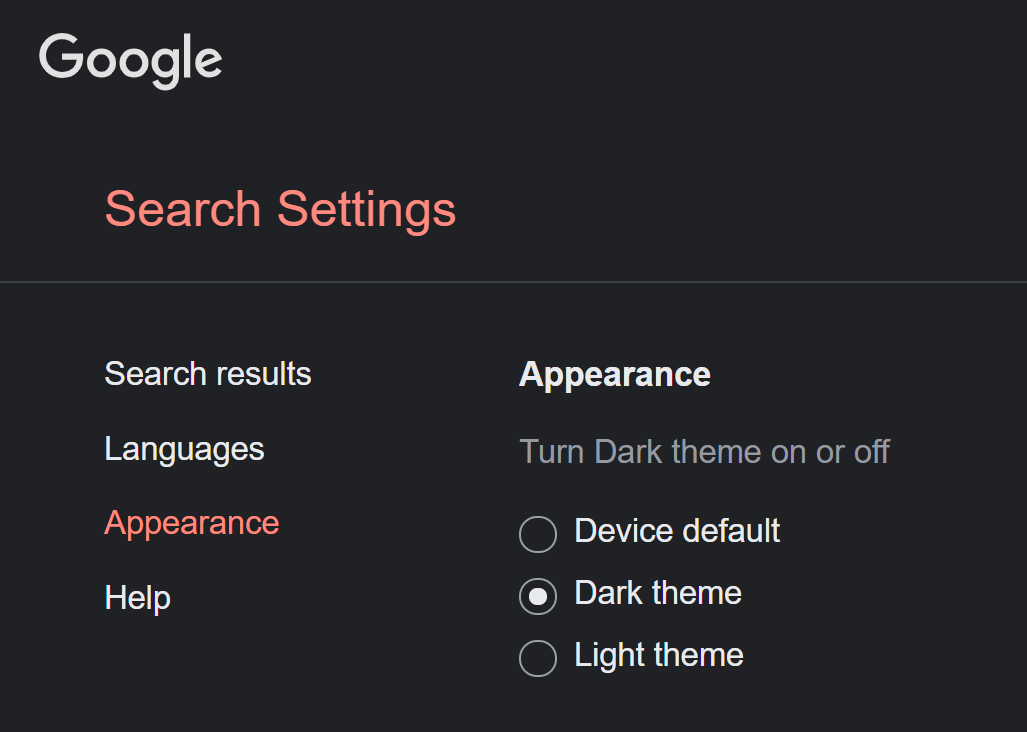
Giving it a try is as simple as tapping on ‘Settings’ at the bottom of Google.com and selecting the new ‘Appearance’ (which won’t show up if the feature hasn’t been enabled for your account).
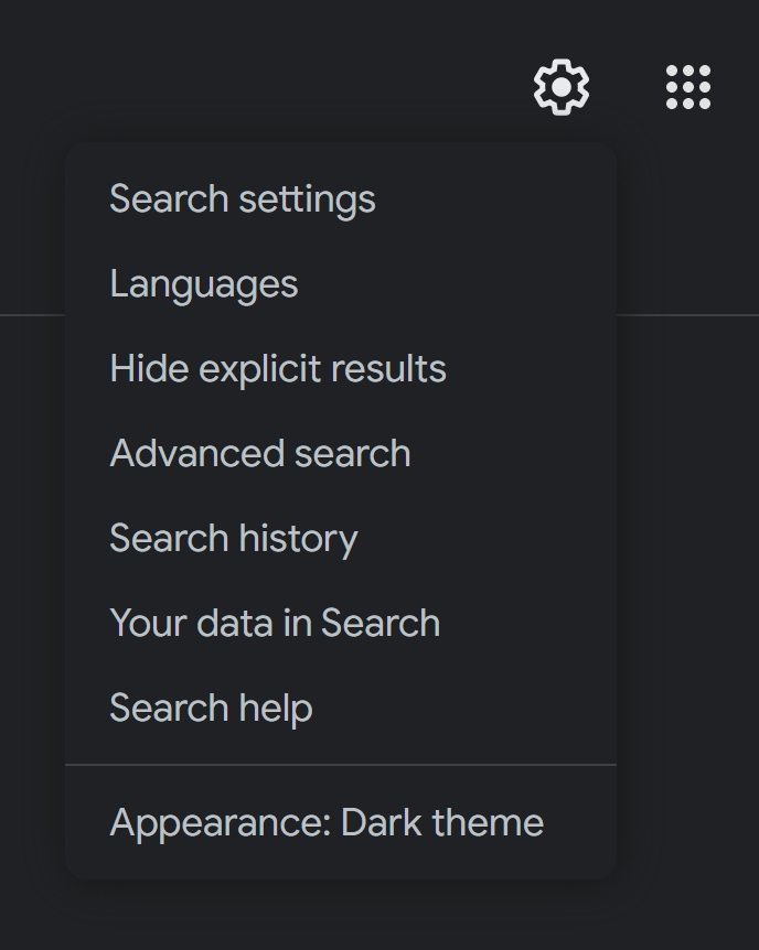
Alternatively, select the cog button on the upper right of the search results page.
You’ll then be taken to the settings page, where you’ll see a new appearance tab. Then simply choose the dark or light theme, or have Google automatically switch the theme based on your system settings.
The feature is also coming to the mobile website, although it’s not clear when that will be official. In the meantime, today’s update will be appreciated for those of us who do much of our searching from a desktop.
Get the TNW newsletter
Get the most important tech news in your inbox each week.
