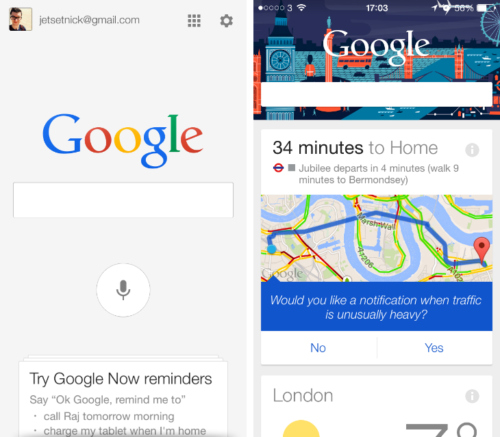
Google updated its Search app today for Apple hardware with a refined iOS 7 redesign, expanding the overall UI and swipe-up Google Now feed to fill the entirety of the screen.
It’s subtle tweak, but given that the Google Search app was always well-designed and not too dissimilar to the look of iOS 7, that’s understandable. When you launch the app, you’ll notice that it now hides the battery iOS status bar at the top of the screen. This is a full-screen experience and it’s consistent when you swipe up from the bottom of your display for Google Now. Although the status bar reappears, the individual cards now take up the width of the screen.
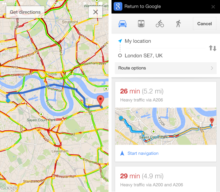
Google has also added “smarter integration” with the Google Maps for iOS app. We’re yet to uncover the depth of that particular feature update, but loading up maps within the Google Search app feels faster than ever. A transparent ‘Get Directions’ button sits in the top right-hand corner of the screen and will flip you over to the Google Maps app when pressed. While in Google’s dedicated navigation app, a ‘Return to Google’ bar now resides at the top of the screen, and again the app now takes up the entirety of the screen.
For iPad owners, Google has also added native image search, so you can find the snaps you need without loading up the Google Chrome for iOS app.
➤ Google Search | iOS
Top Image Credit: Kimhiro Hoshino/Getty Images
Get the TNW newsletter
Get the most important tech news in your inbox each week.


