If you’ve been paying attention of late, you will have noticed that Google products have been undergoing a bit of a facelift. And today, Google has announced the official launch of Blogger’s new design and layout.
We first reported on this back in July, when it was still in the Blogger draft section, where updates are previewed and tested before rolling them out to a wider audience.
Google’s popular blogging platform will receive more than a lick of paint, and it seems that the entire editing and management experience has been reworked, to make it faster and more streamlined. And here’s a snapshot of the changes.
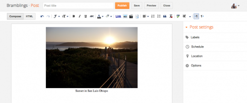
Regardless of whether you’re on a dashboard or settings page at blogger.com, you can create or edit posts with a single click at the top of the screen. And the post editor has also been expanded and simplified to give users a bigger canvas to work on:
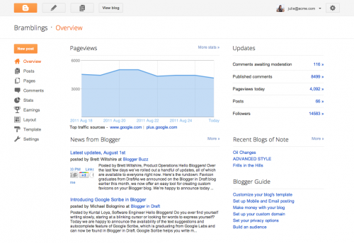
Furthermore, there’s a new Overview section too within the dashboard, where bloggers can see how people are reacting to their blog, with the graph showing recent traffic numbers, comment activity and follower counts.

These changes will be rolling out from today, and users should gradually be given the option to switch to the new interface over the next few days. You should see a pop-up announcement with instructions on how to get to turn on the new changes. There’s also a Blogger Help Center page, where you can read more about these changes.
These changes are the first in a series of major updates that will be rolling out over the next few months.
Get the TNW newsletter
Get the most important tech news in your inbox each week.


