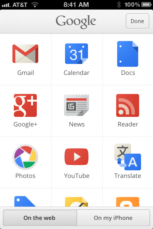
Google has today launched a new version of its Google Search app for iPhone, featuring faster operation, full-screen image and search interface and access to all Google apps in one place, reports Macstories. This brings it more in line with the iPad version of the Search app released late last year.
The iPad version had gotten a nice bump in design, which made it far more feature-rich and handy than the iPhone version. This latest update adds many of those features, but in a way that makes sense on the iPhone. This follows a widely praised update to the Google + app for iPhone, which now looks and works far better than the Android version of the app.
The redesigned app features a much faster interface, with quicker results and faster swiping and scrolling. The search results are automatically presented without search controls one you begin scrolling. It still doesn’t use the ‘Google Instant’ search feature that the iPad does, however.
It’s worth noting that this version of the Google Search app appears to have been written natively, rather than using a simple web view. This has been at the root of many complaints over Google’s apps on iOS in the past. This time around, the team took no shortcuts and the app looks and feels pretty great.
The image search has gotten an overhaul as well, and now features the full-screen endless design, with swipeable lightbox, that the iPad version does.
One of the nicest additions is a pane of all of Google’s apps, delivered via a button right on the splash screen. This was one of the most important updates to the iPad version as well and gives Search app users full access to all of their Google apps in one place. These apps still load directly into a web interface, but not a bad start.
The new app looks like a significant improvement over the original version of the app and demonstrates a continued commitment from Google to finally get apps on iOS right.
Get the TNW newsletter
Get the most important tech news in your inbox each week.


